Sketchbook Flip Through Abstract Sketchbook Welcome to the vibrant realm of my latest abstract sketchbook, where colors and shapes intertwine in a dance of imagination. In this flip through, we will embark on a journey through abstract art, a world where the ordinary...
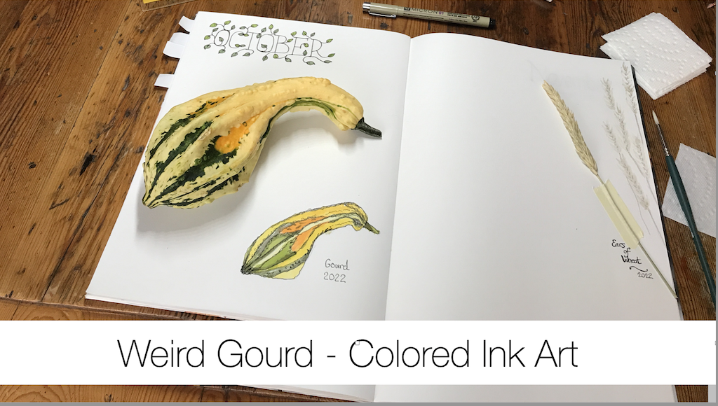
Weird Gourds – Colored Ink Art
Oh, My Gourd!
I was in my local grocery store yesterday and spotted these weird looking gourds in the pumpkin section.
This is not a vegetable I usually prepare, cook and eat, but I thought maybe this time, as I wanted to add a drawing to my Perpetual Nature Journal, I would see what I could do.
Hello
Hi, I’m Alison and I call myself a hobby artist.
I am on a journey to get better at art and I’m doing this for self-care.
In a digital world I find that slow-paced activities which are creative support my drive for a slower lifestyle.
You can read about my journey.
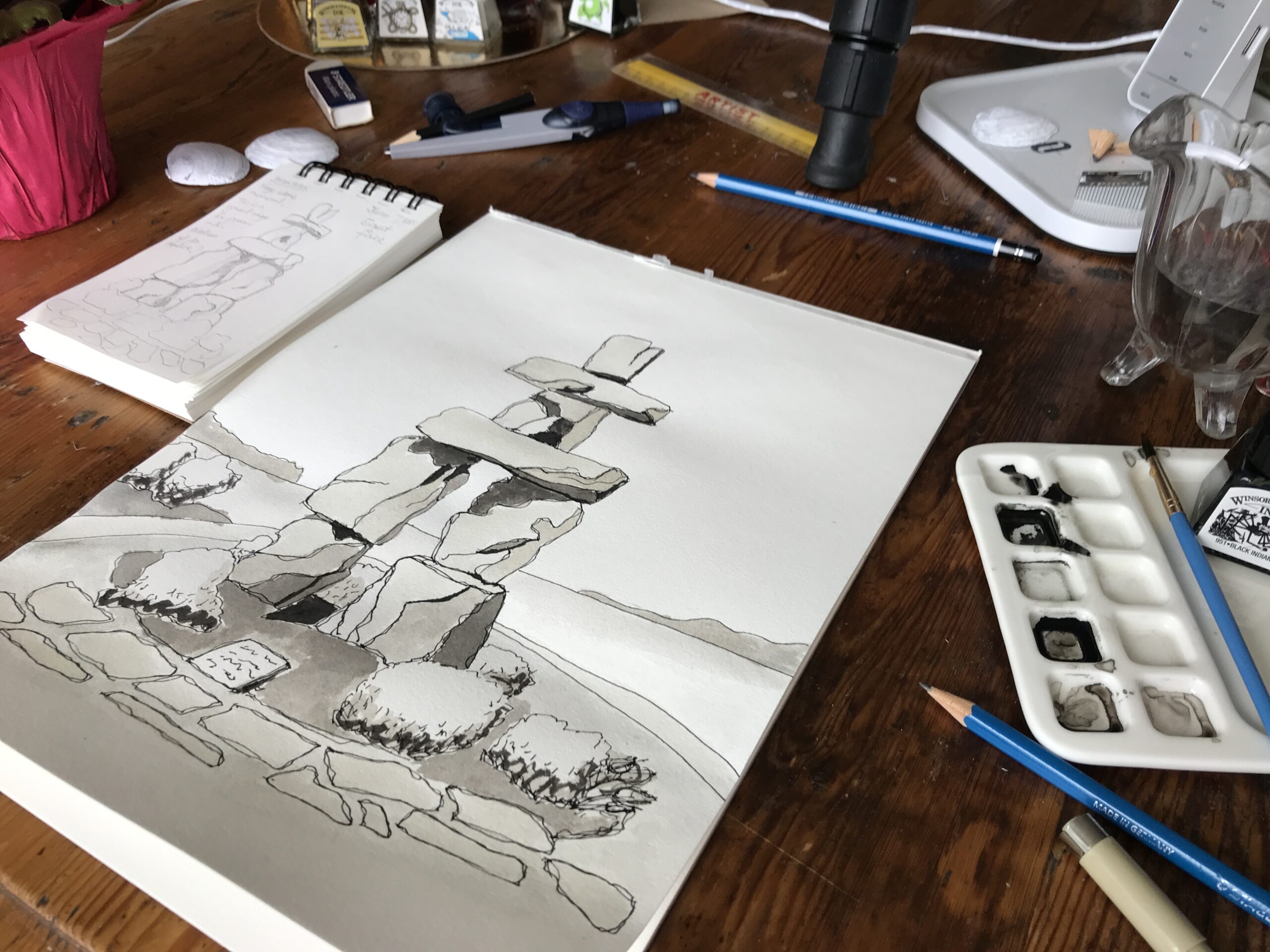
Art Supplies
Get Your Stuff
I urge you to use the paper, sketchbooks, pencil, inks and paints which you have at hand.
I believe that artists already have what they need and there is no requirement to let not having the exact equipment I used to stop you from creating art.
No excuses here.
Look around and gather your art tools.
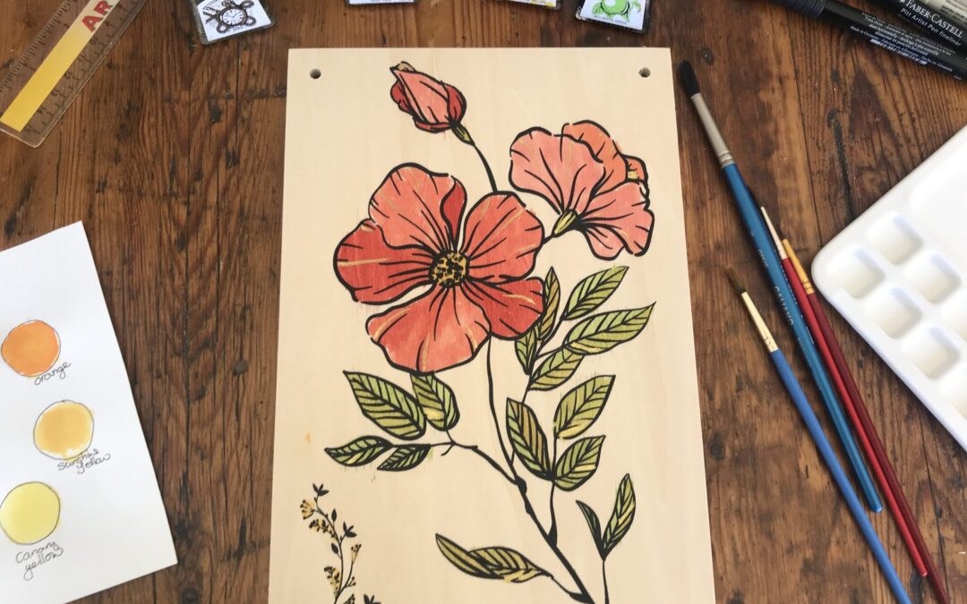
Specific Art Supplies
These are the exact art supplies which I used for this artwork.
- Fabriano Sketchbook as my Perpetual Nature Journal
- 2H Pencil
- Eraser
- Windsor and Newton colored inks
- Assorted Paintbrushes
Part 1 – Drawing the Outside
Perpetual Nature Journal
I added this drawing to my Perpetual Nature Journal on the October page.
This is the first sketch I have for October as I only began this journal earlier in the year in May.
Pencil Sketch
Once I had handled the gourd and rolled it around to find a good side, I lightly sketched the gourd out.
I used my favorite pencil which has a 2H lead. The 2H describes light lines on the page which are easier to erase later.
I took care to get the knobby bits and the color changes as patches as well.
Colored Ink
When working with these inks you do need to shake the bottles beforehand, but you also must wipe off the screw tops before you close them otherwise the stick and you can’t get the lid off next time.
There is an art to looking after your Windsor and Newton inks pots as well.
Yellow
I began with some Canary Yellow ink in my palette and thinned it down quite a bit with water.
I like to keep the paper quite dry and not add too much water, but it is a balancing act.
It seems I prefer to work with the wet on dry technique and not the wet on wet. One.
This opinion may change, but for now it is my selected method of working with colored ink.
Orange
Next, I added some Orange to the palette and dabbed it in where the gourd was much darker.
Green
The green was the Emerald Green to which I added a little Canary Yellow to make it more like a sage or olive green.
I watered down the ink mix quite substantially and then slowly built up the color after each drying.
Layers
I let this artwork dry in between and then added more color with a light touch.
Pen
Finally, I went over the whole drawing with a 0.3mm black pen to define the main outlines.
With this pen I held it loosely and let it wobble a little.
The pen part does give this a flavor of an ink and wash piece.
Part 2 – Drawing the Sliced Half
Hidden
After I’d completed the outside painting of the gourd it occurred to me to look inside.
I struggled considerably to cut this vegetable in half.
I tried my main straight-blade kitchen knife, but to no avail.
Then I got out my big South African cleaver forged from one piece of steel and heavy, oh so heavy, and I managed to push the blade into the gourd.
Artwork
Next, I set about sketching and inking the sectional slice of this gourd.
To be honest there were some interesting seeds in the main cavity, but not much flesh on the gourd only about half an inch of orange pulp.

Cooking the Gourd
After finishing the painting, I tried to cook with the gourd.
I had so much trouble chopping this vegetable up that I gave up.
The skin is so tough.
In the end I had about six one-inch cubes of flesh which I added to the pan with my other roast red potatoes, onions and other vegetables which I was cooking that night.
A gourd is not a vegetable that I am likely to buy to consume again.
However, I am likely to buy them for still-life autumnal center pieces which I love to create and draw.
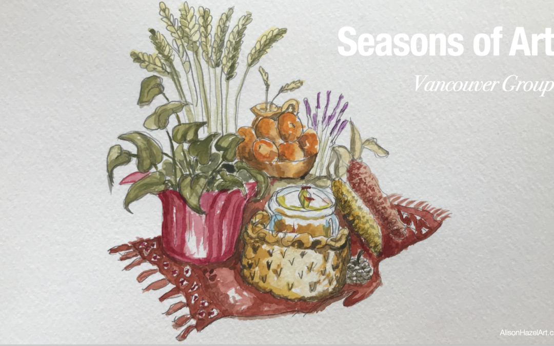
You can see this year’s Seasonal Art Group story here.
Aspiring Artist Activity
Vegetables
This is an activity which can be done by anyone who has vegetable, which I’m assuming is everyone.
Get the kids involved as well.
Find a knobby vegetable that is interesting, perhaps with multiple colors or is a weird shape, which you want to draw.
In your Perpetual Nature Journal and on the appropriate month’s page please do the following:
- On the appropriate month’s section find a suitable page.
- Draw a light pencil sketch and remember that we are not engraving.
- Color in or wash with watercolor, colored ink or your favorite art medium.
- Pen over to add definition to your artwork.
- Write the name of the plant in pen below.
- Sign and date somewhere near the bottom left.
Reflection
Daily Life
This is not the most exciting painting you are likely to create.
Rather, it is a part of paying attention to the world around you and noting the details that go in to make up daily life.
Sketch Journal
This sort of activity can also be created in your sketch journal as a drawing about your day.
If you are the sort of artist who constantly draws your coffee cup in your sketch journal, then doing a gourd will spice things up a little.
Celebrate Seasonal Changes
Celebrate the changing seasons with this type of painting.
It could be a part of your Phenology Wheel as well where you observe nature around you and, during Autumn, the fruits and vegetables ripening into maturity.
Thank You
Thank you for spending part of your day with me.
Love,
Alison

Author Bio
Alison Hazel is a woman who shares her ongoing journey about becoming an artist later in life. She creates simple art that anyone can make. She hopes to inspire you to reach your creative potential in the area that suits you.
More Articles
If you enjoyed this post then you may love some more articles from our blog.
Art for Self-care
Read my journey on Art as Self-care. Get some tips and ideas on how you can add some journaling processes to your day.
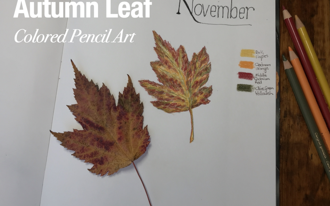
Autumn Leaf Colored Pencil Art
Autumn Leaf colored pencil art in my Perpetual Nature Journal sketchbook. Great for hobby artists and beginners.
style="display:block; text-align:center;"
data-ad-layout="in-article"
data-ad-format="fluid"
data-ad-client="ca-pub-4471307604888511"
data-ad-slot="7787961343">