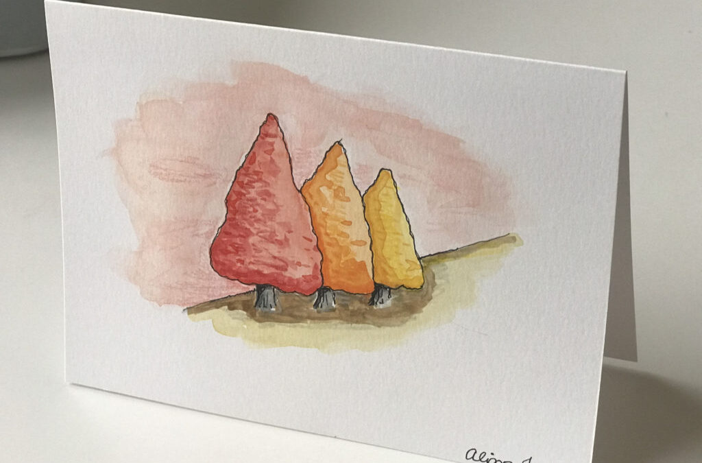
Warm and Cool Colors – “Grove of Trees” Watercolor and Ink
Warm and Cool Colors “Grove of Trees” Artwork
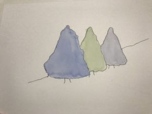
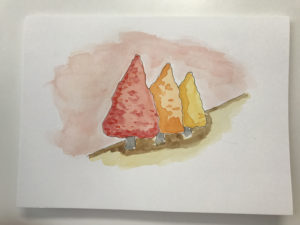
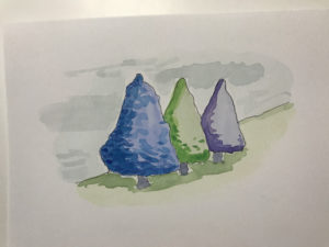
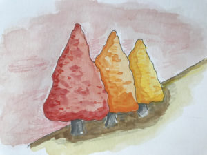
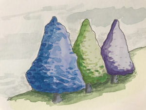
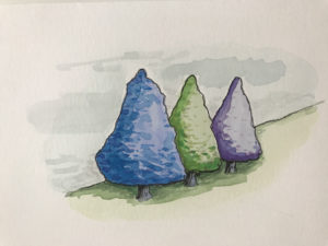
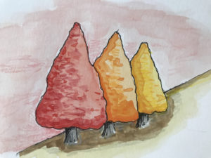
This week I created two similar watercolor and ink artworks of a row of trees.
One piece is painted with warm colours and the other with cool colors.
[embedyt] https://www.youtube.com/watch?v=7WEey11nJEg[/embedyt]
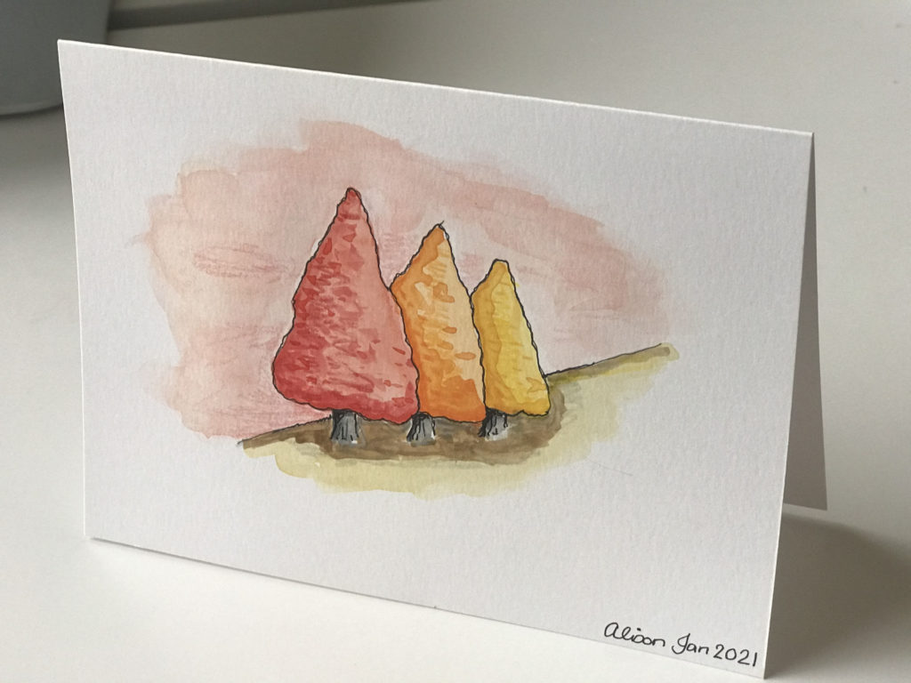
In a way, the first painting looks a lot like it is the autumn season and the second one is reminiscent of spring.
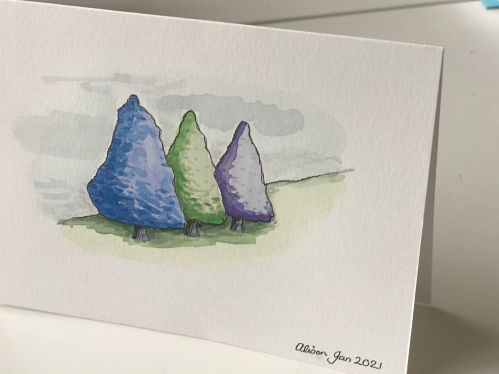
This time I did not create only one painting for my sketch journal, I actually created two really pretty cards with original artwork.
I can use these cards for many occasions perhaps to send to family and friends for their special days or celebrations.
The bonus is that I get to share my creations with others.
Spectrum
The color spectrum of seven colors of visible light in order are red, orange, yellow, green, blue, indigo and violet. These colors can be seen with a human eye.
At the further red end comes infra-red and at the further violet end we find ultraviolet both of which cannot be seen by us. The color spectrum can be loosely divided into warm and cool colors.
Mood
Warm and cool colors bring temperature to your work additionally they can suggest mood as well. The warm colors are hot and spicy and suggest friction, danger and sex.
The cool colors are restful and calming and suggest tranquility, peace and harmony.
Using either a warm or a cool color palette in your artwork will shift the mood of the piece even when the subject is the same as in our grove of trees.
Color Palette
Your palette refers to the colors that you have chosen to use in a particular artwork.
Avoid using all the colors in your paint box. Instead select a few colors that work well together such as the warm colors of red, orange and yellow or the cool colors of violet, indigo, blue and green.
Warm Palette
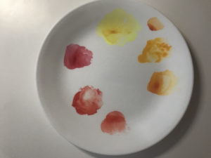
In general red is a hot color. The warm colours are found at the red end of the spectrum. Warm colors are red, orange and yellow.
Warm Paint Palette
Choose reds like Mars red, madder lake and cadmium red. Select oranges like burnt orange, cadmium orange and pyrrole orange. Opt for yellows like yellow ochre, hansa yellow and Naples yellow.
Choose reds like Mars red, madder lake and cadmium red. Select oranges like burnt orange, cadmium orange and pyrrole orange. Opt for yellows like yellow ochre, hansa yellow and Naples yellow.
Warm palette
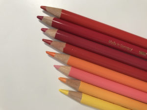
Warm Colored Pencil Palette
In crayons choose alizarin crimson, scarlet red, deep red, pink carmine, orange glaze and cadmium yellow.
Warm colored pencils
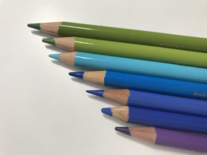
Cool Palette
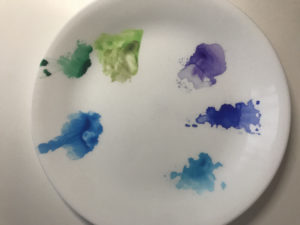
In general blue is a cool color. The cool colours are at the violet end of the spectrum and are violet, indigo, blue and green. Sometimes green can be considered as neutral because it nestles between warm yellow and cool blue. But typically, green is considered as a cool color.
Cool palette
Cool Paint Palette
Choose violets like caput mortuum, ultramarine violet and magenta. Select indigo. Pick blues like ultramarine blue, cobalt blue and phthalo blue. Elect for greens like sap green, olive green and emerald green.
Cool Colored Pencil Palette
In crayons select may green, light cobalt turquoise, phthalo blue, ultramarine, cobalt blue and violet.
Cool colored pencils
These color names are all from Faber Castell Polychromos colored pencils, but you can find similar colors in your crayons.
When you start out you do not have to know the exact color names but rather let your instincts guide you towards using a limited palette of either warm or cool colors.
Picasso
Picasso’s famous blue period is followed by his just as famous pink period.
It’s all about mood.
During his blue period, he was suffering from depression an during his pink period he had found a woman to love and life was rosy.
My Process
I painted my two groves of trees on separate cards.
I used Strathmore Mixed Media cards 140lb (300g/m3) size 5″ x 6 7/8″ (13.3cm x 18.4cm) which come with envelopes in the box.
I followed the process I’ve used before that you can see in detail in the “St. Chads, Poulton” painting and my recent sketch journal “Workdesk” picture.
I began with a simple 2H pencil sketch of three trees.
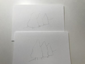
Pencil sketches
I added pen and ink over and then I gently erased the pencil marks otherwise they will show through the paint.
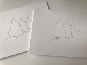
Pen and ink
I gave a super light wash of watercolor paint, one in a warm color palette and one in a cool color palette.
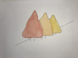
After they were both bone dry, I added more intense watercolor to the underside of the trees.
I added the sky and foreground still keeping in the color pallets that I had chosen.
Using colored pencils in the same warm and cool palettes, I enhanced the depths and shadows in the grove here and there.
Colored pencil touches
Cool colored pencil touches
I went over some of the main details with a black pen again to add definition.
Pen over
Final Thoughts
That trees are normally green, it seems that the cooler palette painting is better somehow.
It resonates with what we expect.
That’s the one with the green tree.
I may repeat this warm/cool exercise with something that can be either red or green like an apple.
That project might be something to create in the future.
Question
Have you noticed, do you naturally gravitate towards a warm or a cool palette for your paintings?