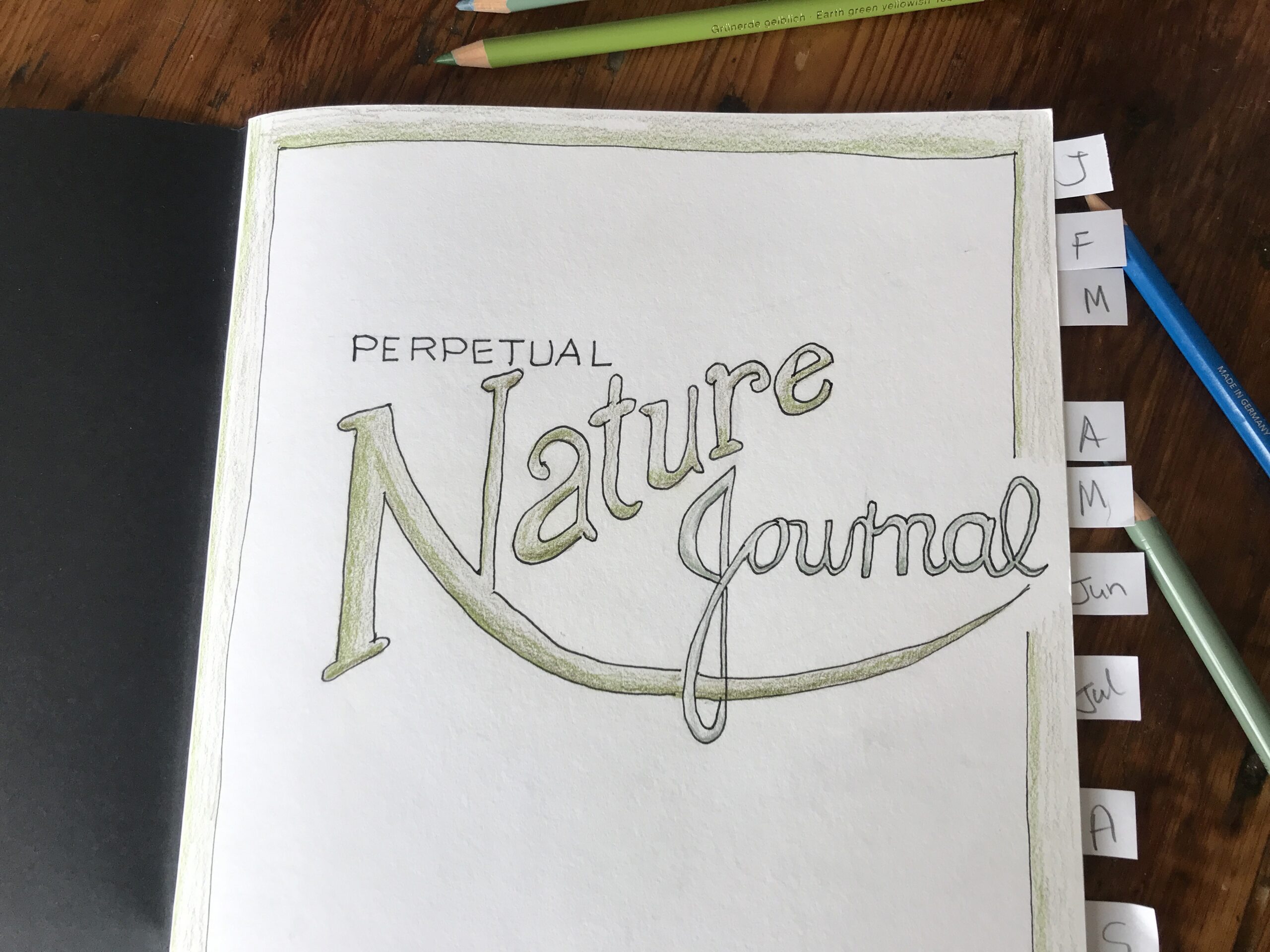
Inspiration The idea of having a Perpetual Nature Journal which is different to a normal nature journal is that rather than starting at the front and working towards the back, depending on where I went and what I saw, I will be focusing on one or two nature features...
Neurographic Art Grid Journal Page
Author: Alison Hazel – Updated: March 2025
Neurographic Art
About three years ago I came across the technique of neurographic art. When you see neurographic art you’ll realize that we’ve been doing all along, but since Pavel Piskarev coined the phrase and put it out there, it became clearer on how to use neurographic art in your art practice.
For a quick overview, neurographic art is a practice you can do which brings focused thought to the art piece on which you are working. In a way, it’s almost like a meditation or therapeutic art piece. Neurographic art can be as simple or as complex as you like, and you can add embellishments as well to the piece. I created a basic neurographic art explainer video if you need a little more.
Artist Trading Cards
Around two years ago I did some work with artist trading cards and I used the neurographic. method for them which was quite a lot of fun. I still have some of these cards and because they’re trading cards, you trade them with other artists. Since then I’ve probably traded five or six cards, but I still do have half of the full twelve pack with me.
Then towards the end of last year, I started working with grid art journaling, where you get six blocks on the page, or different shapes on the page, such as hearts and so on. This week it occurred to me that I should do a neurographic grid art journal page, so that’s what we’re doing this time.
What’s on Your Mind
Question Wrangling
One of the benefits of doing neurographic art is that it calms your mind. This is done if you have a troublesome question or decision that you have to make. Say for instance, your question maybe, “Should you move and downsize to a smaller apartment?”
Moving house is a huge decision to be made of which there may be many permutations, such as:
- I’ll miss my garden…
- Will I like living in a high rise…
- I’ll have to get a new job, but it’s in a bigger city, therefore the chances are better…
- What about the children’ school…
- Perhaps I’ll have to put the dog in a kennel for a week…
- Then there’s the moving truck fees…
- I’ll have to find a new church…
- I’ll have to go to a new yoga studio…
- Will my fabulous cat, Mr. Pickles, run away, or get lost…
- Will I make new friends…
Ruminating
Life’s questions can be complicated, but these are the ideal ones to pose as you do neurographic art in any form. Your question doesn’t have to be complicated and in fact, it doesn’t have to be a question at all, but it could just be something that you are ruminating on. Perhaps it’s about what happened yesterday or a conversation you had last week and you’re just trying to clear your mind. This is the time to do some neurographic art. Let’s get started.
Blank Page
On Your Mind
If you do have a question or something you’re ruminating on or something that’s been worrying you, before you start, write this down either at the bottom of the page or on the back of the actual artwork. It doesn’t have to be complicated. You could just put the words “move?” or “new job” or anything which is troubling you for which you want to try and find some resolution.
I’m not saying that you’re going to have the answer at the end of it, but your thought processes of creating this neurographic art and the alignment of the synapses that occur in your brain as you think will possible provide fresh ideas for you. The idea is that this neurographic art technique will ease your mind and benefit your mental health.
Draw the Grid
2:3
For this grid page I went back to basics and chose the two by three (2:3) 5cm or 2-inch squares in my A5 sketchbook. As a reminder, you can check out how to set up a grid art journal page with six blocks in this manner.
Circles
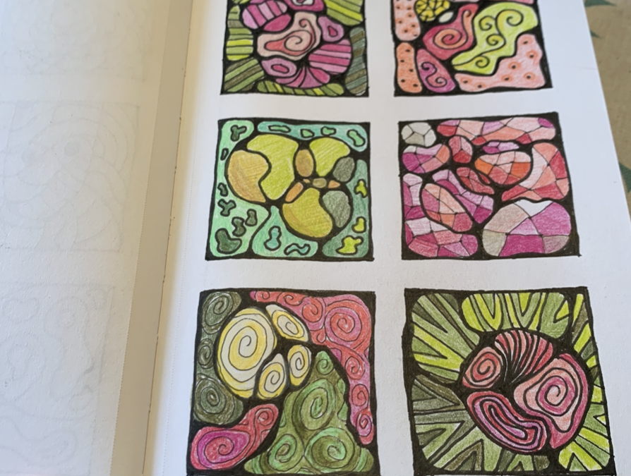
Start with some circles and you can use a template for this or do it freehand. As I wanted to lay them out in some type of compositional form within the block I did each of the circles a different size. In each of the blocks, I sketched one or two circles lightly with my 2H pencil.
Neurographic Lines
Inside each of the blocks, I drew one or two neurographic lines going from one edge through to the second edge as by now you know that neurographic lines never dangle. These lines break up the six blocks into smaller sections, as we will see later.

Inner Corners
Next comes the fun part where you start with your black ink. I used a 0.3mm black pen, but you can used whatever pen you have to hand and it doesn’t have to be black. Curve in each of the corners and so for the four corners on each block I curved them in. I used about a 3mm radius here for each corner arc. If the curves are too thin the piece looks kind of spindly. So those are the four corners neatly rounded.
Intersections
Then I turned my attention to the intersections where two lines cross, or where a neurographic line overlaps with a circle, or where two circles meet. Anywhere where two lines cross each other will be an intersection, and every crossing needs to be curved. If your lines are very close together, you will end up with a very small blob shape and that’s okay. Depending on the angle at which the two lines come together, the junction might be quite whopping as well, and that’s acceptable too.

No Rush
Inking the intersections is the stage where you are mentally getting into the zone, finding your flow state and contemplating the question or issue which you put before yourself earlier. Take your time here, there is no rush. In fact, I took a full day from starting the curves on these corners and intersections and then I left my sketchbook overnight.
Returning to it the next day I could see the page with fresh eyes and was able to find the bits I wanted to smooth out further. I really didn’t like some of the pointy looking corners I had, so I smoothed out my curves even deeper and in this way laid down more black ink on the sheet.
Pattern
Now you have a page with several open squidgy areas, also known as blobs, and here you can definitely get creative. You can add patterns like swirls, zigzags or waves as you see fit. For guidance use your intuition and don’t feel the need to overdo it. To have one focal point (blob) in each block is a good idea. Try to think back to the issue you posed before you began and let your thoughts run on that path and create new tracks.
Colour
The next step is to add some color in the open shapes. Only as your art piece evolves can you decide on color. If you make the page too busy with multiple patterns and colors it can become somewhat of a blur overall. I like to use a limited color palette when I’m working on such small sketches like in this grid art journal page. This time I chose pinks and greens.
Embellishments
But wait, there’s more! Now you can add some embellishments if you like. I typically add some flourishes of gold pen here and there and that seems to be enough for me, but you could collage some sequins, ribbons or other trimmings if you like. It’s up to you.

Creating Grid Art Pages
Why
I think that the practice of creating grid art journal pages in your sketchbook has two main benefits and it could have more if I thought about it longer.
Practice Art
The first benefit is that it gets you doing daily art practice and you keep sketching your art in your style. I do like the idea of doing the weekly or daily art practice. This is why I love using my grid art journal sketchbook and you can get a peek inside.
Concept Art
The second reason to work on your grid art journal pages is as micro concept art ideas. In general, concept art is a form of visual storytelling used to convey ideas before the final work is developed and is a process which allows creators to experiment with ideas quickly. With concept art the goal is to capture the essence of a concept, ensuring a clear and cohesive vision. It’s a way that something which evolves in one of your blocks, in one of your grids, on one of your pages, may one day be the genesis for a larger drawing or painting piece which you can later develop further. Clearly, not everything you doodle in our grid art journal is going anywhere, but some of it can.
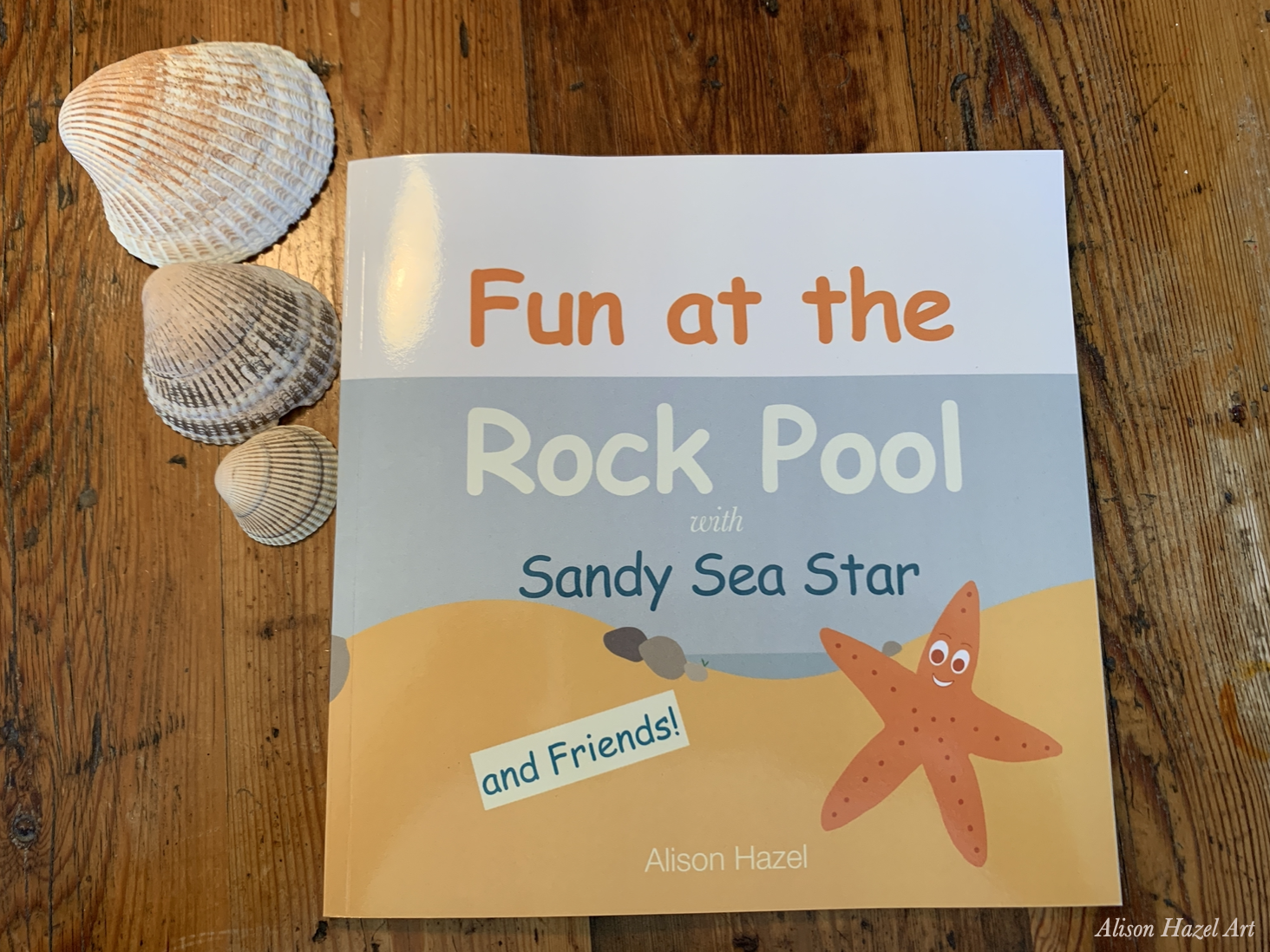
Last year I took one of my grid art journal pages and developed it into the illustrations for a children’s book which I’ll explain more about one day. And to be perfectly honest, of all the sketches I’ve done in my grid art journal pages, only the sea star page did develop into something further. Although I have taken a couple of the sketches that came through my grid art journal page earlier and created larger images which I’ve used on greeting cards and you can check out more of those in my art shop.
Overarch
Let Me Know
Let me know if you’ve tried grid art journaling or if you tried neurographic art at all and how you are getting on.

Save this pin to read later.

Author Bio: Alison Hazel
Alison Hazel is a hobby artist and she shares her ongoing journey about becoming an artist later in life. She creates simple art that anyone can make. She hopes to inspire you to reach your creative potential in the area that suits you.
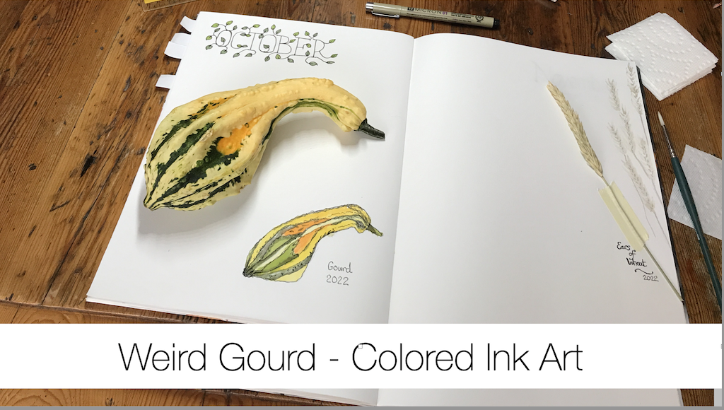
Weird Gourds – Colored Ink Art
Join me as I sketch, draw and paint a weird autumn themed knobby gourd using colored ink as a hobby artist.
No Results Found
The page you requested could not be found. Try refining your search, or use the navigation above to locate the post.