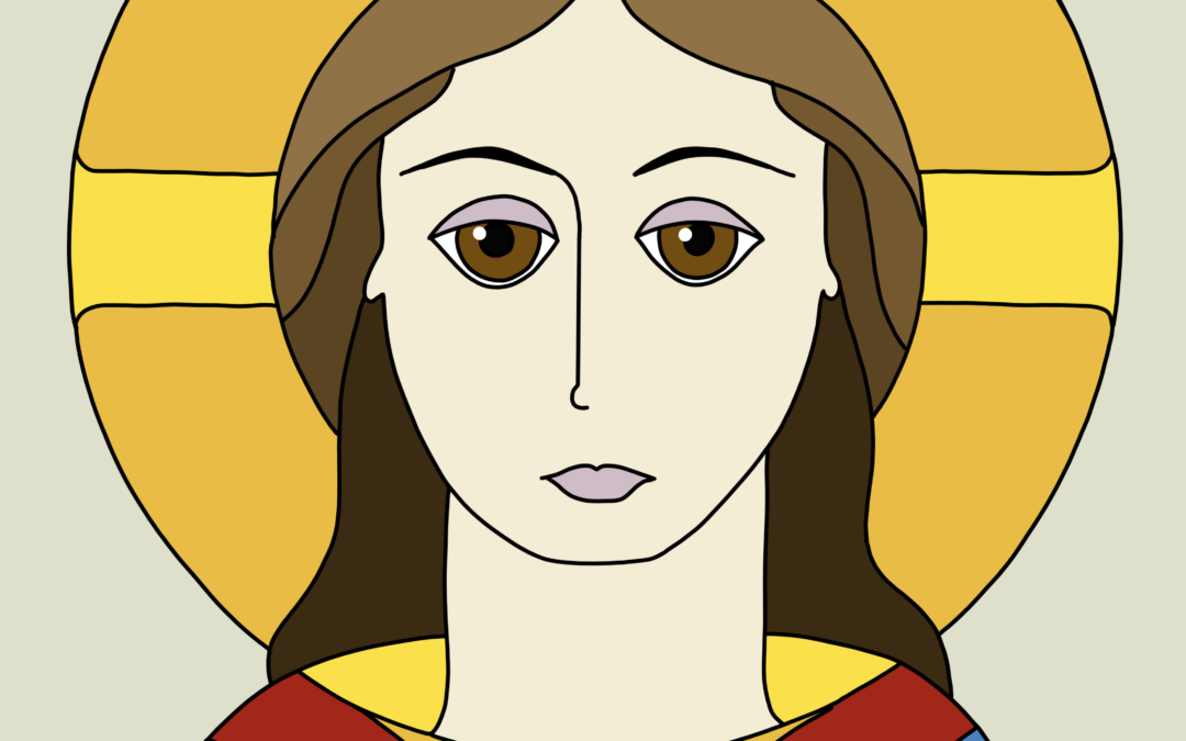
Author: Alison Hazel - Published: February 2024 Reference and Acknowledgement Today I'm going to show you how I draw the face of Jesus as an icon. This is not my original idea as I am following along and referencing the work of Mikhail Fadi at UK Coptic Icons and...
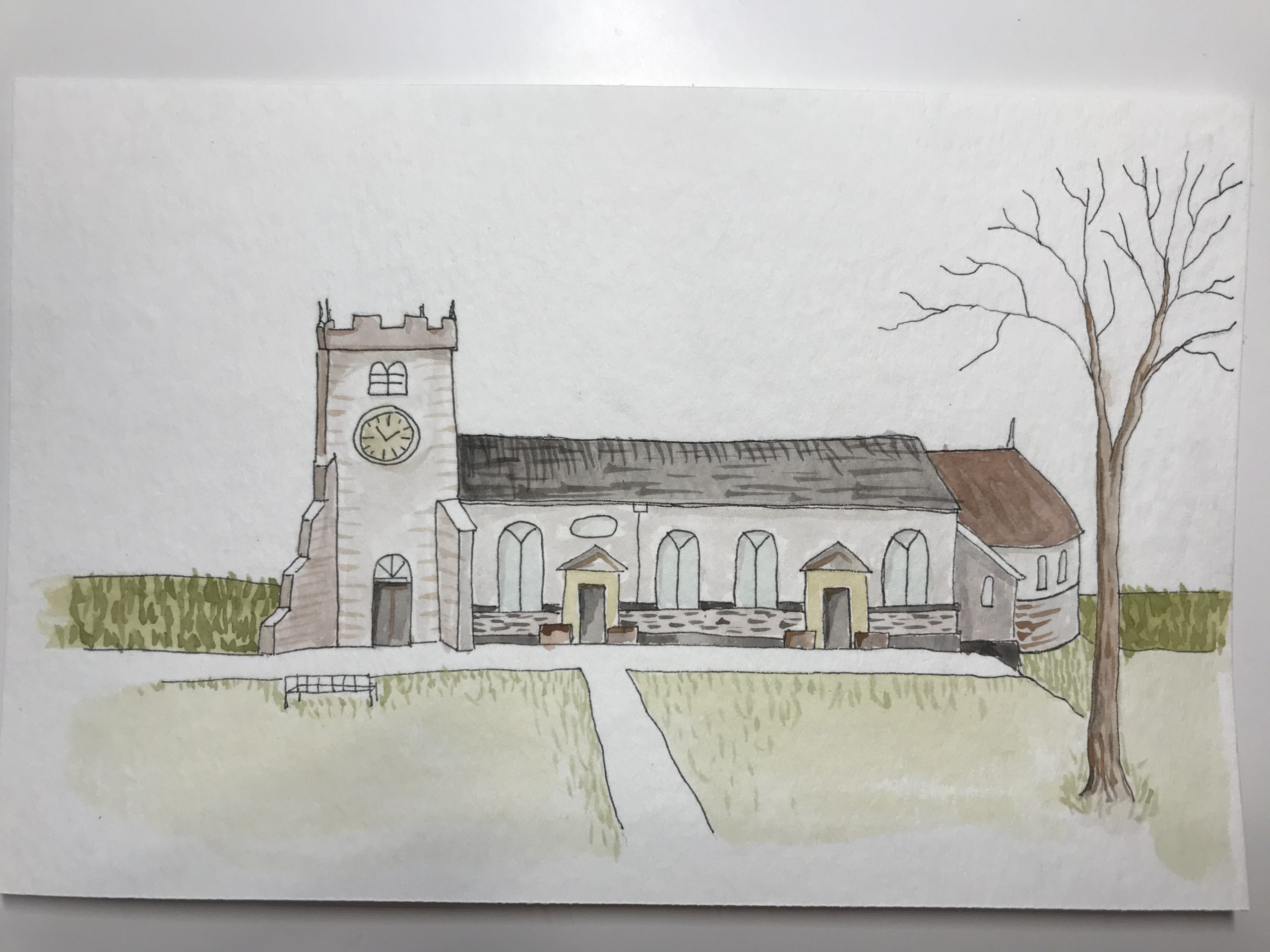
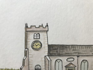
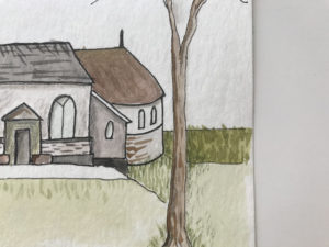
St Chad’s Church Poulton-le-Fylde, Ink and Watercolor
St Chad’s Church Poulton, Pen and Ink and Watercolour
This is a pen and ink and watercolor painting that I created this week.
The method that I used is similar to the Sketch Journal Page from last time, but without the commentary that goes with a journal entry.
Buildings
I do enjoy drawing buildings. I find them easier than people or animals which always seem to look a little weird.
I joined my local Urban Sketchers group the year before lockdown and I found it very interesting to draw what was in my city.
Back then I was using a pencil and Tombow markers because I had no paints or crayons for that matter. I didn’t know just how much I was going to love getting back into art after so many years.
Sacred Places as Subject Matter
Sacred places are typically buildings, groves, fields or monuments that have special meaning for people. They can be places where people congregate and find community.
St Chad’s Church
Many years ago, I lived in a small village near St Chad’s church in Poulton-le-Fylde, Lancashire, England. I was christened in that church, so it seems a good sacred building to start with.
I found some images of St Chad’s church online, and looking at the images for reference, I drew the front façade of the building and added a tree.
I suspect that it is a Norman church by the square tower, but that is really as far as my knowledge goes.
In a way it is an inconspicuous building as churches go.
It seems to have been built between 1086 and 1094. You can read more about the history of this St Chad’s church here.
Each spring there is a wonderful display of lilac and purple crocuses over the entrance lawns.
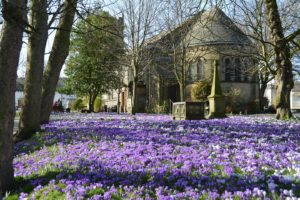
Crocus
Pencil Sketch
Using an HB pencil, I began with a light sketch and combined all the features from a few photos that I looked at online. I can’t show those photos here as they are copywrite to someone else.
I chose watercolor paper from Strathmore size 140mm x 216mm or 5 ½ x 8 ½ inches.
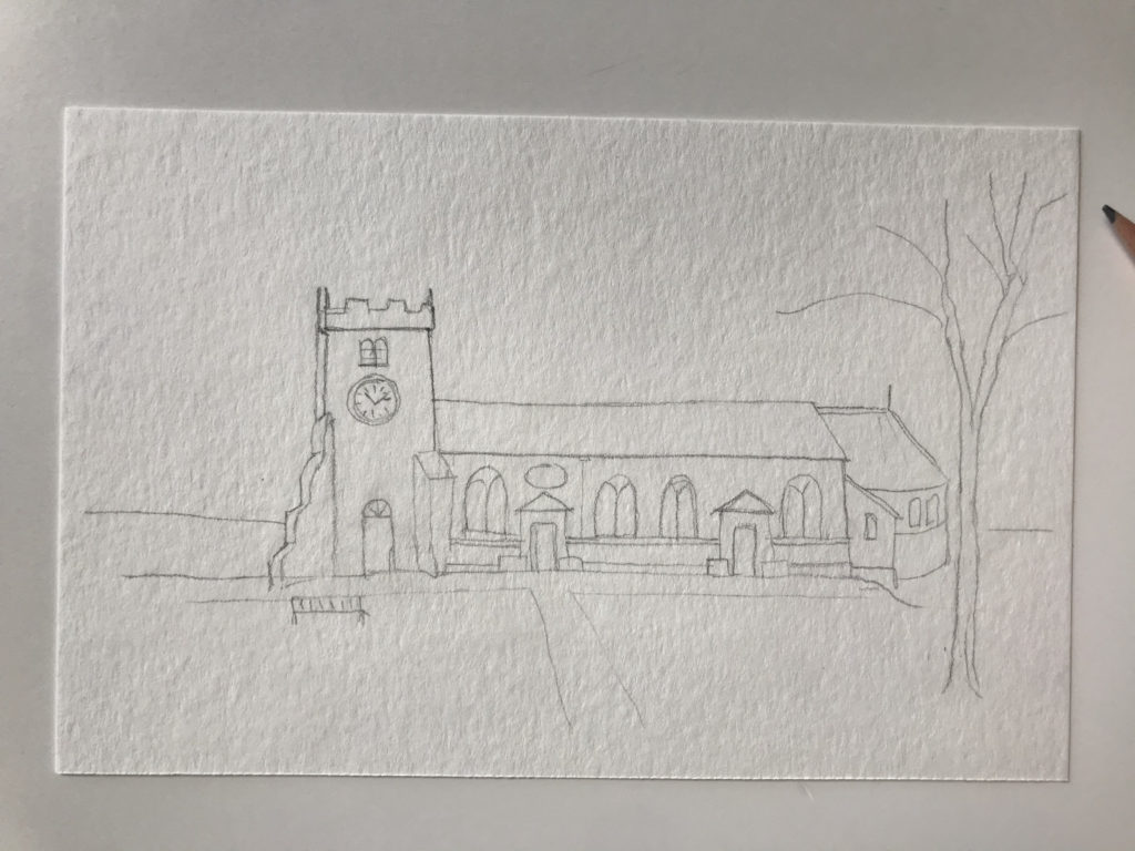
Pencil sketch
Pen and Ink
With a 0.1mm black pen I drew the main lines of the building and the other features.
After this I gently erased the pencil lines so they were no more. If you leave the pencil lines on the page you will see them through the watercolor paint and then you cannot get rid of them once they have been painted over.
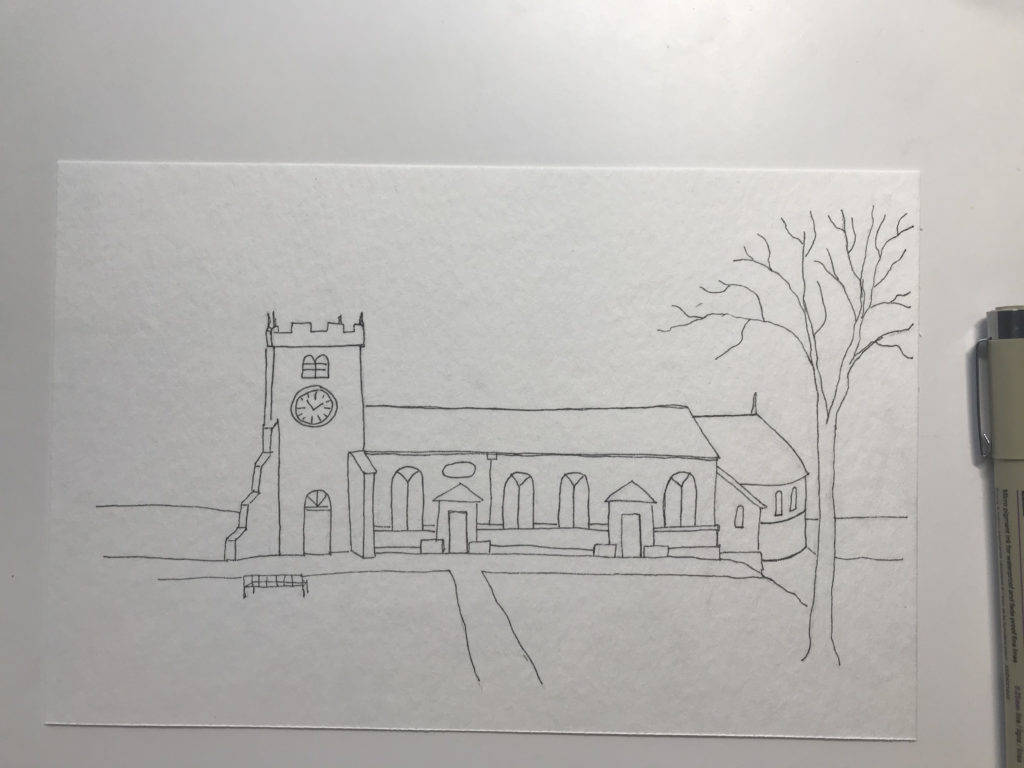
Pen and Ink
Watercolor
With a light mixture of Payne’s grey and brown I started to lightly wash the building walls. I tried to add a little more grey for each separate type of brick work just to add some interest.
Here I used a number 6 watercolor brush and kept gently rolling it to mop up excess water each time.
I repeated the color layers a few times to add depth to the color and to vary the shadows a little.

Watercolor
Once that part was dry, I went in with a finer brush (number 2) and with denser paint I laid down some brick marks and roof tiles just to give the effect of rough texture to the stonework.
For the grass I mixed an olive green with a touch of burnt sienna.
I always avoid the bright greens that are in my paint box. They are not natural and are glaring when used in a landscape painting. It is best practice to mix colors and never use them straight out of the little pans.
Pencil Crayon
With my pencil crayons in several tones of cool grey I gently added small definitions like the shadows below the eaves and the door recesses. This brings details to life and adds shadows to suggest depth.
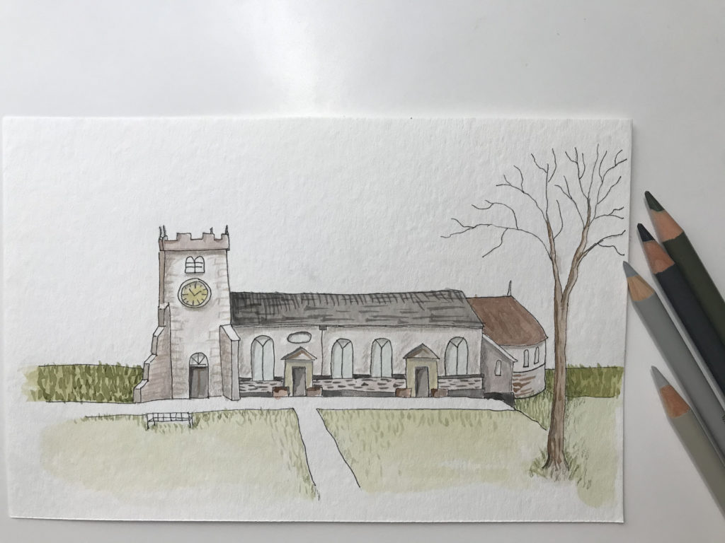
Colored pencil highlights
Pen Again
I went over the main structure lines once more with my fine 0.1mm pen and in some places I employed a 0.3mm black pen.
Gold Trim
I do love some gold trim in my artworks. In this drawing it was a challenge to know where to add a spot of gleam, but I found one or two spots that could do with some life.
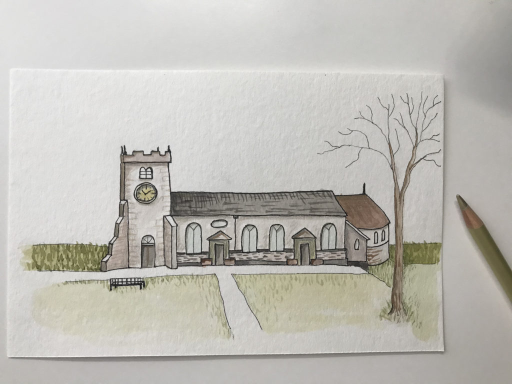
Shimmer of gold
Overall
I am really happy with this painting. Receiving a watercolor set from my son-in-law this past Christmas, I am a relative newcomer to watercolor painting.
- Clock Tower
- Apse
This piece is probably my fifth painting so far using this art medium.
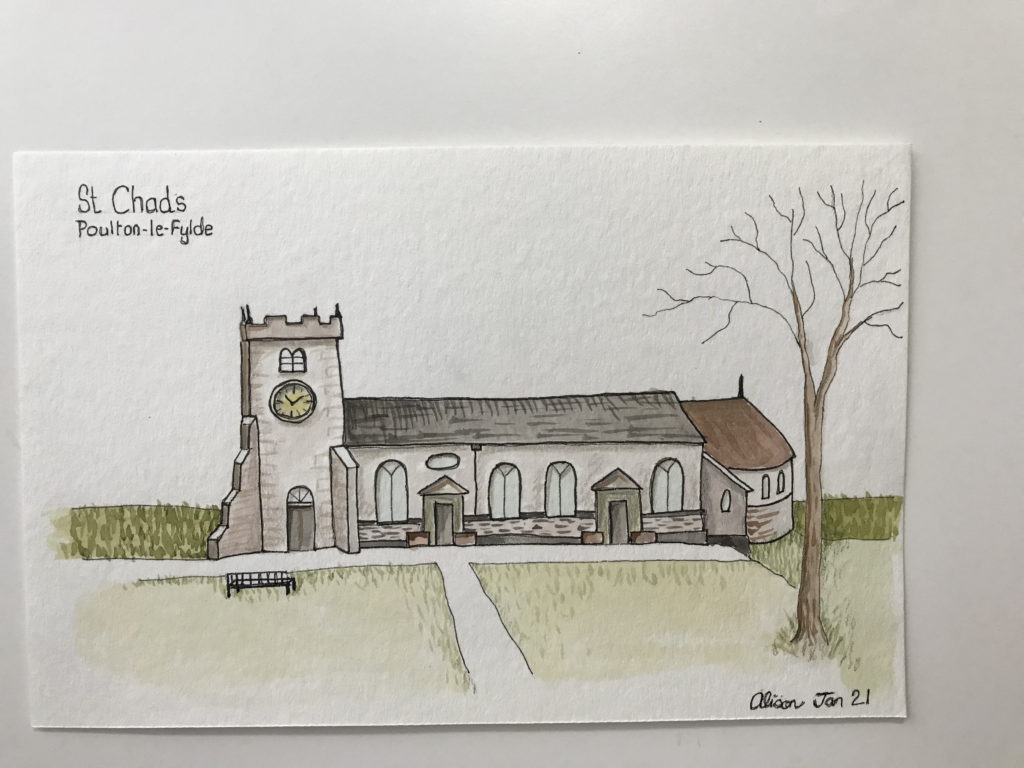
Complete
There was some flow over of color especially around the tree, but I will get better at controlling the paint and handling my brushes with some practice.
Let me know what you think.
Alison
Products I use
Faber Castell Pitt Artist pens
Sketch book/journal Leuchtturm
Strathmore watercolour paper pad of 12 sheets
Faber Castell polychromas colored pencils– This is a tin of 60 colored pencils, but you can buy the colored pencils one by one which is how I do it now, so I can pick and choose the colors I want.
Van Gogh Royal Talens water-colour paint tube, 10 ml – Deep Gold
More Articles
If you enjoyed this post read more content from us in the blog below.
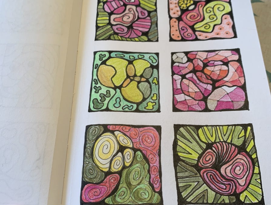
Neurographic Art Grid Journal Page
As a hobby artist, you can practice some NEUROGRAPHIC ART in your GRID ART JOURNAL to loosen up before you start a bigger piece.

Monday’s Child Poem – Digital Art Time-lapse
How to create the “Monday’s Child is fair of face” poem nursery artwork for your home with simple and easy images.
