Get the AHAtober prompts and learn how you can win Inktober, what I’m doing to compete and what to do with what you draw.
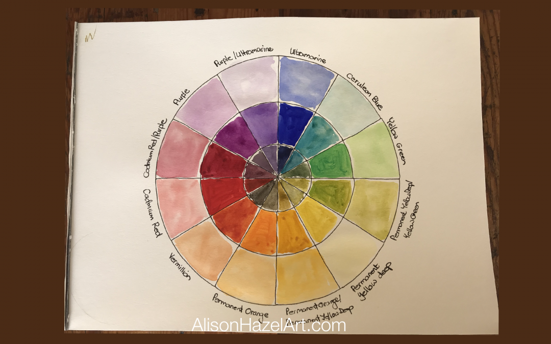
The Artist’s Color Wheel
The Artist’s Color Wheel
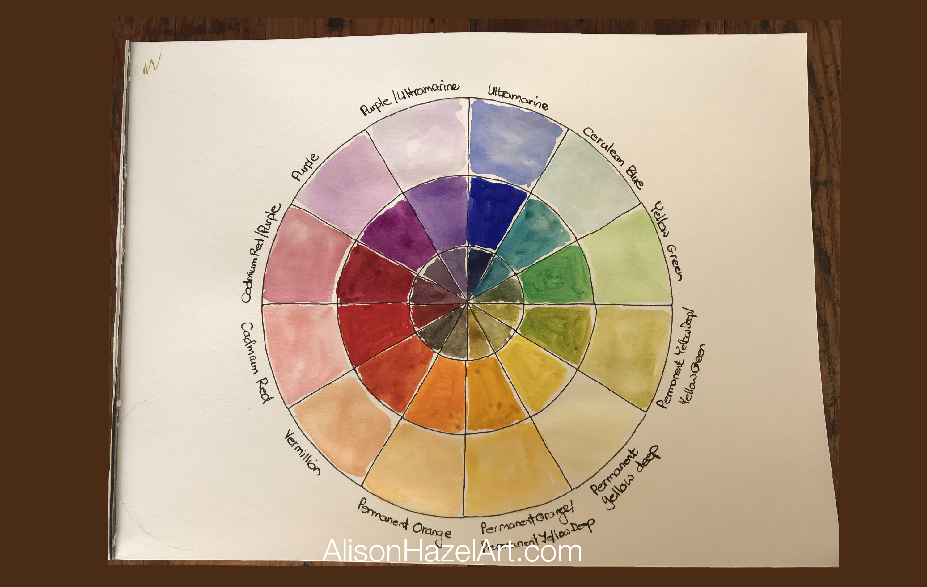
The artist’s color wheel is a handy chart or artwork that you can create to help you make sense of color. The artist’s color wheel has three distinct rings, the center ring, the middle ring and the outer ring.
There are different intensities of color in the different rings in the color wheel with the main color being in the middle ring. To show the primary, secondary and tertiary colors you need twelve segments.
SMIKE
Note: The Artist’s color wheel is different to the printer’s (or process) color wheel which used CMYK (pronounced “smike”) cyan (C), magenta (M), yellow (Y) and black (K).
Art Supplies I Used
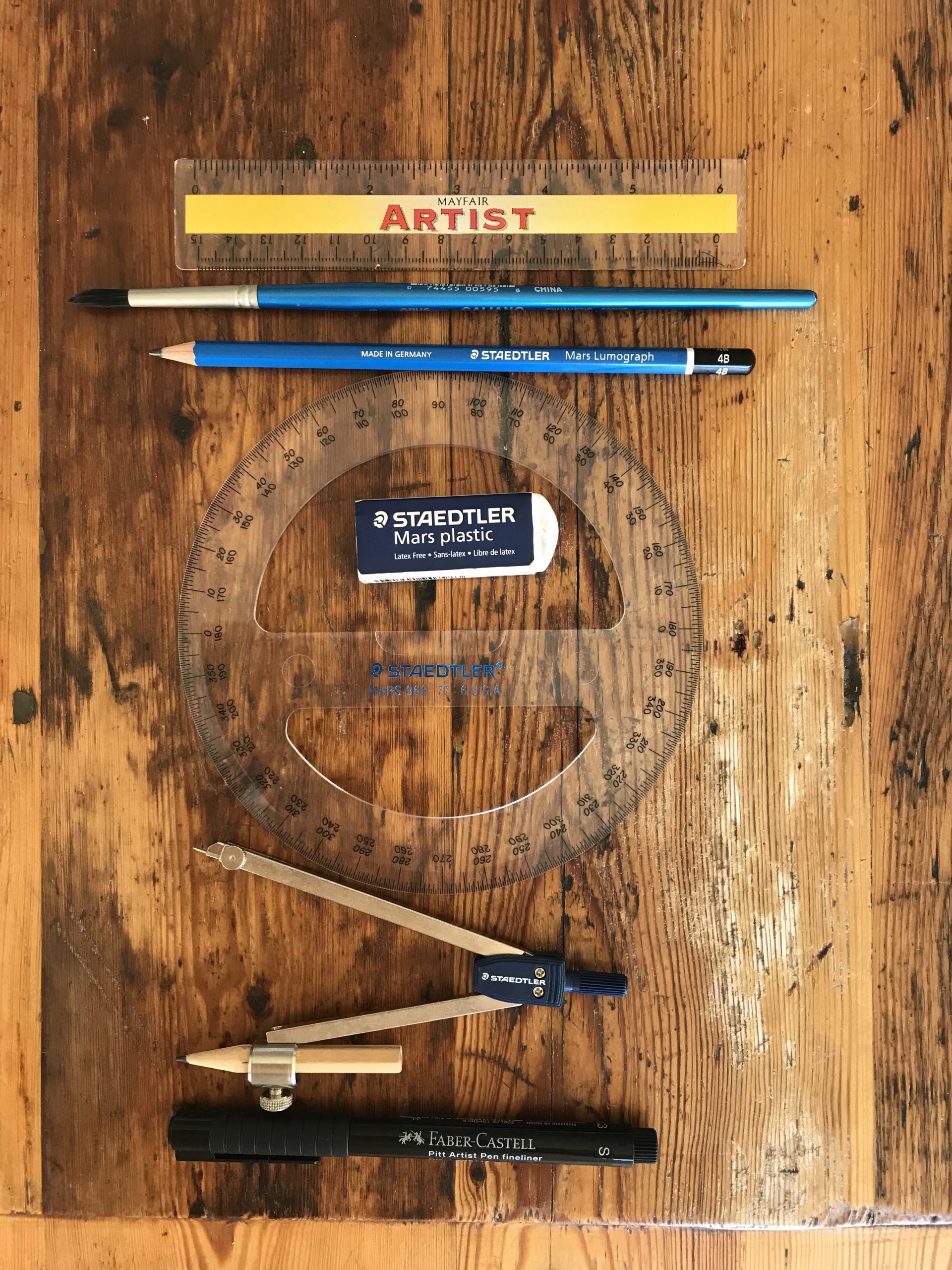
To make my artist’s color wheel I used the following supplies:
Paper
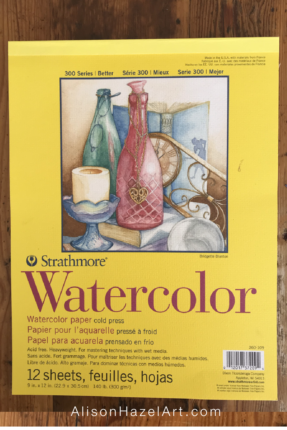
I used one sheet from my Strathmore cold press watercolor pad.
Paintbrush
My paintbrush is quite old, but here is a similar one number 6 medium watercolor brush.
Paint
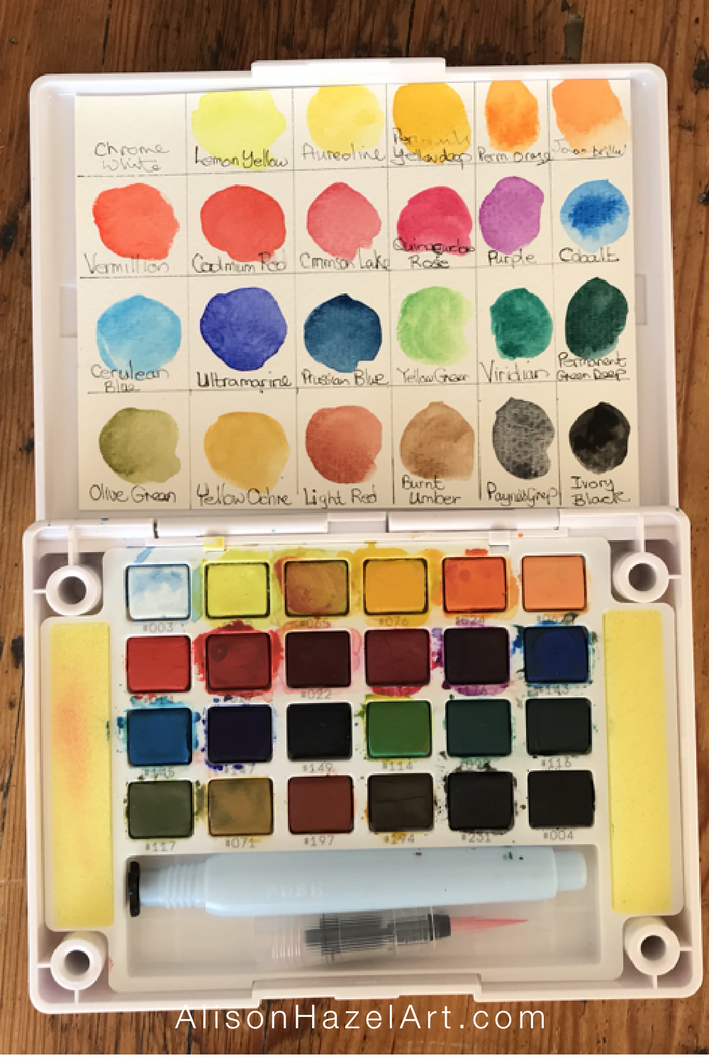
If you want to create this exact colour wheel shown here, I made it using my Sakura Koi watercolour paints which have specific color names for the colours. Your paints might have different names for each of the colours. If your paintbox has less colors, you will have to mix more colors to make the secondary and tertiary colors. If your paintbox has more colors, you may be able to take the colors you need straight from the pan.
Pen
I used a permanent Faber Castell 0.3mm Artist Pitt pen in black.
Other Equipment
Staedtler compass with pencil.
Staedtler 360-degree protractor.
Ruler.
Paint Swatches
When I received this paintbox as a gift from my son-in-law last Christmas, I decided to make a color swatch chart.
On some watercolor paper, I drew a grid of six columns by four rows to align with each color pan in the box. Next, I created a test color swatch of each paint in the exact position each color is found in the paintbox. By writing the manufacturer’s name of the actual color, as shown on the outer cover that the paints came in, on my swatch card, I can refer to each color by name for instances such as this. I trimmed the paper down, so it fits neatly into the lid of my paintbox.
I use the paint swatch as a guide, because you can’t always see what the colors will be like on the page when they are in the little pans.
Read more >>> Weird Gourds – Colored Ink Art
Read more >>> Crystal Ink Swatch
Color Categories
3 Primary Colors
Red, yellow and blue are the three primary colors. The primary colors are shown in the center ring of the color wheel. Each of the three primary colours are placed to form a triangle with three segment gaps in between.
In general, the three primary colors cannot be created by mixing other colors.
Red
From my paint box for red I used “Alizarin crimson.”
Blue
For blue I used “ultramarine” and
Yellow
For yellow I chose “permanent yellow deep.”
3 Secondary Colors
Secondary colors are created by mixing two primary colors together. Paint the secondary colors between the primary colors by leaving one gap between each primary.
Violet
Violet is created by combining red and blue and from my paint box I used the color called “purple” (yes, I know).
Orange
Orange is created by merging red and yellow and from my paintbox I used the color called “permanent orange.”
Green
Green is created by mixing yellow and blue and from my paintbox I used a color called “yellow green.”
6 Tertiary Colors
There are six tertiary colors all of which are nestled between one primary color and one secondary color. Some of these colors I took straight out of the pans in my paintbox and a few I mixed. It depends on how many colors you have in your paintbox whether you can use the color immediately or if you must mix it.
Vermillion
Vermillion (tangerine) is the tertiary color that lies between red and orange.
Apricot
Aureoline (apricot) is the tertiary color that lies between orange and yellow.
Chartreuse
Chartreuse (lime green) is the tertiary color that lives between yellow and green.
Turquoise
Turquoise is the tertiary color that is between green and blue and from my paintbox I used “cerulean blue.”
Indigo
Indigo is the tertiary color that lies between blue and violet and from my paintbox I mixed ultramarine and purple.
Magenta
Magenta is the tertiary color that lies between violet and red and from my paintbox I mixed cadmium red and purple.
Color Names
The color names I have used here to describe the colors in teh color wheel can be replaced by other color names close to the actual color if you like. I like to keep it simple and use names for colors that make sense to me. Also it helps if they are in the Apple color crayon box.
I have told you the color names in my paintbox and you may have colors similar but with different names in yoru paint box. Manufacturers can be different reagarding color names.
Read more >>> Colored Pencils: Orchids Sketchbook
Light and Dark
Tints: Outer Ring
Tints are made by combining white with any color. The tints for the primary, secondary and tertiary colors are shown on the outer ring where the colors are becoming progressively lighter.
Technically, and because this is watercolor paint, I just watered down the main color from the middle ring to make a lighter color. I did not add white, as that comes from the paper.
Shades: Inner Ring
Shades are made by adding black to any color. The darker shades are shown in the center ring on this artist’s color wheel. All shades become increasingly darker as black is added.
The shades are displayed as each main inner ring color has a tiny bit of black added to darken and dull down, or mute, the color.
The black I use from my paintbox was called “ivory black.”
Full Blown Color Chart
Ideas for a Bigger Color Wheel
You could create a color wheel with 24 or 48 segments and add all the combinations of color. That I may do one day, but for now I’ll stick to the twelve spoke color wheel that I created. I did enjoy making this color wheel as it helps me to choose colors that I want to use in future paintings.
Aspiring Artist Activity: Color Wheel
What To Do
With a piece of watercolor paper and some watercolor paints please do the following:
- With a pencil compass, draw three concentric circles with the following radii (distance), 3cm, 5.5cm and 9cm (or 1 inch, 2 ¼ inch and 3 ½ inch).
- With a circular protractor, divide the wheel into twelve 30-degree segments.
- With a 0.3mm black waterproof pen, go over the lines.
- Paint the middle circle with the solid colors, the inner circle with shades (add a little black) and the outer circle with lighter tints thinned with water.
- If possible, write the name of each color around the wheel as shown.
Share
Share your creations with the hashtag #alisonhazelartactivity
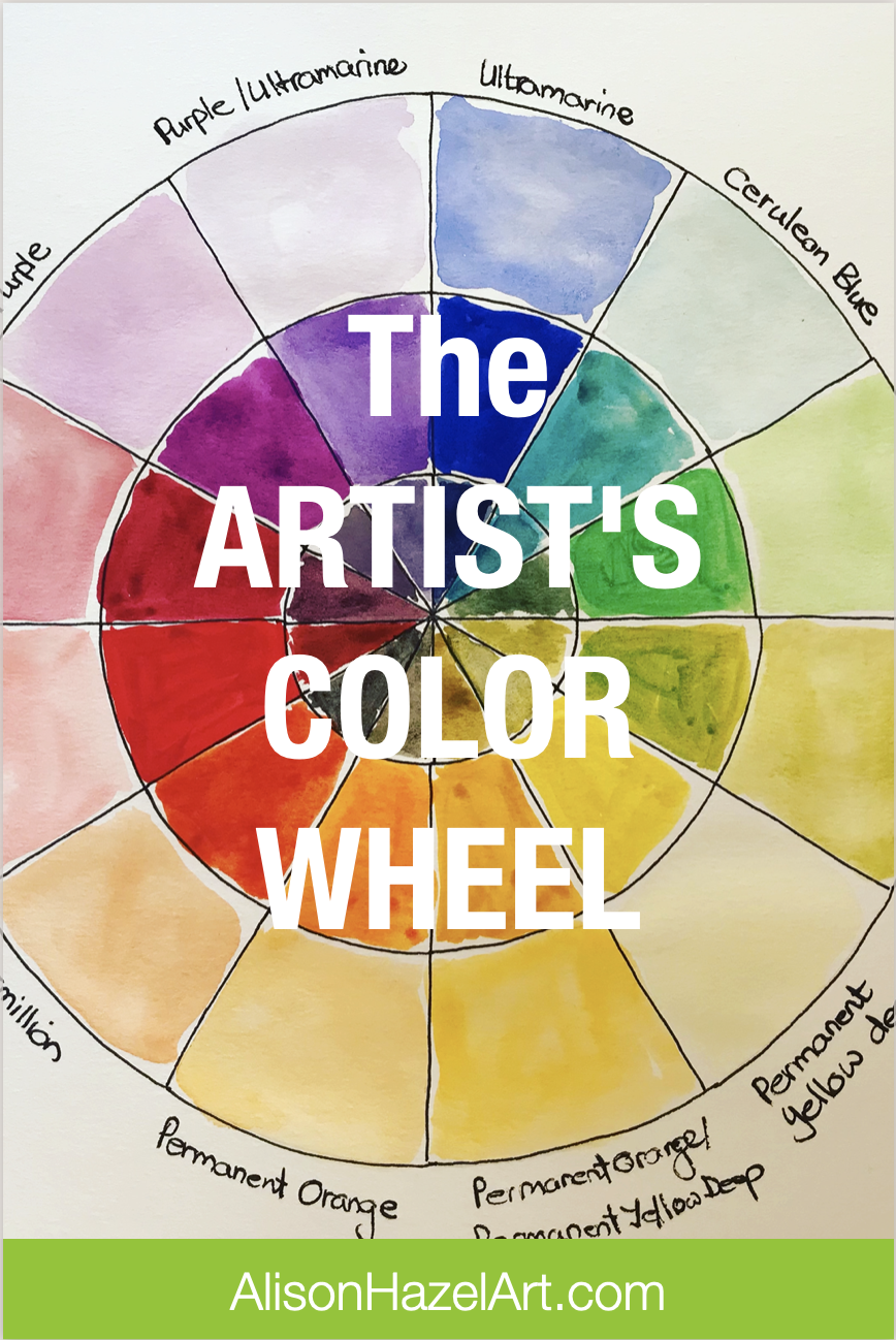
Save this pin to read later.
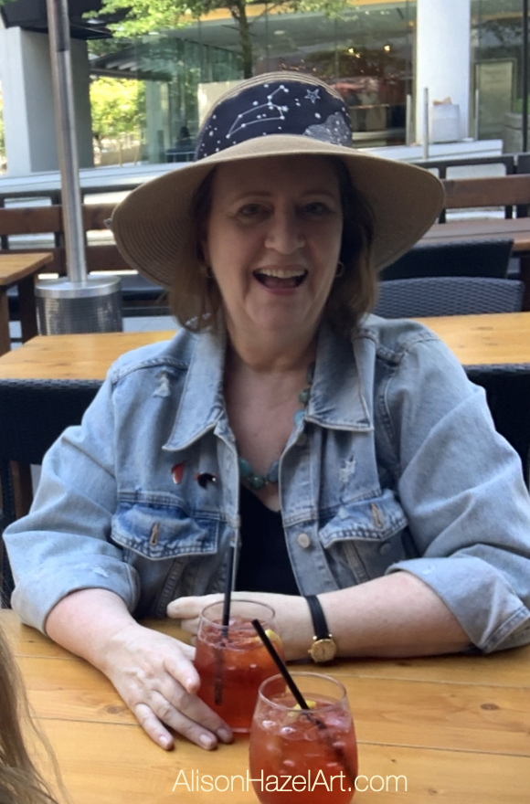
Author Bio
Alison Hazel is a woman who shares her ongoing journey about becoming an artist later in life. She creates simple art that anyone can make. She hopes to inspire you to reach your creative potential in the area that suits you.

What to Pack for a Writing Retreat
For Hobby Artists: What to pack for a writing retreat for artists, clothes, tech, writing equipment, jewelry, clothes and more.

The Creation: 7-Day Challenge
Author: Alison Hazel - Published: January 2024 Inspiration I'm trying to do more Christian...
