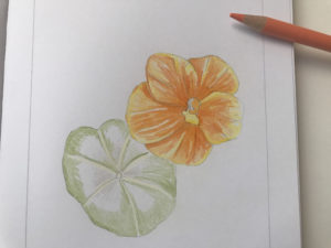
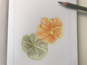
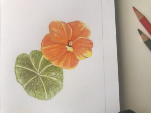
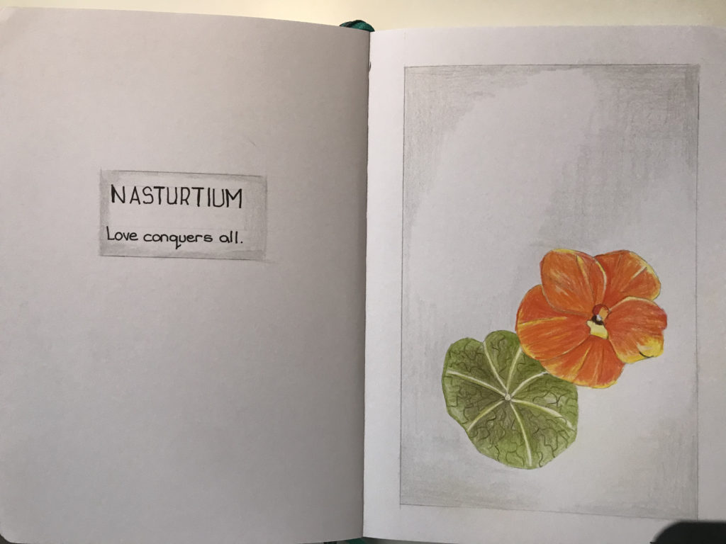
As a hobby artist, adding SIGILS is a creative way to begin weaving words and meaning into your artwork without using traditional text.
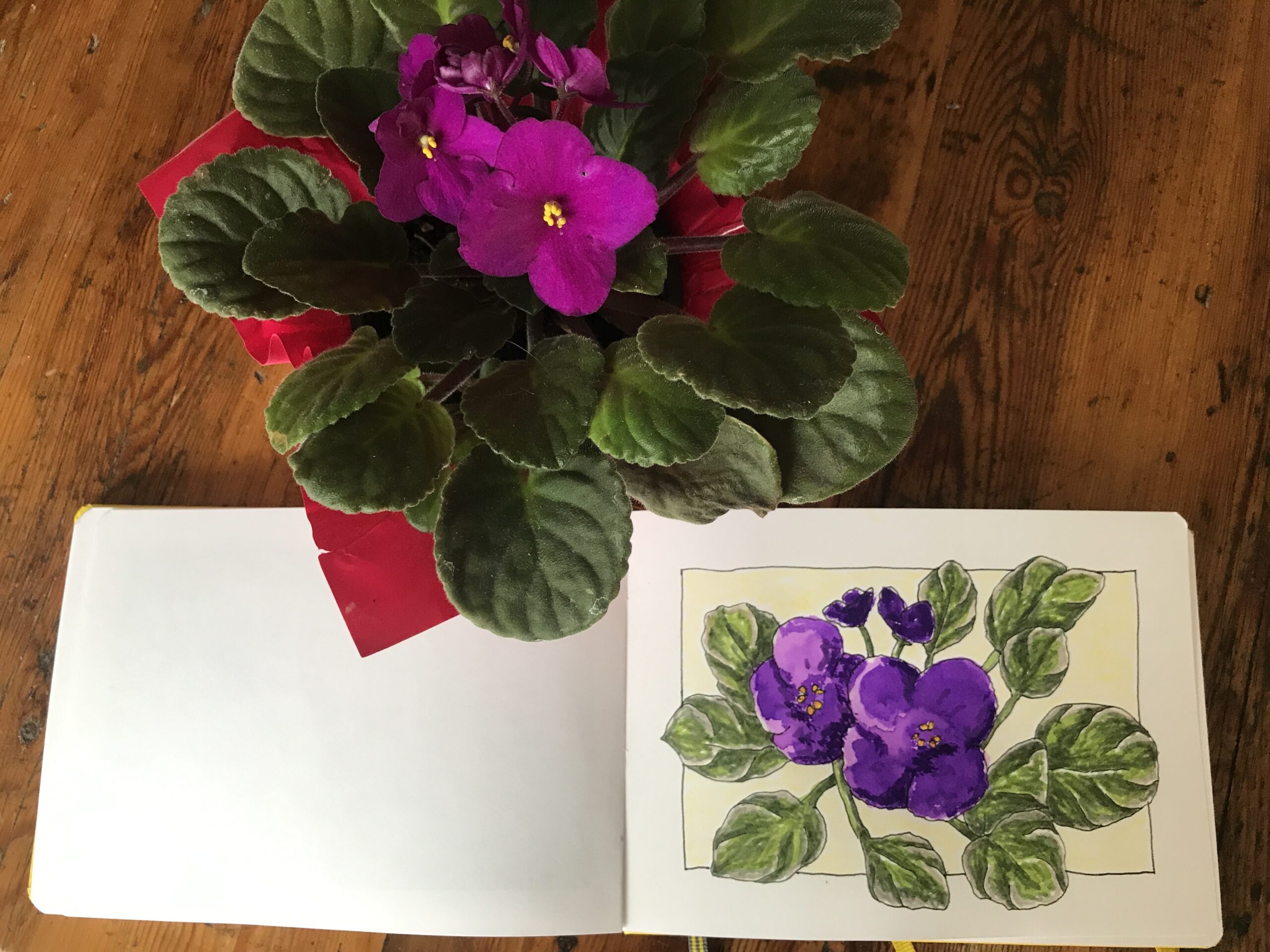
Sketchbook African Violet Ink Wash
Sketching
This weekend I had planned to go to the beach. It’s a short bus ride from my home and very pleasant to spend time there on one of my precious days off. Unfortunately, it continued to rain which seemed to be set in for the whole day. My original idea was to go to the coast and do some sketching of the shore, the seaside, and seascapes. I’m particularly interested in the pebbles and what is brought up on the beach by the high tide. Objects such as shells and seaweed are always interesting things to draw. However, I decided to stay at home because of the incessant downpour.
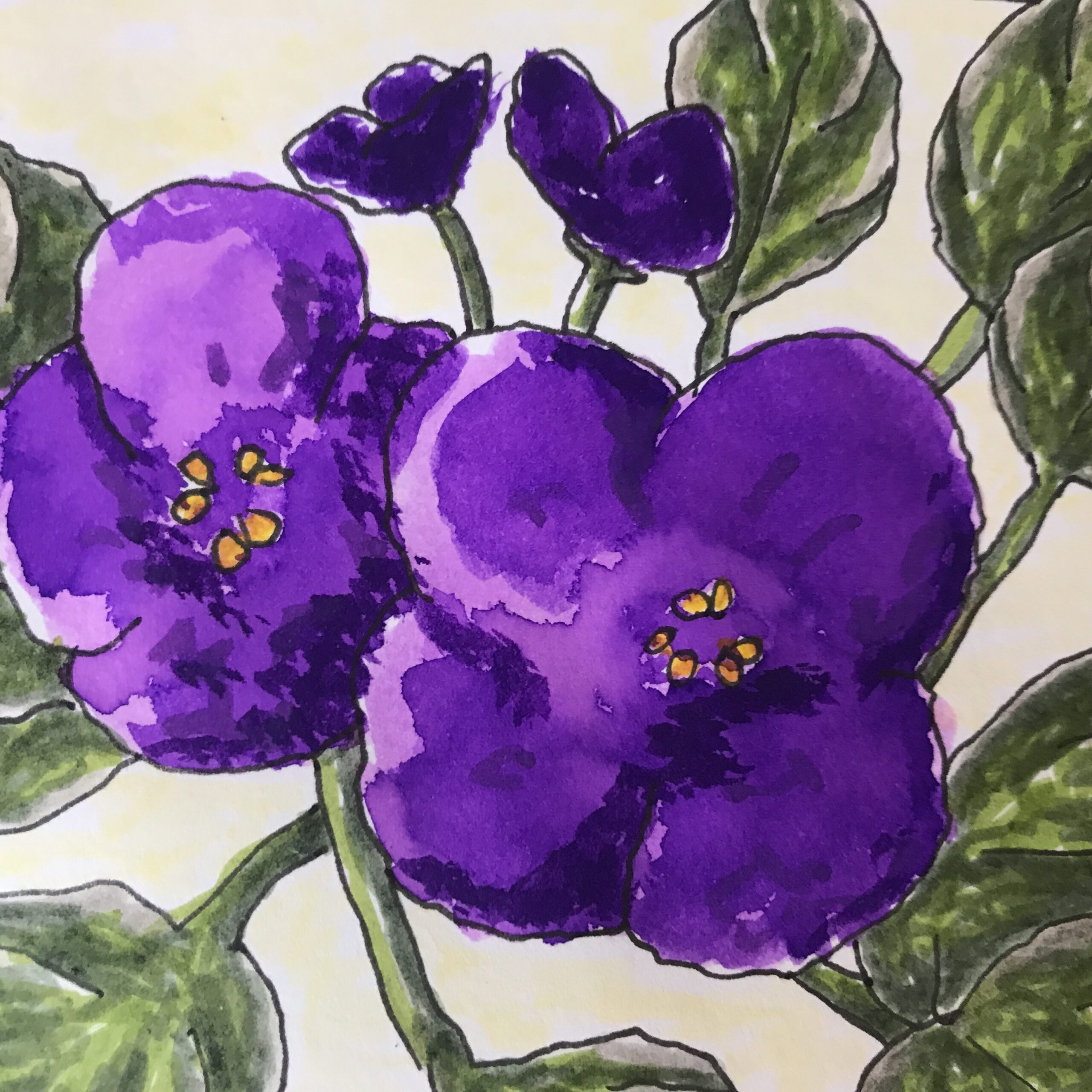
African Violet
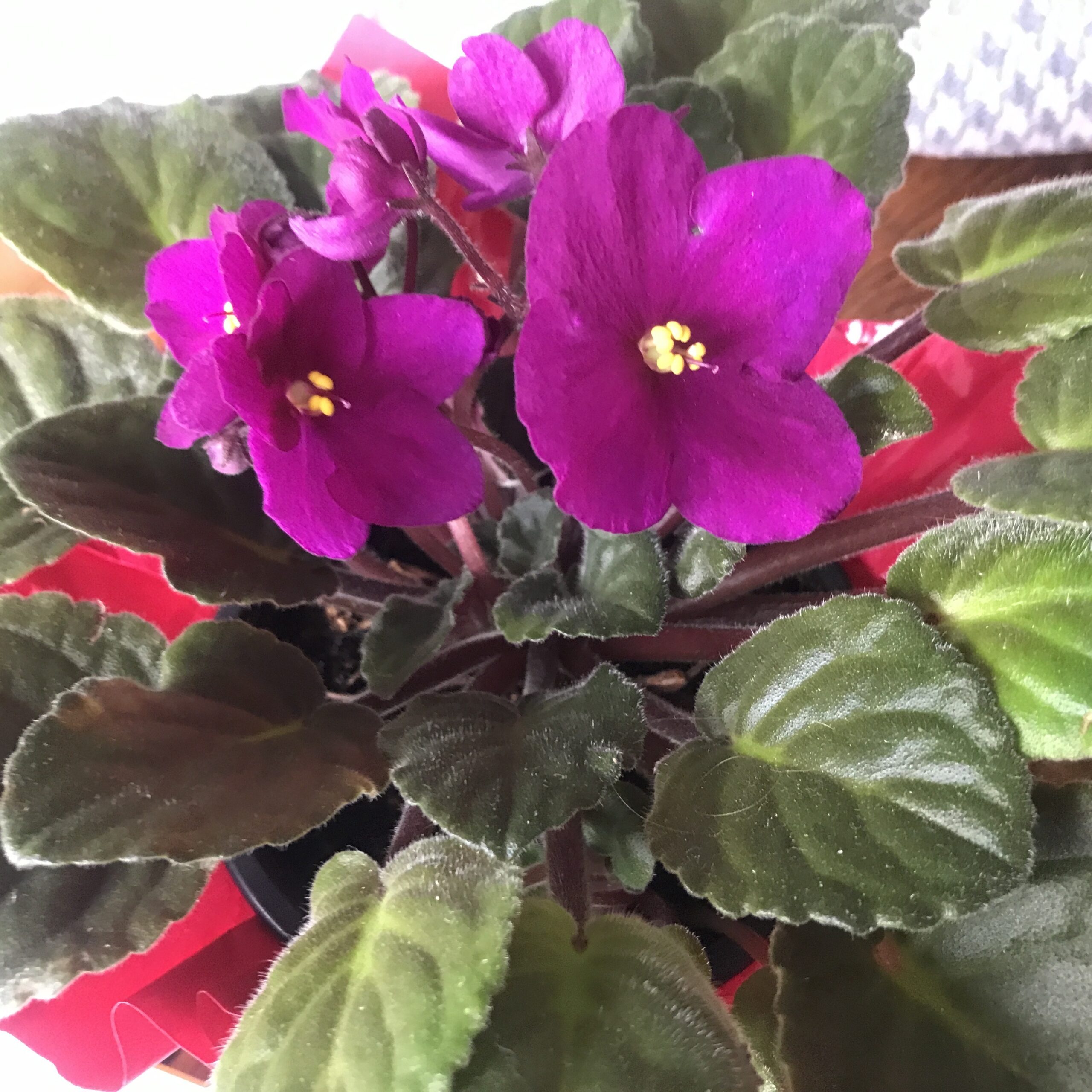
I have a little African Violet plant that I received around Christmas when it was first in bloom. I’ve managed to keep this plant alive and even though the first flowers faded and went. Now five months later in May I finally have the second bloom of glorious violet flowers. The houseplant is quite a bit bigger now and the petals are larger and more prolific. I decided that this little plant would be my nature sketch for today which I will do at home in my creator studio. Not being able to visit the beach to do some sketching this weekend home sketching is the compromise.
Border
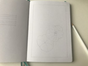
In my Leuchtturm A5 sketchbook, I start with a border on my page, even if I don’t stick to it, because it does help to align the image.
Pencil Sketch
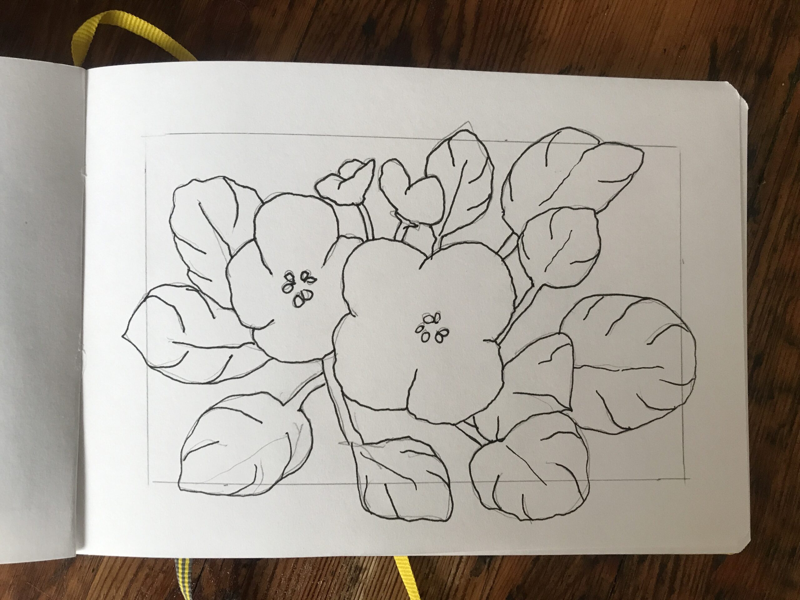
Using a 2H pencil I sketched lightly to layout the subject and ensure that the main petals were slightly off center in my composition.
I added a few of the leaves for balance and drew some of them over the border which I thought would be an interesting thing to do.
Black Pen
I went over the sketch with a Faber Castell Artist Pitt 0.3mm pen in black and firmed up the shapes and main details of the plant.
Although the petals are smooth and don’t have much texture the leaves themselves are quite deeply veined.
Upon close inspection I realized how the curves were happening on these leaves even though they are quite furry leaves, they are still somewhat raised and pillow-like where the veins run.
I drew many of the veins on the leaves with the pen.
I could have drawn more leaves, but it seemed overwhelming and as there are plenty of leaves on the plant than there are flowers.
I didn’t want the greenery to overshadow the lovely purple blooms which are the main reason for the drawing in the first place.
Ink Wash
I had recently been watching a YouTube channel by Alex at The Daily Nature Journal about using botanical inks in his drawings and this inspired me to dig out some of my inks.
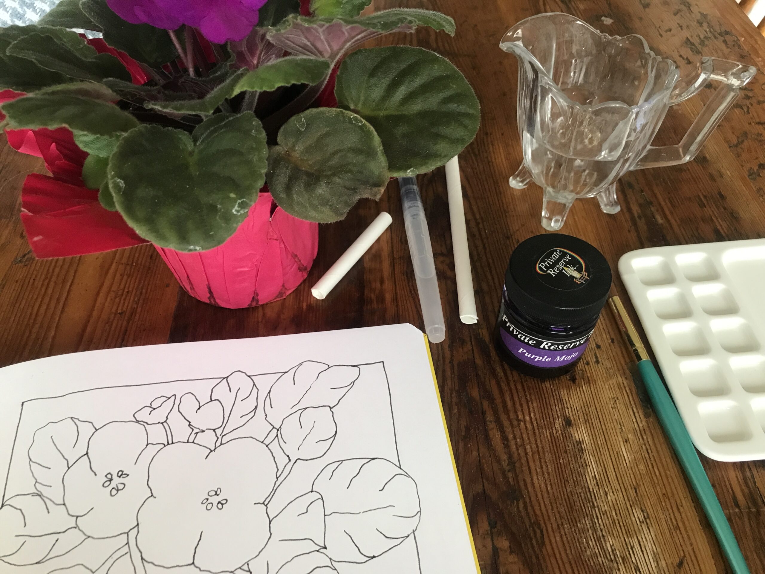
Not that I have botanical inks (not yet), I have normal inks, but I did have one bottle of Purple Mojo ink from Private Reserve ink company which I’ve had for years.
I dug out this old inkpot, shook it up and got out my palette.
I took a regular paint brush and dipped it in water first and put some water on my palette just a few drops because I was going to dilute the ink down.
It was serendipitous that I happened to have purple ink and I was drawing an African Violet. How convenient is that?
With a wet paintbrush I dipped into the ink and strained quite a bit of it off against the top of the bottle and then ran the ink into the water pool on my palette.
I mixed up the water and ink which dissolves immediately. The water thinned the ink down which is what I was going for.
Ink is not like paint where you must work the pigment, inks dilute rapidly.
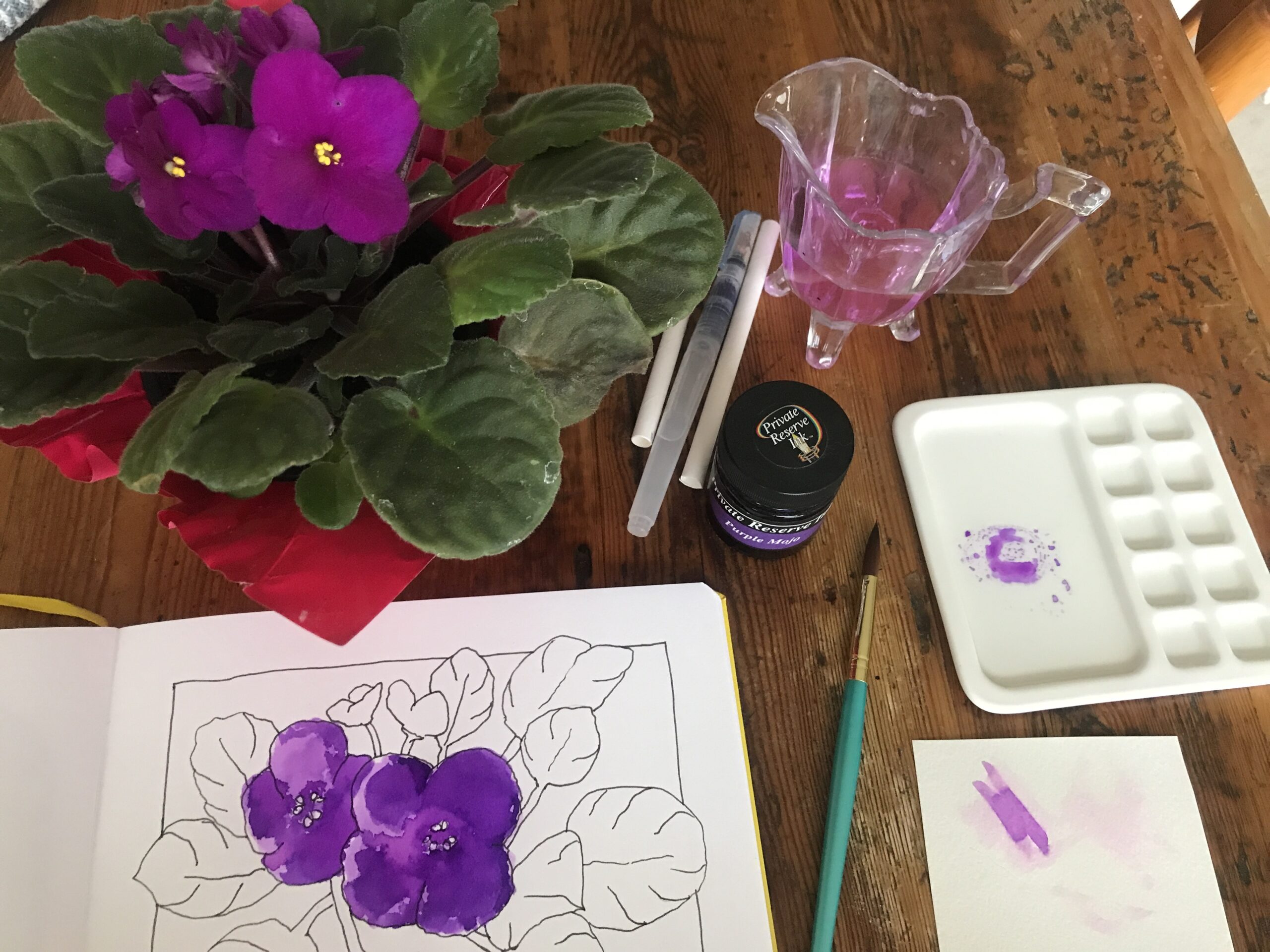
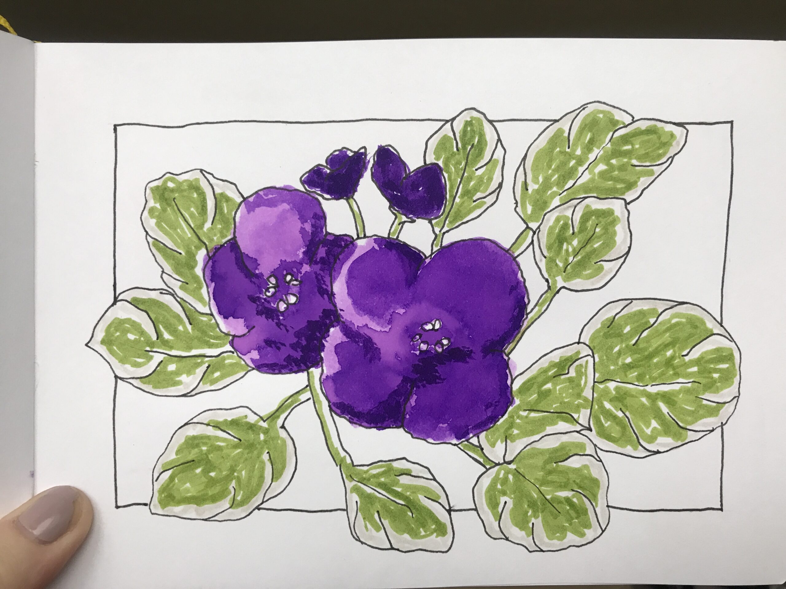
To dry paper, I washed the purple ink onto my violet petals. I did end up with quite a few hard edges and thought that I perhaps could have wet the paper beforehand, but I kept going.
I painted a first light coat on all the petals and let it dry a little bit.
I applied a second coat of the same consistency of ink wash over the petals as well.
I let the second coat dry.
Finally, I came back with some stronger ink, straight out of the inkpot, and added a few dimensional shadows to the petals for interest.
I let the ink thoroughly dry before I moved on, but I have to say that with working with ink gets on all your fingers. It stains everywhere and I had to stop and do some washing up of my hands and the palette and brush before I went any further.
Markers
Ideally, I would have done the leaves in green ink, if I had any, but I didn’t, so I turned to my Faber Castell Pitt Artist Brush Pens.
I started running the Warm Grey I around the edges of the leaves because they are much lighter at the edges and I did that for all the leaves.
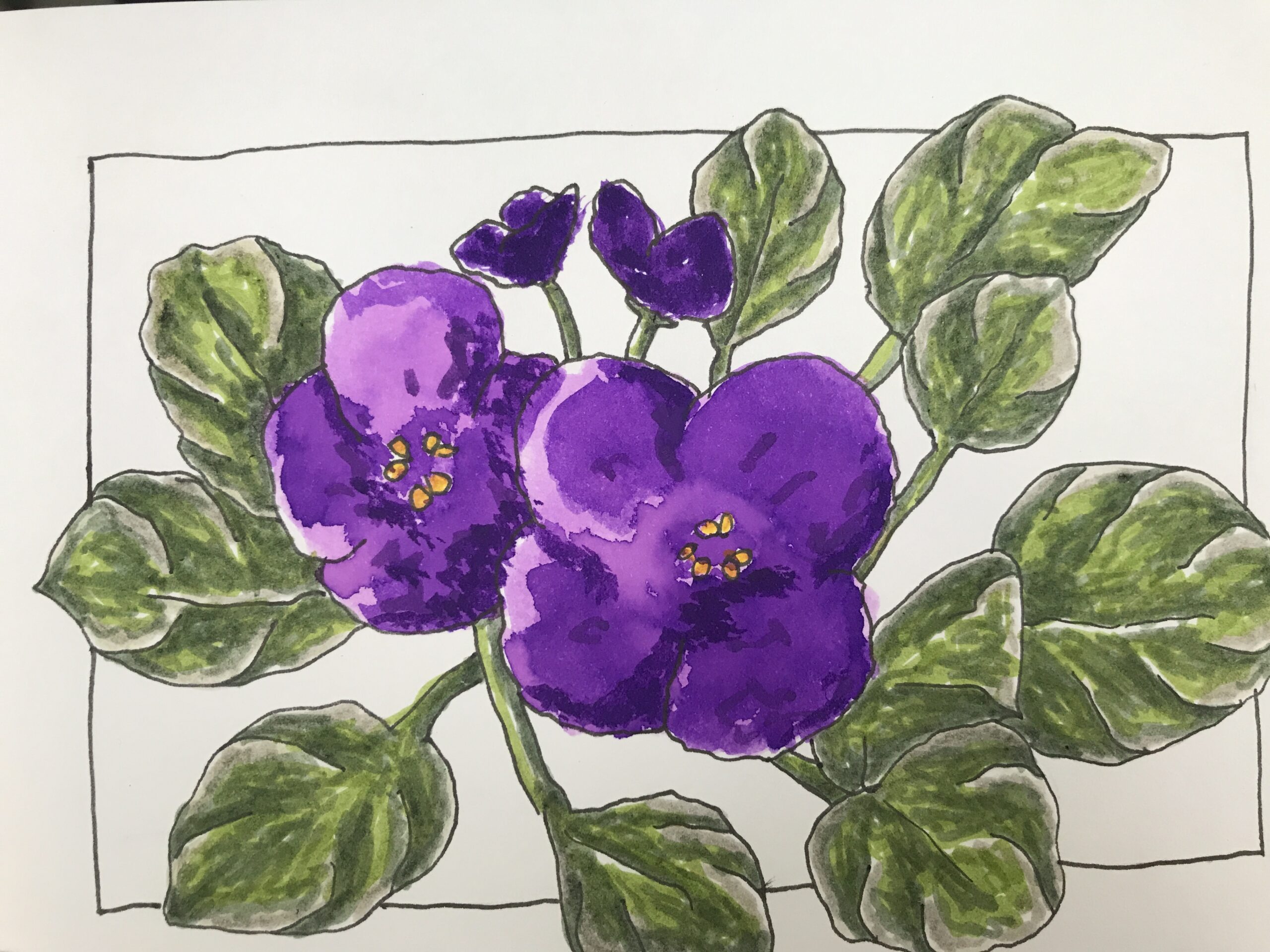
Next, I took my May Green 170 and colored in some of the main bodies of the leaves.
It’s quite a bright green, so I was a little scared of that, but it turned out well in the end.
The second green I used was called Earth Green 172 and with this I brought more shadows and was running along the edges of the veins and enhancing the puffiness of these leaves.
I tried to work quickly with these Faber Castell Artist Brush Pens because the longer you leave them on the page the darker the color will become.
I went round all the leaves adding the darker shadows to them.
The fourth colour I added to the leaves with a light Warm Grey I 270.
I used it to blend the edges which had the light cream out into the mid green.
I just softened the color down a bit as the leaves seemed a little bit like a hedera helix leaf which has lighter edges and African Violet leaves are really not white at all on the edges, they are just lighter.
I continued a little bit further with the Earth Green just adding finer points along the ridges of the veins on the leaves until I felt I was happy with the work.
The little middle parts of the flowers which are super bright yellow I just added a few dots of Cadmium Yellow 107 in there.
I could have left those areas slightly larger as they did seem to be overwhelmed and crowded out by the purple ink
Background
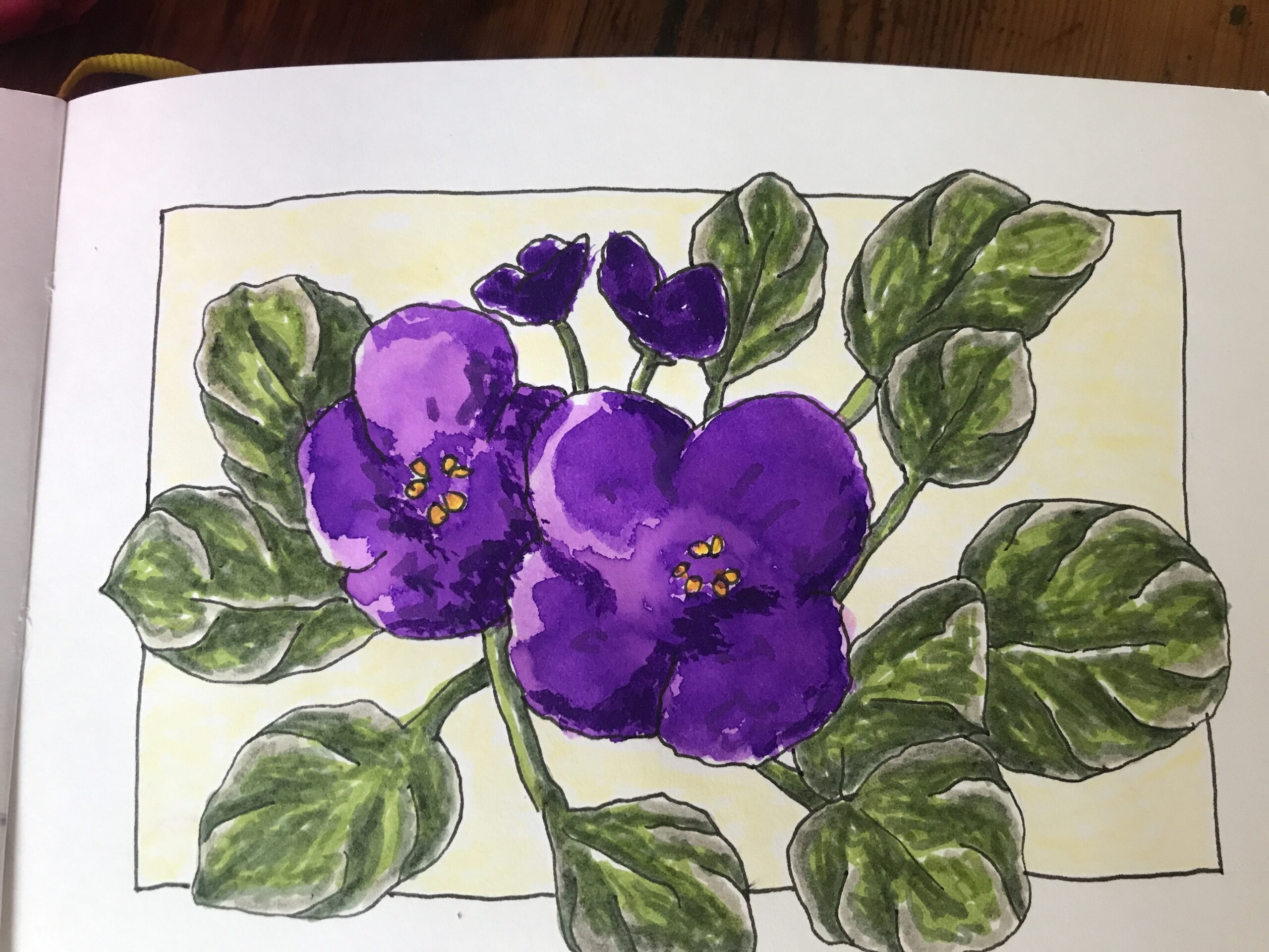
Finally, I added a light Ivory 103 into the main background of the drawing excluding the border.
I felt this soft color lifted the image slightly without overpowering the plant itself.
I had considered creating the background in yellow to highlight the golden bits in the middle of the petals, but I felt it would be too harsh on such a delicate drawing.
Conclusion
I’m quite pleased with how this sketch turned out.
It was a challenge to work with the ink because you really must work swiftly.
In future drawings I will probably consider combining perhaps a purple and a blue ink to get different colours or something like that.
I do have other inks but they are metallics like silver and gold.
I do not have a red, green or yellow ink which I think I might need to purchase soon.
So, does that signal another trip to my local art store? Yaay!
Have a creative day.
Love,
Alison


Aspiring Artist Activity
- Create a simple sketch of a flower that you have in your home or garden.
- Practice using inks and thin them down.
- Try to use one or more colored inks on your drawing.
- You may use markers, colored pencils or even watercolor for the rest.
- Get creative.
Share
Show your work on social with the hashtag #AHAinkviolets, so we can see what you create.

Sigils as Art
As a hobby artist, adding SIGILS is a creative way to begin weaving words and meaning into your artwork without using traditional text.

Sigils as Art
As a hobby artist, adding SIGILS is a creative way to begin weaving words and meaning into your artwork without using traditional text.
