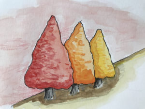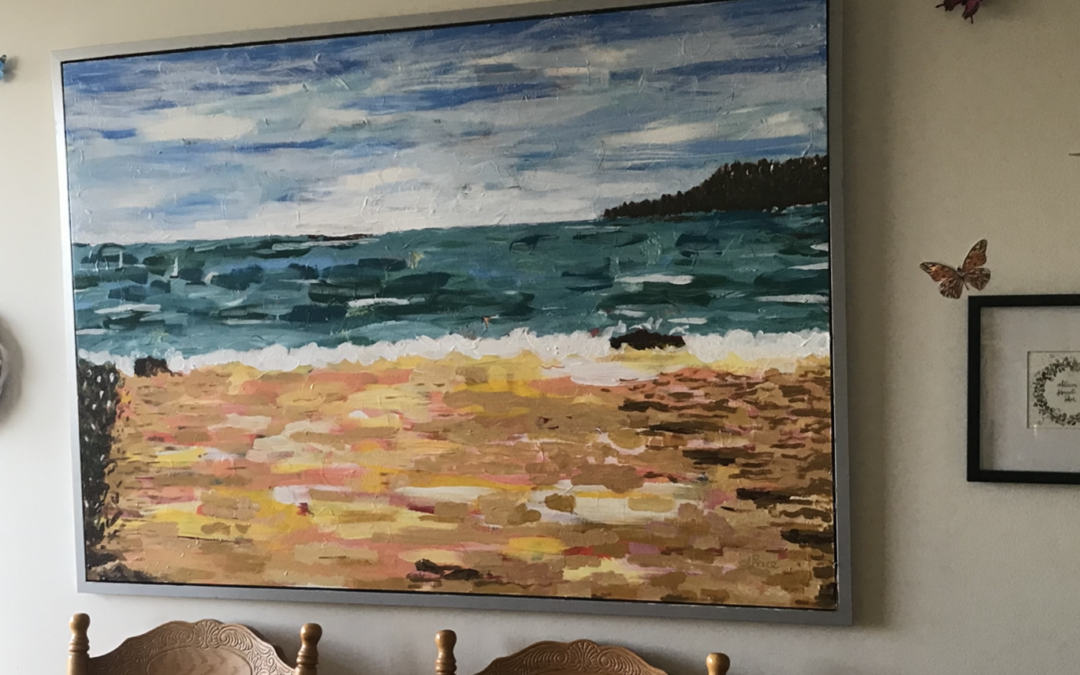
Author: Alison Hazel - Published: January 2024 Overpainting Last month I decided to paint over, or overpaint, a large Ikea artwork I had in my living room. Over painting is a technique used by many of the great artists when supplies were short and canvasses hard...
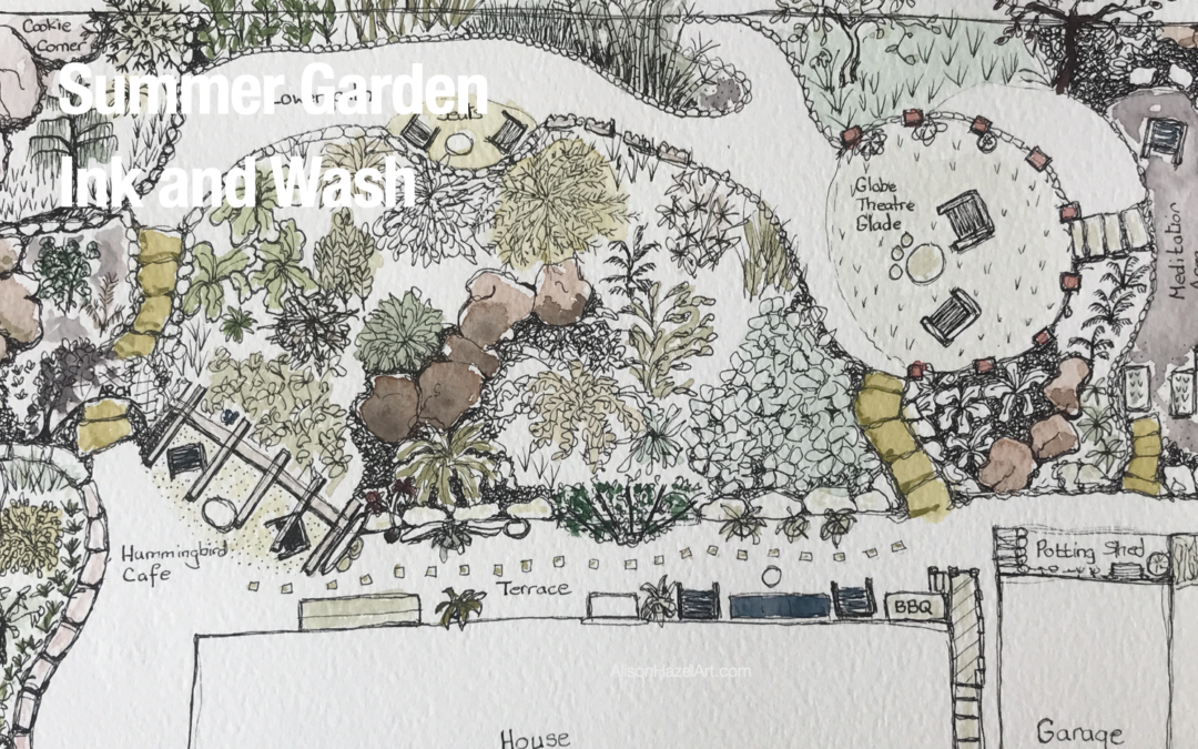
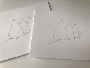
Summer Garden Art – Ink and Wash
Location
This summer I was fortunate to take a week off to visit some good friends of mine who live on the Sunshine Coast in west British Columbia, Canada.
Their delightful home is perched high on a hill with sea views that overlook the local bay.
This is a wonderful spot to observe sailing boats, cargo ships and cruise liners navigating up and down the coast.
We also spotted hawks and eagles.
In early evening, the full Moon rose from the east, climbed high and bathed us in shimmering light that danced across the water and set the scene for a perfect moment.

Garden Layout
Due to the rugged terrain, the front garden has deep lavender and cone flower terraces supported by tons of bedrock underneath.
The house is perched right at the apex of a rocky outcrop.
After a 3m wide terrace, the back garden falls off at a steep incline plunging to the lower garden level below.
Water Restrictions
Due to the incidence of forest fires and a lack of rainfall in the area, there are stringent water restrictions in place during the summer months.
This means that you can only water with handheld hosepipes or buckets for two hours each day.
Therefore, this garden must contain chiefly indigenous plants which can survive these dry hot conditions and those which can make it through the harsh winter snows that may accumulate up to two feet deep.
Because of the natural terrain, the back garden is particularly interesting with a walking path that winds throughout.
Looking with my artist’s eye, I decided to draw a plan view of this garden rather than to select one part to draw.

Garden Plan View
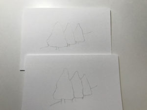
I created the sketch for the plan view from the terrace by lightly drawing the outline shape of the perimeter fence and the outside walls of the house. I later realized that the garden is not actually square, but it’s a bit more of a rhomboid shape and that the house has a few more ins and outs than I had in my sketch, but in general, there are two rectangular shapes, the fence and the house.
Pen
With a 0.1mm black pen I lightly sketched the main features of the garden. First, I drew the terrace round the back, the gates on either side, the pathways and the rough hewn stone steps to the east and west.
Seating Areas
Next came the sitting areas of which there are several. There is the main terrace seating area, the Hummingbird café bench, the lower-level intimate chat section on the path, the main stage forum in an emerald glade of fine grass and finally, a few steps up from there nestled a garden chair in the solitary meditation area. Along the wall I sketched in some of the massive external boulders as this garden was basically hewn out of bedrock.
Large Foliage
Some of the trees and plants are quite spectacular. There is a gigantic wisteria on an espaliered fan just at the top of the terrace which I drew first. A colossal magnolia tree with extra-large blooms dominates the scene right down in the main valley, but still visible from the house. Around the corner to the left, is a delicate rose garden still under development. A hardy white grape vine cascades over an aging trellis arch at the top of the western staircase flight. Against the back boundary grows a towering clump of bamboo which eagerly shot up this summer.
Hard Landscaping
A sun-kissed covered seating area is fondly called the Hummingbird café for obvious reasons. The guys have hung feeders and the birds flock in. Down at a section which I think is called the “globe theatre glade” had been erected several vertical poles all around the circle. This provides a strong statement area. Topping each post are stylish multi-colored garden lights which can fluctuate from white to colored, warm or cool at the flick of a switch. To have a wonderful area in which to gather on warm summer evenings is no doubt a serene place where the imagination can soar.
Raised Beds
The folks had strategically positioned several raised beds and grow a striking selection of herbs and vegetables including some immense tomato plants. Pumpkins cascade out of terracotta pots to seek the warmth and light. This vegetable heaven is over towards the east of the property, so on the plan view it is represented with oblong boxes.
Overview
Once I had laid down on the page the main hard pathways of this drawing, the key seating areas and some specimen plants, I was ready to fill in the rest. I took my time in the core section and found different ways to illustrate distinctive plants. Now this really is me using my artistic license as there are many component bushes and trees thriving in this area.
Perspective
For most of this drawing I used plan perspective which means the viewer is looking down from above. Plan view lays things out very much like a map. For a lot of the unknown shrubs, I use the plan viewpoint where I just plonked the leaves on the page, but in some cases, I employed elevation perspective where I created the side view of the plant in its position. This combination technique adds visual interest to my illustration.
Wildlife
A vast number of birds are attracted into the garden.
The hummingbirds came in their droves.
I saw blue jays for the first time in my life.
Chipmunks popped in and out of the shrubbery busily collecting snacks, peanuts and seeds.
Many chickadee birds fluttered in the trees and around the bench where I was.
As I sat on the terrace with my sketch paraphernalia, a chickadee bird swooped down and landed on the top edge of my sketchbook.
To start with I didn’t realize what it was and I let out a scream that had the household running as I leapt to my feet.
I soon realized it was a cute little two-inch wild bird.
I settled back down to my sketching and five minutes later another chickadee, probably the same cheeky one from before, landed on the toe of my flip-flop as I relaxed, legs crossed, sketching.
This time I kept my cool as by now I was an expert outdoors woman and not just a city slicker.
Evolution of a Garden
I had visited this enchanted garden last year and although the main features were in place and all the hard landscaping had been done, back then the plant life itself was quite a wilderness.
In the year I have been away, the owners have really labored to clear a lot of the vegetation to bring forth specimen plants that were there, but could not be seen.
By the sweat of their brow, they felled dead trees and cut back countless brambles and blackberry bushes to let the light in and which allowed lower growing shrubs to have a fighting chance.
Gardens, obviously, are living things and that they continue to evolve, whether we pay attention on not, is a natural wonder.
I look forward to witnessing how this well-loved outdoor space will develop in the future.

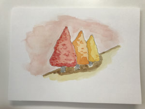
Watercolor
I had my traveling art field sketch equipment with me as I don’t like to take too much art stuff when I go away.
My minimal drawing kit included:
- A small A6 field sketchbook
- A large A3 sketchbook
- Schmincke watercolor paint travel set with twelve colors which I love as it is petite
- 3 small paintbrushes sizes 2, 4 and 6
- A water pen
- 2H and 2B pencils
- Eraser
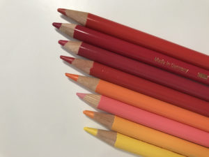
- Pens in black, gold, white and sepia with assorted nibs

Side Note
As I have recently been getting into colored ink work, I really wanted to take my tinted inks with me, but it was totally impractical to lug twelve small glass bottles of quick-stain ink my bag.
The thought did cross my mind and then I let it go…
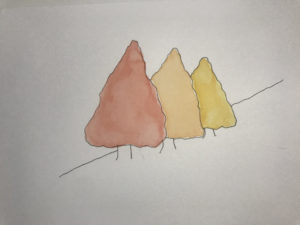
Paint and Wash
After breakfast I set myself down on the back terrace with my field drawing equipment.
My water pen had some liquid in it which I prefer rather than a jam jar of water.
Mixing olive green and yellow ochre, I put two drops of water into the khaki pan and two drops of water into the mustard-like pan and with my paintbrush slowly stimulated the paints.
Then I mixed the two colors over on the paintbox lid palette.
I thinned the colours down substantially by releasing drops of water into my palette.
I’m really working with microscopic amounts of paint here with only one or two teaspoons of each color.

Painting
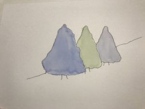
I started coloring the stone steps to the east and west and some of the main boulders with very light watercolor wash
Ensuring to let the pigments dry and to not work on adjacent colors that were still wet, I pushed on.
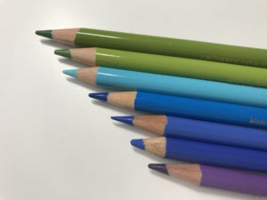
Lightly washing the shrubberies in different greens, I developed the plant life in the garden.
It was a scorching day around 28C and the paint was drying quite fast.
I turned to the large stones with some yellow ochre and a dab of sepia brown.
Once the boulders were dry, I mixed up a slightly deeper carmine red and added light shadows nestled below and to the left of each rock.
Adding shade again breaks from the plan view to the elevation view, but this is a piece of art, so that’s why I did it.
I believe the combination of top and side views created additional interest in this artwork.
Area Names
The owners have some fun and quirky names for the different zones of their garden.
Where I could remember some of the words, I wrote them on my drawing.


Reflection
I did enjoy creating this artwork.
Although it is not correct as an architectural drawing or even perhaps a garden layout drawing, it is a perfect sketch representation of this wonderful and magical garden.
As my friends continue to pour love, warmth and energy into their property, it will no doubt mature, blossom, bear fruit and become a garden of anybody’s dreams.
I feel honored to have shared some time with them in their wonderful uplifting outdoor space.
Thanks to my friends for their exceptional hospitality and openhearted spirit.
I simply loved being an aspiring artist in their welcoming haven.
If you have are still with me this far in, then thank you for sharing part of your day with me.
Love,


Pin this image to your Pinterest board.
Aspiring Artist Activity
This activity is to draw an artists impression, or illustration of your backyard.
If you don’t have the luxury of a garden, find another natural space which you like to visit.


Landscaping
- Sketch the perimeter fence of the property.
- Add outlines of the big shapes like house walls and any other buildings.
- Sketch in any paths, streams or ponds.
- Now bring in greenhouses, raised beds, seating areas and the like.
- Start to add textures to hard surfaces such as wooden decking, stone paths, gravel walkways, brick paving or boulders.
Plants
- Now draw in all the main greenery such as large trees and specimen plants.
- Using a variety of styles, fill in all the beds with different plant drawings.
Color
- Once you are happy with your pen drawing, get out your favorite colored art medium, so perhaps this would be watercolors, markers or inks and lightly wash color over your drawing.
- Start with the lightest colors and work up to the darker shades.
- It is okay to leave some parts unpainted.
- When everything is dry, go over it all again with a black pen to sharpen up the images.
Words
- Add words to your page to add interest such as terrace, greenhouse, fishpond, glade or potting shed.
- Let everything dry.
- Frame your artwork.
- Hang it proudly in your art studio.

Author Bio
Alison Hazel is a mature woman who shares her ongoing journey about becoming an artist later in life. She creates simple art that anyone can make. She hopes to inspire you to reach your creative potential in the area that suits you.
Go here to read more about Alison’s story.
If you want to send Alison a quick message go here.
More Articles
If you enjoyed this article, you may like some more inspiration on starting your art journey and working with ink and wash.
Check out more of our blog posts below.

The Creation: 7-Day Challenge
Author: Alison Hazel - Published: January 2024 Inspiration I'm trying to do more Christian artwork on this channel. It occured to me just to go back to basics, so I thought I could just do some simple artworks that depict the Creation in Genesis for the very...
Sketchbook Flip Through
Sketchbook Flip Through Abstract Sketchbook Welcome to the vibrant realm of my latest abstract sketchbook, where colors and shapes intertwine in a dance of imagination. In this flip through, we will embark on a journey through abstract art, a world where the ordinary...