Sketchbook Flip Through Abstract Sketchbook Welcome to the vibrant realm of my latest abstract sketchbook, where colors and shapes intertwine in a dance of imagination. In this flip through, we will embark on a journey through abstract art, a world where the ordinary...
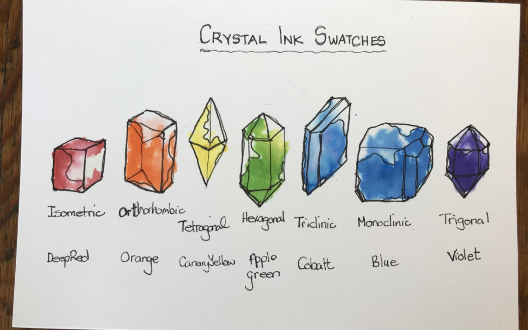
Crystal Ink Swatches
Ink Swatches
This time I’m creating color ink swatches for the seven colours of the rainbow.
I’ve always felt that paint, ink or colored pencil swatching could be created in a way to make an art piece.
I like working with color and art but dislike not having anything to show for it at the end.
I believe that all my art practice should be beautiful and so I decided to take my swatching up a notch.
Instead of just doing the swatch on a square grid, I’m going to create some artworks as I do this swatch.
These will be in the shape of crystals.
I’ll be using my new favorite Windsor and Newton drawing inks.
style="display:block; text-align:center;"
data-ad-layout="in-article"
data-ad-format="fluid"
data-ad-client="ca-pub-4471307604888511"
data-ad-slot="7787961343">
Seven
Seven is a popular number found in everyday life. There are seven days of the week and seven colors of the rainbow, seven chakras and now seven crystal forms.
I’ll be using the seven colors of the rainbow for my ink swatches.
I selected one of the seven forms with a crystal in that form which matches the colour. I will be using artistic license for these images.
Clearly, I’m not using all the colors available in the Windsor and Newton drawing inks range.

Rainbow
It’s always handy to work in groups of seven as there are seven colours in the rainbow. These colours are broken out from white light which is the true energy.
The seven colours of the rainbow in order are red, orange, yellow, green, blue, indigo and violet.
In a rainbow usually the red is always on the outer circle and violet is always on the inner cycle.
Beyond both ends of the rainbow is where we find infrared, before the red, and ultraviolet, after the violet.
We cannot see these color with our eyes, although scientists can measure them.
Art Supplies
For swatches or ink swatches you can use what you have.
There really is no need to get the exact supplies that I’m using. I believe as an artist you probably have what you need right in your own home.
The specific art supplies which I used are listed here:

Crystal Forms
In nature, a crystal habit is how it forms.
A crystal’s form is determined by the number of axes and faces on the crystal.
The seven crystal forms are:
- Isometric
- Tetragonal
- Triclinic
- Hexagonal
- Monoclinic
- Orthorhombic
- Trigonal
Each of the crystal forms has many crystals associated within that form.
I have selected one colour from each group that matches one of the seven colours of the rainbow for my drawing ink swatches.

Isometric Crystal
Definition
Isometric crystals have all three axes the same and are at right angles to each other.
Isometric Crystal Examples
Examples of isometric crystals are the garnet an icositetrahedron and the spinel an octahedron.
An example of a red crystal in the isometric crystal form is the garnet.

Isometric Crystal Examples
Examples of isometric crystals are the garnet an icositetrahedron and the spinel an octahedron.
An example of a red crystal in the isometric crystal form is the garnet.
Orthorhombic Crystal
Definition
Orthorhombic crystals have three axes of unequal length. Two are at right angles to one another and the third is perpendicular.

Orthorhombic Crystal Examples
Examples of the orthorhombic crystal structure are the peridot and topaz.
I chose to draw an orange crystal from the orthombic form and this one is a topaz.
Tetragonal Crystal
Definition
Tetragonal crystals have three axes which are at right angles to each other. The two on the same plane are equal in length while the third is perpendicular to this plane and of different length.

Tetragonal Crystal Examples
Examples of tetragonal crystals are the zircon and the scapolite.
An a yellow crystal in the tetragonal form is scheelite.
Hexagonal Crystal
Definition
The hexagonal crystal has three of the four axes all in one plane and intersect at 60°. The 4th axis is perpendicular and unequal in length to the other. There are six planes of symmetry.

Hexagonal Crystal Examples
Examples of hexagonal crystal are the apatite and the beryl.
A much-loved hexagonal form crystal is the emerald which are green.
Triclinic Crystal
Definition
The triclinic crystal has three axes of unequal length all inclined to one another at different angles.

Triclinic Crystal Examples
Amazonite (alkali feldspar) and rhodonite are examples of the triclinic crystal form.
The example I’ve chosen for a blue crystal in the triclinic form is the turquoise blue.
Monoclinic Crystal
Definition
The monoclinic crystal has three axes of unequal length. Two intersect at an oblique angle in one plane and the third is perpendicular.

Monoclinic Crystal Examples
Examples of monoclinic crystals are the epidote and orthoclase feldspar.
In the monoclinic crystal form I have selected the crystal chrysocolla which is often an indigo color.
Trigonal Crystal
Definition
The trigonal crystal is similar to the hexagonal system. There are three axes at 60° to each other in the same plane. The fourth axis is perpendicular. There are three planes of symmetry.

Trigonal Crystal Examples
Quartz and sapphire are examples of the trigonal crystal form.
There are many crystals in the trigonal form and the one I have chosen is amethyst which is violet.
Amethyst Cluster
A popular way to draw an amethyst is in cluster form.
These are highly popular crystals because they form points and sometimes points for both ends.

They are often used in new age practices and crystal healing.
An amethyst cluster will emanate good energy into a room.
Crystal clusters are highly popular as gorgeous décor items which you can place on a coffee table.
Amethyst Cathedrals
The way amethyst crystals grow are sometimes as original bubbles trapped within an ancient lava flow.
The minerals get trapped within the bubble and overtime crystallize.

These bubbles can either be small as geodes, but when they became very big, they are known as cathedrals.
An amethyst cathedral can be spectacular and a great addition to your home or office style.
style="display:block; text-align:center;"
data-ad-layout="in-article"
data-ad-format="fluid"
data-ad-client="ca-pub-4471307604888511"
data-ad-slot="7787961343">
Process
Many of you ask about my process and how I created this artwork.
Research for Ink Swatches
I did some research to start with as I needed seven crystals in particular colors.
I wanted the color sequence to go as on the rainbow which is from red to violet.
I had to explore the crystal forms and find out which crystals were the correct color that I required to use for my rainbow.

I investigated each crystal form to find for instance a red crystal for the isometric and a green crystal for the hexagonal.
Even though there are many different crystals within the same form they’re not all the same colors.
I also spent quite a bit of time studying the crystal axes and faces and what that really meant.
To be honest I still don’t fully understand this part, but I do have a couple of sketches to help determine which crystal is which.
Pencil Sketch
Seven Crystals
Once I had decided which color crystal I was going to use for each form, I laid the crystal shapes out in the order of the colors that I had chosen because I wanted it to go from red to violet.
Now technically this may not be the natural way that you would list crystals because I understand there is a particular pattern, but I moved it around because I wanted to use the different colors crystals.
What the forms were didn’t really matter to me because I was going to be using my inks.
With a 2H pencil I started with to lightly sketch out these crystals.
Although technically when a crystal grows it can be perfect, very often in nature they are not.
Crystals frequently contain flaws, imperfections, cracks and cloudiness within them.
It all depends on which other minerals were around at the time it grew.
When you draw your crystals, they don’t have to be exact and mine certainly are not.
Black Pen
With a 0.5mm black pen and I went over the main outlines of the shapes.
I used a light touch because these lines are a guide on where to place the ink.

Colored Ink
Now comes the fun part where we start to use the colored drawing inks.
Red Ink
I started with the red end, so the ink color is called deep red.
I took a clean paint brush and put some of the red ink into the well on my palette so I can see what I’m doing.
With a clean paintbrush which had water on it, I gently laid some water over the shape of the crystal.
Next, I picked up my red ink on my paintbrush, not diluted, and I started dabbing it into the water of the shape of the crystal on the page, so it will naturally disperse and move.
In a way ink is very much like watercolor but it is lighter, and I do enjoy using it.
Orange Ink
For the second crystal, which is orange, I used the ink called orange which is great.
With a clean paint brush, I picked up some orange ink straight out of the ink pot and put it into my palette well.
Then I wet the shape of the crystal with some plain water and dabbed some orange straight onto the crystal.
The idea that I was going for is that it would create a mottled effect, but we can still see the color of the ink.
I’m making ink swatches is so even though there will be some dark areas of ink there will be a lot of light parts as well.
Yellow Ink
There are a couple of yellow inks in the Winsor and Newton drawing in collection.
I chose the Canary yellow for this project.
With a clean paintbrush, I picked up some yellow and put it in the well on my palette.
I wet the crystal with plain water and added some dabs of yellow ink.
Green Ink
For the middle hexagonal crystal, which is going to be green, I chose the ink color called Apple green.
Funnily enough there is an ink called Emerald green in this suite of inks, but I didn’t like the way it was. It was a little too blue for my liking, so that is why I went with the Apple green color.
I wet the crystal and dabbed in some Apple green ink to the crystal.
Blue Ink
The next color in the rainbow is blue. In my stash I have two blue inks namely Cobalt blue and Blue.
For this project I chose the cobalt blue for the blue crystal because I was going to use the other regular blue for the indigo.
With the clean paintbrush I picked up some cobalt ink straight from the pot and put it into the well in my palette.
Next, I wet the image of the crystal and added some cobalt ink into the shape.
Indigo Ink
For my indigo crystal I chose the ink that’s called Blue from the Windsor and Newton inks.
I believe they may have a darker blue as well or a more indigo blue, but I don’t own it, so that’s why I chose the Blue.
It also occurred to me that I could have gone in and used my regular fountain pen dark blue for this project, but that really wasn’t what I was going for.
The idea is that I’m swatching out my Windsor and Newton drawing inks.
Next I wet the crystal and then added some dabs of blue ink for the indigo crystal.
Violet Ink
For the seventh and final crystal which is going to be Violet, I chose the ink which is called Violet which is great.
In my general ink collection, I do have a purple as well which is far darker, so this Violet was a great choice for the Violet crystal.
This will be the amethyst crystal which I must say is one of my absolute favorite crystals.
For this final crystal I wet the paper and with a clean paintbrush I picked up some of the amethyst ink out of the ink pot and I dropped it into the well in my palette.
In this way I could see what I was doing I wet the image and then I gently dabbed some Violet ink into the final crystal.

Gold ink
Titles
Below each crystal I wrote the shape name, the crystal form and the name of the ink color which I used for that crystal.
Gold Ink
Because I always seem to add some gold to all the images I do, I decided I would as well this time.
After all, why not?
I got out my gold ink and with a clean paint brush and straight form the ink pot I put some glimmer and shimmer onto each of the crystals.

Conclusion
I’m very happy with the final artwork.
I truly believe that doing a color swatch doesn’t have to be boring.
To add some more interest to a swatch makes sense to me.
There are other ways to do this without even doing crystals.
Perhaps you could do fruit where you would have a red fruit and an orange fruit and a yellow fruit and, in the end, you have created a delightful little artwork as well.
I know that making swatches is a valuable part of an artist’s practice, but swatches don’t have to be humdrum.
Thank you for sharing your day with me.
Alison

Aspiring Artist Activity
For this activity (which you can do with your kids) get your art supplies to hand and your sketchbook and please do the following:

- Choose your art medium. It could be pencil crayons watercolors or inks it’s up to you.
- Select the seven colors red, orange, yellow, green, blue, indigo and violet.
- Using our images as a guide, draw out seven crystal forms. If you find these drawings a bit tricky just work with the small cube first, alternatively you could do fruit.
- Color in the crystals making sure to have some dark full color at the bottom that fades lighter towards the top.
- Label each color with the correct color name from your art medium for example cadmium yellow so you know exactly which color you used.
- Write a title on your swatch so you will know exactly which medium you used whether it was your Faber Castell polychromos crayons, your watercolor paints, or your Winsor and Newton drawing inks.
Share Your Artwork
You can share your artwork on social so everyone can see what you created.
If you add the hashtag #AHAactivity I can find your work as well.
style="display:block; text-align:center;"
data-ad-layout="in-article"
data-ad-format="fluid"
data-ad-client="ca-pub-4471307604888511"
data-ad-slot="7787961343">

Author Bio
Alison Hazel is a mature woman who shares her ongoing journey about becoming an artist later in life. She creates simple art that anyone can make. She hopes to inspire you to reach your creative potential in the area that suits you.
Go here to read more about Alison’s story.
If you want to send Alison a quick message go here.
More Articles
Here are some more articles for you to have a look at about the different types of art and other cool stuff we do on this blog.
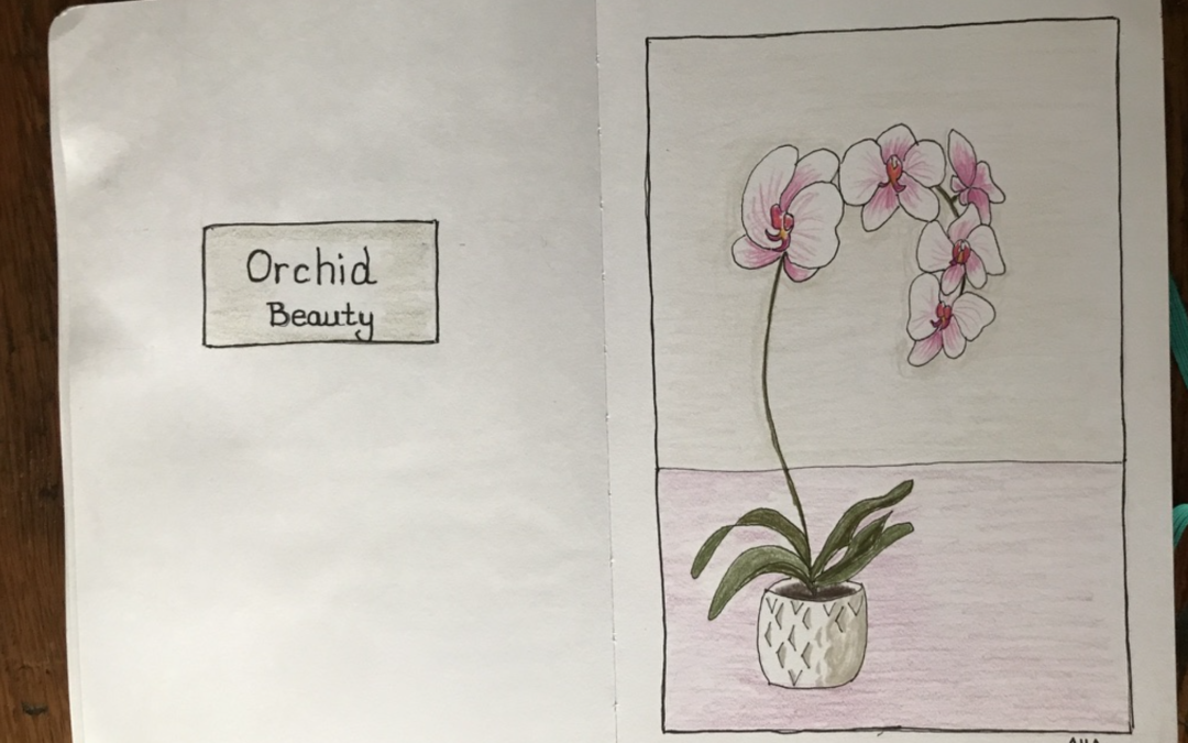
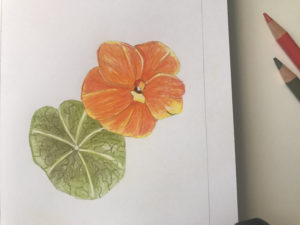
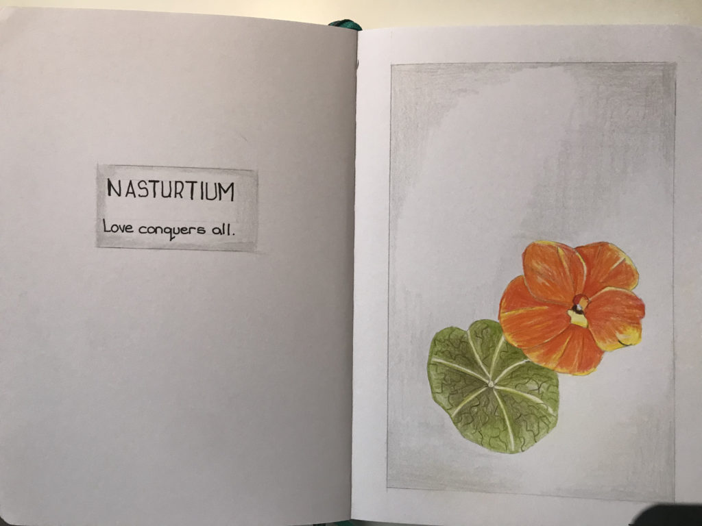
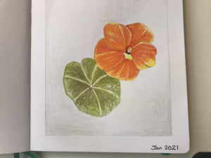
Sketchbook – Orchid with Colored Pencils
See how to draw step-by-step an orchid with colored pencils in your sketchbook. Learn the meaning of the orchid flower.
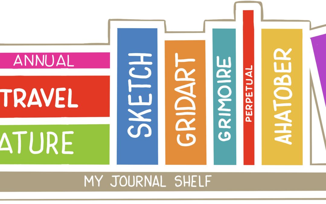
How Many Sketchbooks Do You Need?
As a hobby artist, you will benefit by having a variety of different sketchbooks. Here I share my list of sketchbooks you need.