No Results Found
The page you requested could not be found. Try refining your search, or use the navigation above to locate the post.
Today I’m going to show you how I draw the face of Jesus as an icon. This is not my original idea as I am following along and referencing the work of Mikhail Fadi at UK Coptic Icons and you can see more of Mikhail’s work on his YouTube channel.
Watch >>> UK Coptic Items Video
I plan to create more Christian art. It doesn’t have to be super religious, but calm and simple art that reflects what I believe. I’ve been trying more Christian art pieces recently.
You can look at the watercolor I did of the church in which I was christened. This is trip down memory lane as clearly, I can’t remember the auspicious day.
The place is a dim memory now, but still I enjoyed researching the church’s history as I tried to make a watercolor artwork.
Watercolor is a medium that I do like, but I have not yet mastered. Maybe I never will and I certainly won’t get better if I don’t do more watercolor.
Read more >>> Ink and Wash: St. Chads Church
Then I did a pen and ink sketch of the church closest to my home here in Vancouver.
St Andrew’s is on an extremely busy street in the heart of downtown Vancouver. I think it is on the highest point in the city. This makes sense as the early church builders want the churches to be visible for miles around. When churches are prominent on the horizon parishioners can see them and are moved to attend worship each Sunday.
Read more >>> Pen and Ink: St Andrew’s Church
I’ve also been trying to sketch some religious sculpture such as la Pieta by Michelangelo. Which depicts Mary holding her dead son after they took him down from the cross. This is a sketch I did in graphite. I feel it requires some more darker shadows and I may do that to bring more depth.

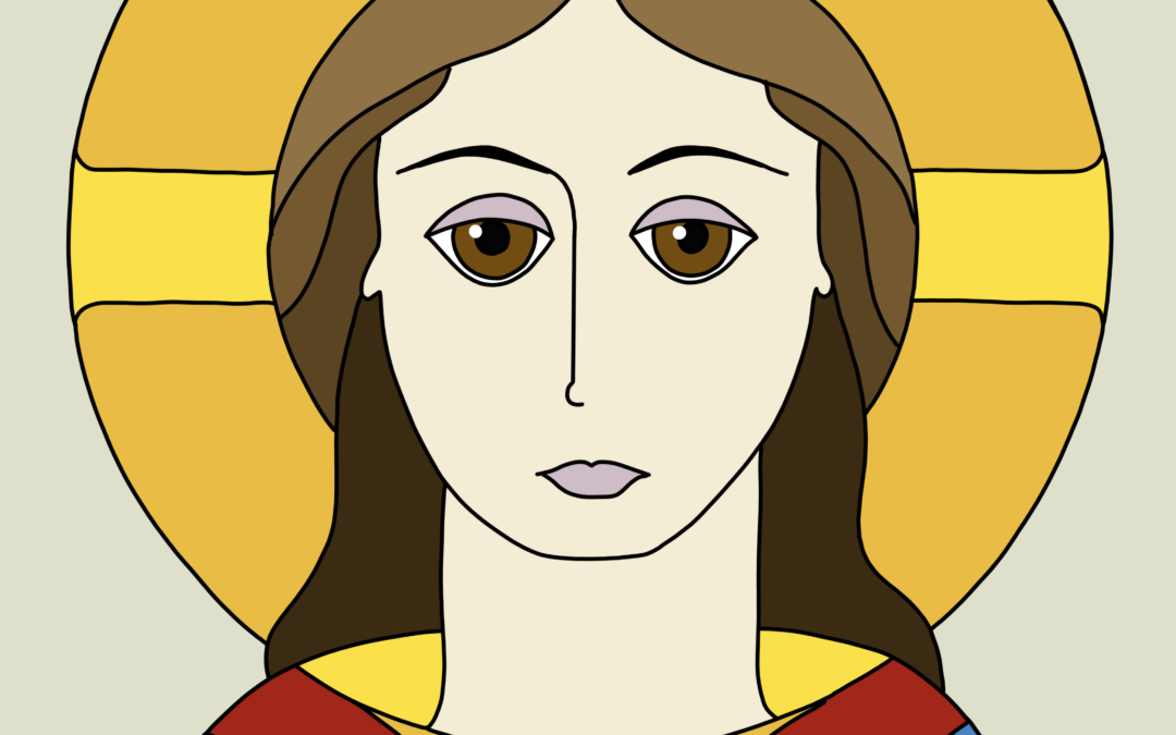
Now I’ve turned my attention to religious icons and how they are styled. First up is my drawing of the face of Jesus. The layout is quite specific.
Here in Canada my paper size is letter which is 8 1/2 inches by 11 inches, but you can use A4 as well.
To create this exact sketch, you will need a 2H pencil, a compass, a ruler and an eraser.
Read more >>> My Art Supplies
I use a 2H pencil for all my guidelines. Find the center of the page by lightly drawing a diagonal line from each corner.
Draw a vertical line at the center. We will call this line A-B. Measure down from the top 110mm. Draw a horizontal line and we will call this line C-D. This creates a crosshair in the center of the face.
We will create marks at specific points along these two guidelines A-B and C-D.

Typically, His face is two thirds the width of the halo. Draw a circle with a radius of 80mm for the outside of the halo.
For the face, draw a circle with a 50mm radius.
Where the face intersects the line C-D, mark the points as E and F and the center cross as H.

On the lines E-G and G-F inside the face circle, divide both sides into three equal parts as follows:
The irises are at the two points of I and J.
The irises are the colored parts of the eye. The irises diameter is 14mm diameter or roughly the distance between the chin and the nose (see later). Draw a circle for each iris at positions I and J.
The pupils are 5mm diameter or about one third the diameter of the iris. Draw the pupils in the center of the iris.

Divide line H-I and mark with L. Divide line I-G and mark with M. For the right eyelid lower line, draw a soft curve from position L to position M and line up with the top of the pupil. For the top eyelid line draw a light curve from L just on the top of the iris to point M.
Divide line G-J and mark with N. Divide line J-K and mark with O. For the left eyelid lower line draw a soft curve from point N to O and align with the top of the pupil. For the top eyelid line draw a light curve from N to just on the top of the iris to point O.

Place a P at the intersection of line A-G and the halo circle. Divide the vertical line G-P into 4 equal parts and mark with S, R and T.
The eyebrows curve from the above the eye, across the top of the eye and gently tail off slightly longer than the outside edge. The eyebrows begin directly above the inner eye position.

The nose is usually long and thin and in the center of the face. Starting from the inner eye position midway between M and G mark as W. From midway between positions G and N mark as W.

At position V draw a light horizontal line. The mouth width lines up to just past the nostril curves.
The mouth is typically closed. The upper lip is thinner but wider than the lower lip.
Do not to add a too small mouth as it can look pinched. Work on the mouth as this feature can give expression to the face. Ideally you want a generous expression.

Avoid a too sharp chin as this makes the image look pinched. Make sure both sides are the same evenly.

Where vertical H and F intersect horizontal U is the ear position X and Z.
Only the earlobes show in this image and not the full ear.
The earlobes are nestled just below the hairline.

Depending on the age of Christ that you are drawing, the neck starts in different places. In general, younger men (and women) have thinner necks. Mature men have thicker necks.
For a younger Christ (and female Saints and Mary), draw a line down (from vertical L and O) in a slight curve from the edge of the face to the shoulders.
For a mature Christ (and mature male Saints) start the neck at the full side of the face circle.
Sketch the shoulders in a gentle curve across the page. Again, a younger Christ (and female Saints and Mary) will have longer necks and slightly thinner shoulders. Whereas a mature Christ has a thicker neck and broader shoulders.

At position R draw a horizontal guideline. The hair is drawn in three separate folds which gently curve in an “S” shape.
At the point where horizontal R intersects the first lock begin the second lock of hair.

Only Jesus has a cross in his halo. This is so you can pick him out in a scene. People without halos are not Christ. You can draw a second halo line just inside the original sketch to add emphasis to the halo. In religious icons the halos are always gold.
Only draw the halo cross in images of Jesus.
You can gently curve or taper the halo cross towards the outside halo circle for artistic effect.

Jesus’ clothes are usually blue with a red sash and gold trim. The three primary colors red, blue and yellow (gold) and are often all you need for an icon image. Of course, you can choose other colors to match the situation within the image.
For example, Mary is always in blue robes and often baby Jesus is in white wraps. The trick is to avoid being too busy with your color palette.
If you have a particular theme or place where this icon image will be displayed you can choose colours to suit. You may have a church with special color theme inside and you may wish to make the artwork feel a part of the whole.
Or perhaps you plan to hang the picture on a wall in a room with a color theme. You could change the robe colors to align with the decor. This will create a cohesive feeling for the space.

The backgrounds of icons should always be plain. You can choose a color that complements the robes of the icon. The backdrops must be simple and not detract from the glory of Jesus, angel, saint or religious figure in the portrait.
Avoid busy backgrounds with:
Keep the background as plain and simple as possible.
Your image of Jesus will be slightly different to mine. This is a natural expression of each of us and our own art. You are not trying to reproduce the exact same image every time. You can add some nuance to your artwork.
If you do this project with your children, they too will have different results on the look and shape of Christ’s face and this is okay. Everyone draws art in their own style, through their own hand and with their own brain. Individual artistic expression and interpretation is the beauty of each original drawing.
Continue slowly darkening the main lines to make the image just how you want it. You may carefully erase the pencil guidelines if you want to pen and ink the final image as I did.
I have a digital image of Christ.
I have one with colored pencils to show you. The last one is the very first attempt I had of drawing the face of Christ. You can see the evolution of my style and skill with this drawing.

Your face of Jesus artwork needs to be the focus wherever it is located. Place your icon either in a corner, in a shrine or hang it on wall where there are no distractions.
People who visit your home and see this art will want to take a moment to pause and appreciate the piece. Individuals will need room to sit, kneel, stand or pray. Give your artwork some space to be enjoyed. Let this art piece breathe.
This art needs respect which is found by carefully choosing a place for it to live. Do not hang your face of Jesus in a complex wall gallery of other images from your vacation, your kids and your cat. Avoid unsuitable places like hot kitchens and wet bathrooms.
If you have this drawing of Christ in your sketchbook, place a sheet of tissue paper over the face to protect it. It is usual to have many practice drawings before you get the best one and these sketches may be in your sketchbook. Due to the importance of Jesus always slip in some tissue paper to protect the image and give respect.

When I first followed along witrh the video I found that this was not an easy design to start with. I personally had many attempts at drawing the face of Jesus. To help you out, I have created a template with all the lines and shapes you need to draw the face of Christ.
This design can be used as a guide and you can pen over and color in to your heart’s content. I suggest you follow your intuition when working with this template.
Here is my final image. An icon of Christ colored in shades that I like with red and blue robes. I do like the cross in the halo. I will probably repeat this drawing in my sketchbook. It is one that needs time to be perfect. And it is what I want, a perfect drawing of Christ’s face. Let me know how you get on drawing the face of Jesus.

This is the saem drawing but with a moustache and beard. I also added some crow’s feet and brow furrows to add age.


Alison Hazel is a hobby artist and she shares her ongoing journey about becoming an artist later in life. She creates simple art that anyone can make. She hopes to inspire you to reach your creative potential in the area that suits you.
The page you requested could not be found. Try refining your search, or use the navigation above to locate the post.
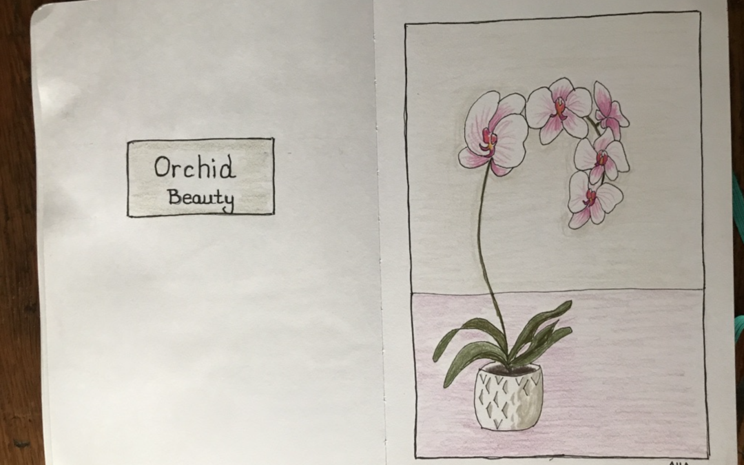
See how to draw step-by-step an orchid with colored pencils in your sketchbook. Learn the meaning of the orchid flower.
The page you requested could not be found. Try refining your search, or use the navigation above to locate the post.

I’m trying to do more Christian artwork on this channel. It occured to me just to go back to basics, so I thought I could just do some simple artworks that depict the Creation in Genesis for the very first week.
I am a fan of art challenges. Some art challenges are harder than others because there’s just so much you have to do. I have a few challenges on this site.
When I started looking into the Creation Seven Day Art Challenge. I thought this is a good idea, I can do a 7-Day Art Challenge and it’s not going to kill me. It’s a way of continuing working with daily art practice. I created these seven simple, extremely simple images for the Creation.
Read more >>> Seasonal Art Challenge
Light and day and night.

The vault of the sky.

Sea and land.
Vegetation plants, trees, fruit and seeds.

The Sun to light the day and the Moon and stars to light the night.

Birds to fly in the sky. Sea creatures to team in the oceans.

Land animals, livestock and wild animals. Mankind, male and female to rule the animals and the food and seeds of the green plants and the seas.

The Holy day of rest. The sun is shining and all is good. Everything is there. Everything is poised for greatness and to continue to flourish.

These few drawings have to be the simplest depiction of the Creation with flat color and limited palette. The idea is that if you reduce your art down to the most minimal strokes, it can still denote what it is supposed to represent.
I think this type of work can be the origin for symbolism where one stroke can symbolize a nation, group, or movement.
Read more >>> St.Chad’s Poulton-le-Fylde: Pen and Wash
Read more >>> Christian Art and Sacred Places

Alison Hazel is a hobby artist and she shares her ongoing journey about becoming an artist later in life. She creates simple art that anyone can make. She hopes to inspire you to reach your creative potential in the area that suits you.
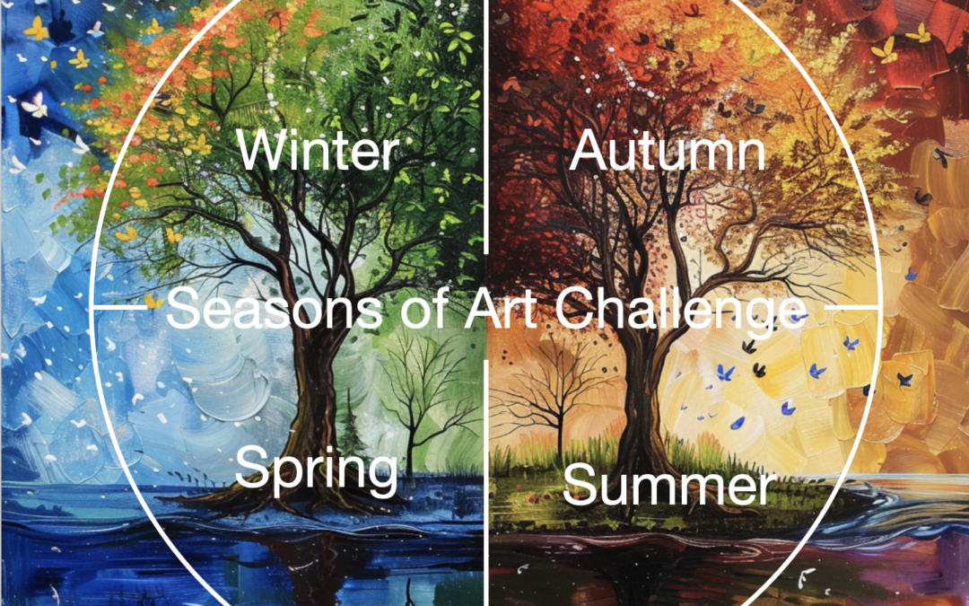
Join us for the Seasons of Art weekly art/drawing challenge. See what you can do in your art life.
See how to draw step-by-step an orchid with colored pencils in your sketchbook. Learn the meaning of the orchid flower.
The page you requested could not be found. Try refining your search, or use the navigation above to locate the post.
The Christian Art we practice here at Alison Hazel Art is traditional and straightforward. We want our Christian Art to be peaceful, meditative and reflective. To draw Christian images and symbols adds a richness to life which we enjoy, and we want to share that with you.
We are not here to influence you, or to convert you, but rather to celebrate our beliefs with you. If that resonates with you, then you may enjoy some of our future plans for creating and developing some Christian art.
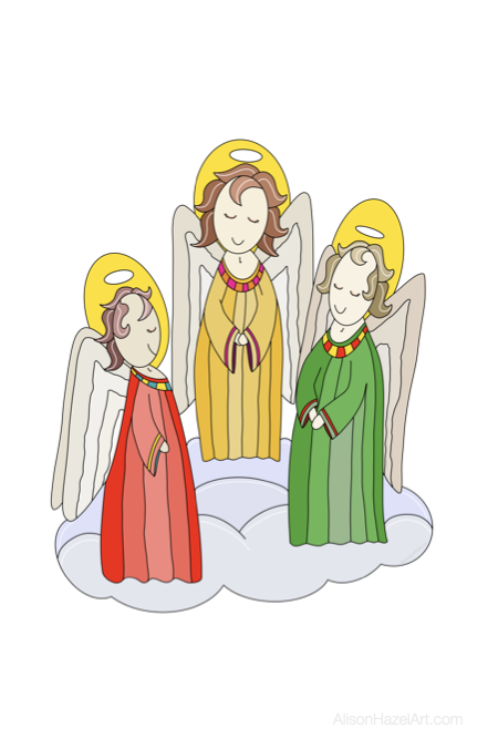
We aspire to have more drawings and images of religious people such as:

We will be drawing and illustrating chapters from the bible and particularly from the book of Genesis with stories like:

We also have an interest in sacred places. Sacred places generally means churches, cathedrals and related buildings, but it also encompasses other places such as:
So far, we have drawn:

We have plans to sketch:
We plan to explore Christian symbolism. This can be as:
There is a place for all art. We believe that if you follow Jesus then if you draw and create your own Christian themed art it will benefit you.
Some of our Christian art is already available on Christmas cards and you can see more designs in our Redbubble shop.


Alison Hazel is a hobby artist and she shares her ongoing journey about becoming an artist later in life. She creates simple art that anyone can make. She hopes to inspire you to reach your creative potential in the area that suits you.
Join us for the Seasons of Art weekly art/drawing challenge. See what you can do in your art life.
See how to draw step-by-step an orchid with colored pencils in your sketchbook. Learn the meaning of the orchid flower.
The page you requested could not be found. Try refining your search, or use the navigation above to locate the post.
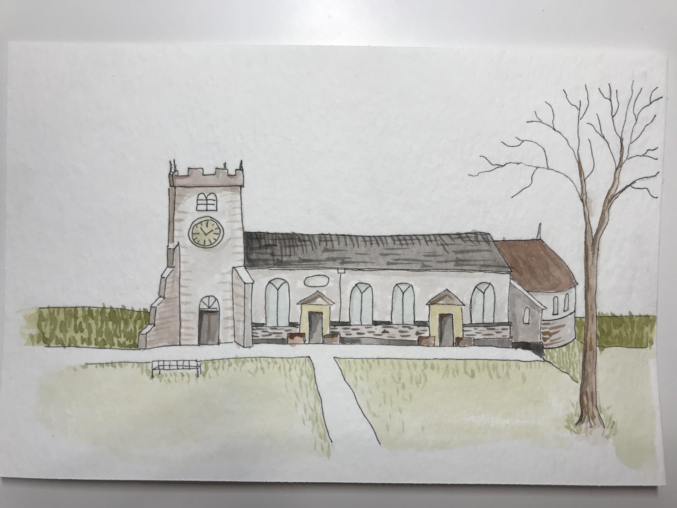
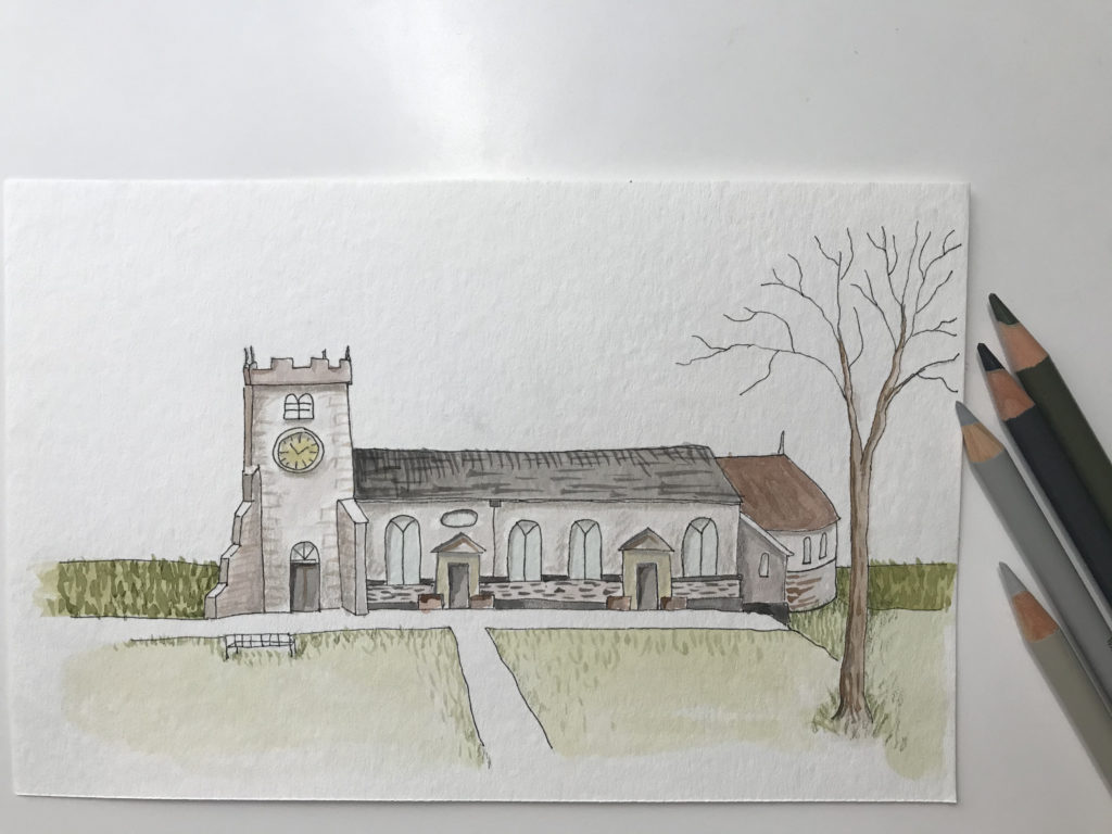
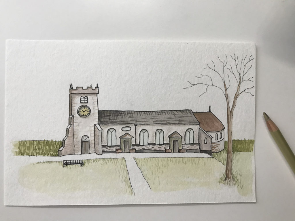
This is a pen and ink and watercolor painting that I created this week.
The method that I used is similar to the Sketch Journal Page from last time, but without the commentary that goes with a journal entry.
I do enjoy drawing buildings. I find them easier than people or animals which always seem to look a little weird.
I joined my local Urban Sketchers group the year before lockdown and I found it very interesting to draw what was in my city.
Back then I was using a pencil and Tombow markers because I had no paints or crayons for that matter. I didn’t know just how much I was going to love getting back into art after so many years.
Sacred places are typically buildings, groves, fields or monuments that have special meaning for people. They can be places where people congregate and find community.
Many years ago, I lived in a small village near St Chad’s church in Poulton-le-Fylde, Lancashire, England. I was christened in that church, so it seems a good sacred building to start with.
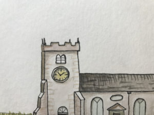
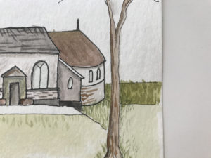
I found some images of St Chad’s church online, and looking at the images for reference, I drew the front façade of the building and added a tree.
I suspect that it is a Norman church by the square tower, but that is really as far as my knowledge goes.
In a way it is an inconspicuous building as churches go.
It seems to have been built between 1086 and 1094. You can read more about the history of this St Chad’s church here.
Each spring there is a wonderful display of lilac and purple crocuses over the entrance lawns.
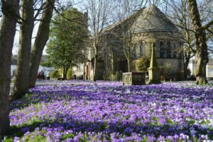
Crocus
Using an HB pencil, I began with a light sketch and combined all the features from a few photos that I looked at online. I can’t show those photos here as they are copywrite to someone else.
I chose watercolor paper from Strathmore size 140mm x 216mm or 5 ½ x 8 ½ inches.
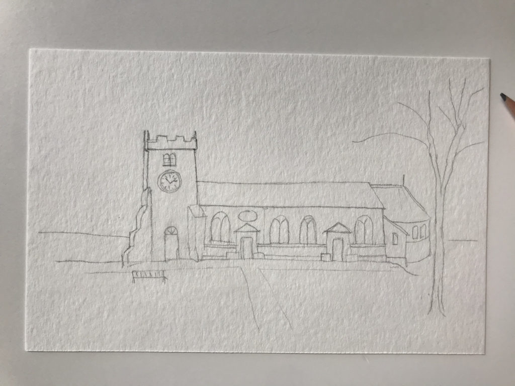
Pencil sketch
With a 0.1mm black pen I drew the main lines of the building and the other features.
After this I gently erased the pencil lines so they were no more. If you leave the pencil lines on the page you will see them through the watercolor paint and then you cannot get rid of them once they have been painted over.
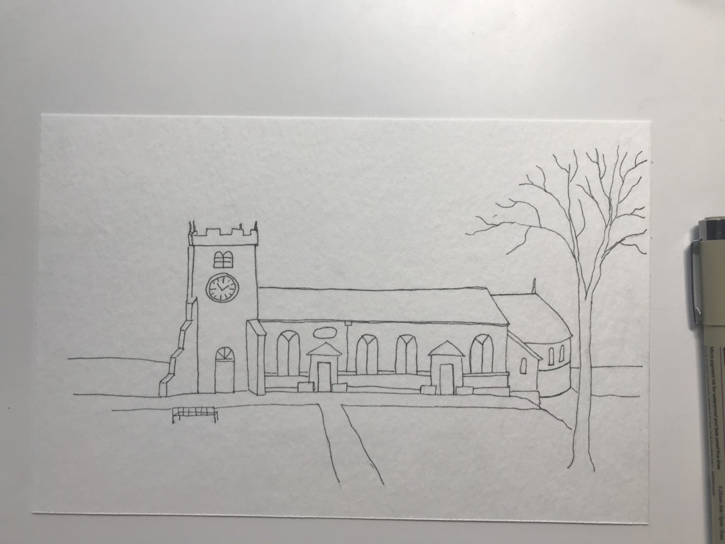
Pen and Ink
With a light mixture of Payne’s grey and brown I started to lightly wash the building walls. I tried to add a little more grey for each separate type of brick work just to add some interest.
Here I used a number 6 watercolor brush and kept gently rolling it to mop up excess water each time.
I repeated the color layers a few times to add depth to the color and to vary the shadows a little.

Watercolor
Once that part was dry, I went in with a finer brush (number 2) and with denser paint I laid down some brick marks and roof tiles just to give the effect of rough texture to the stonework.
For the grass I mixed an olive green with a touch of burnt sienna.
I always avoid the bright greens that are in my paint box. They are not natural and are glaring when used in a landscape painting. It is best practice to mix colors and never use them straight out of the little pans.
With my pencil crayons in several tones of cool grey I gently added small definitions like the shadows below the eaves and the door recesses. This brings details to life and adds shadows to suggest depth.
Colored pencil highlights
I went over the main structure lines once more with my fine 0.1mm pen and in some places I employed a 0.3mm black pen.
I do love some gold trim in my artworks. In this drawing it was a challenge to know where to add a spot of gleam, but I found one or two spots that could do with some life.
Shimmer of gold
I am really happy with this painting. Receiving a watercolor set from my son-in-law this past Christmas, I am a relative newcomer to watercolor painting.
This piece is probably my fifth painting so far using this art medium.
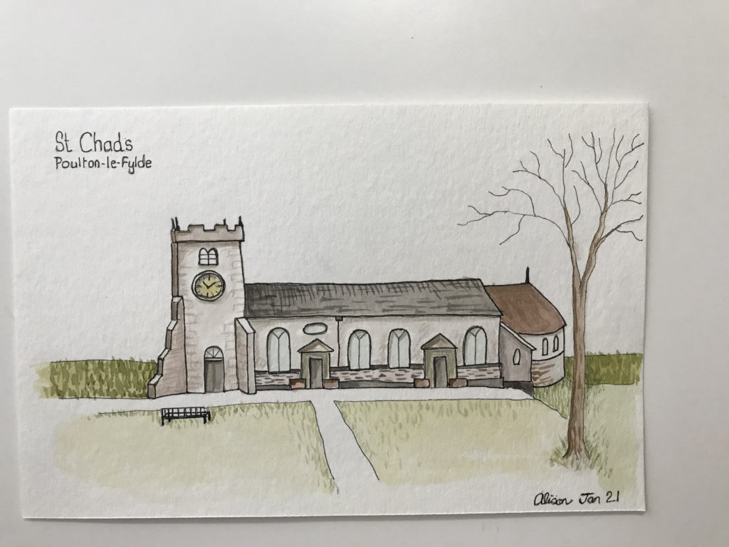
Complete
There was some flow over of color especially around the tree, but I will get better at controlling the paint and handling my brushes with some practice.
Let me know what you think.
Alison
Faber Castell Pitt Artist pens
Sketch book/journal Leuchtturm
Strathmore watercolour paper pad of 12 sheets
Faber Castell polychromas colored pencils– This is a tin of 60 colored pencils, but you can buy the colored pencils one by one which is how I do it now, so I can pick and choose the colors I want.
Van Gogh Royal Talens water-colour paint tube, 10 ml – Deep Gold
If you enjoyed this post read more content from us in the blog below.
Learn to draw some simple Christian and Sacred Places art, images and symbols to add richness to your life.
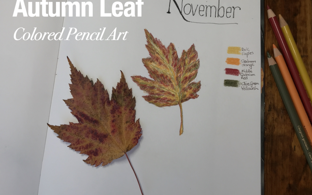
Autumn Leaf colored pencil art in my Perpetual Nature Journal sketchbook. Great for hobby artists and beginners.
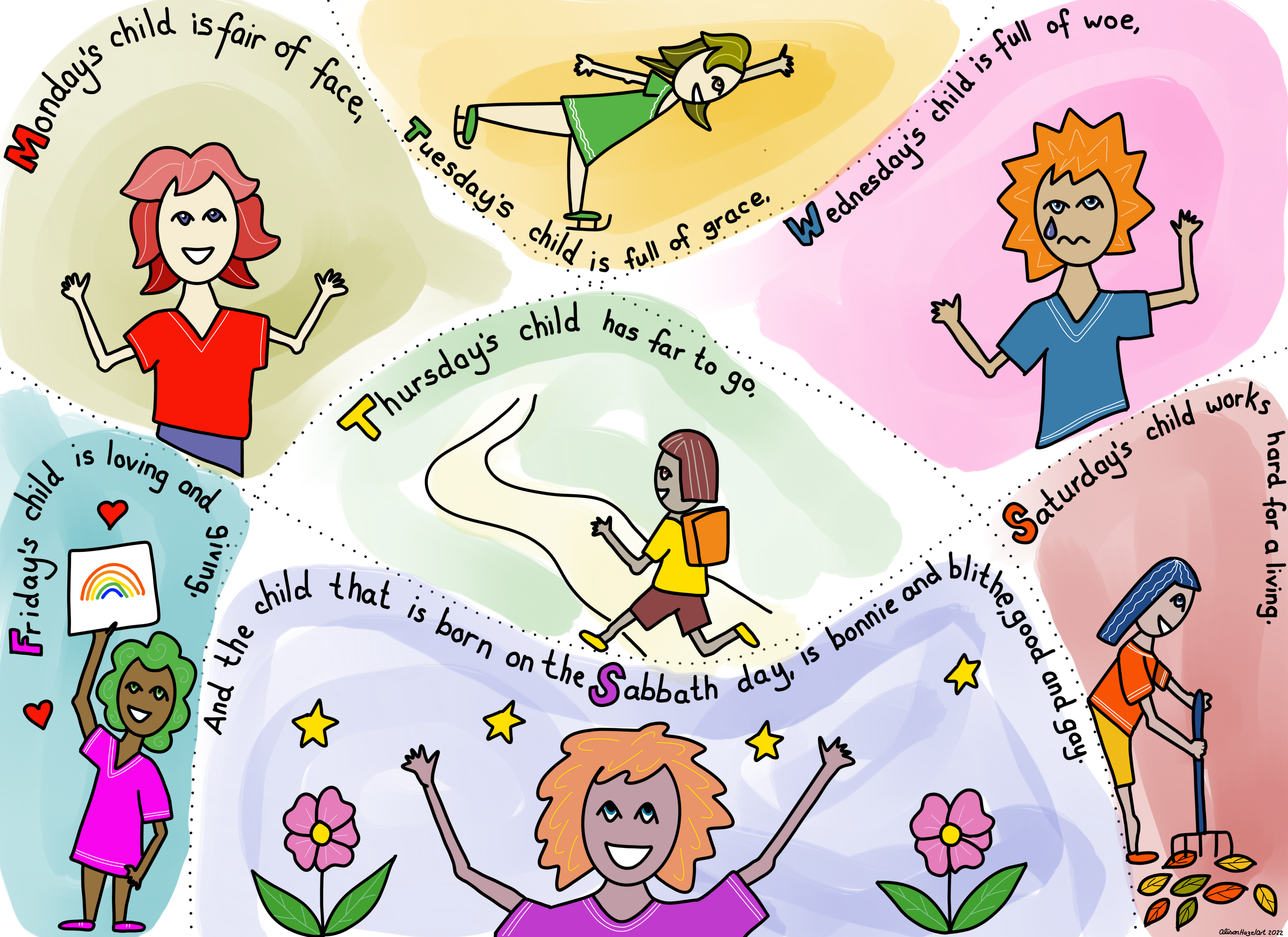
How to create the “Monday’s Child is fair of face” poem nursery artwork for your home with simple and easy images.