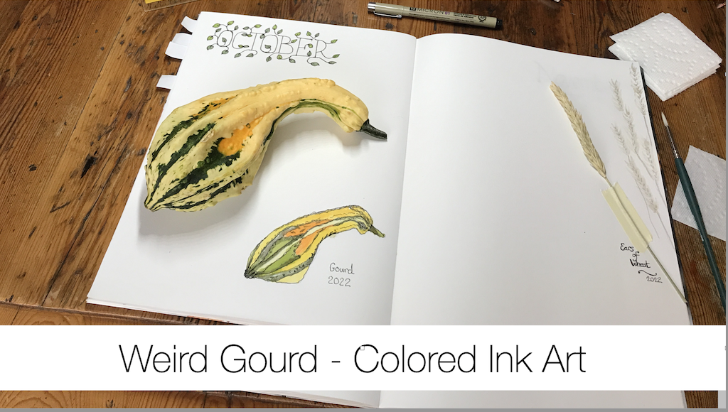
Weird Gourds – Colored Ink Art

Weird Gourds – Colored Ink Art

Oh, My Gourd!

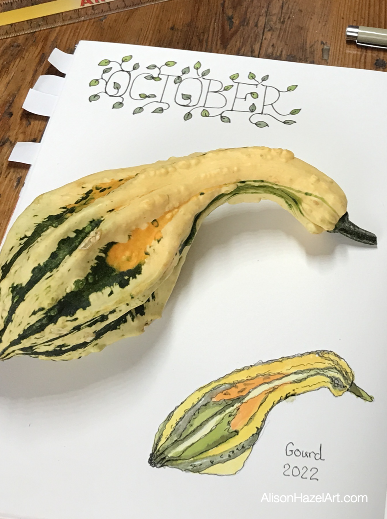
I was in my local grocery store yesterday and spotted these weird looking gourds in the pumpkin section.

This is not a vegetable I usually prepare, cook and eat, but I thought maybe this time, as I wanted to add a drawing to my Perpetual Nature Journal, I would see what I could do.

Hello

Hi, I’m Alison and I call myself a hobby artist.

I am on a journey to get better at art and I’m doing this for self-care.

In a digital world I find that slow-paced activities which are creative support my drive for a slower lifestyle.

You can read about my journey.

Art Supplies

Get Your Stuff

I urge you to use the paper, sketchbooks, pencil, inks and paints which you have at hand.

I believe that artists already have what they need and there is no requirement to let not having the exact equipment I used to stop you from creating art.

No excuses here.

Look around and gather your art tools.

Specific Art Supplies

These are the exact art supplies which I used for this artwork.

Part 1 – Drawing the Outside

Perpetual Nature Journal

I added this drawing to my Perpetual Nature Journal on the October page.

This is the first sketch I have for October as I only began this journal earlier in the year in May.

Pencil Sketch

Once I had handled the gourd and rolled it around to find a good side, I lightly sketched the gourd out.

I used my favorite pencil which has a 2H lead. The 2H describes light lines on the page which are easier to erase later.

I took care to get the knobby bits and the color changes as patches as well.

Colored Ink

When working with these inks you do need to shake the bottles beforehand, but you also must wipe off the screw tops before you close them otherwise the stick and you can’t get the lid off next time.

There is an art to looking after your Windsor and Newton inks pots as well.

Yellow

I began with some Canary Yellow ink in my palette and thinned it down quite a bit with water.

I like to keep the paper quite dry and not add too much water, but it is a balancing act.

It seems I prefer to work with the wet on dry technique and not the wet on wet. One.

This opinion may change, but for now it is my selected method of working with colored ink.

Orange

Next, I added some Orange to the palette and dabbed it in where the gourd was much darker.

Green

The green was the Emerald Green to which I added a little Canary Yellow to make it more like a sage or olive green.

I watered down the ink mix quite substantially and then slowly built up the color after each drying.

Layers

I let this artwork dry in between and then added more color with a light touch.

Pen

Finally, I went over the whole drawing with a 0.3mm black pen to define the main outlines.

With this pen I held it loosely and let it wobble a little.

The pen part does give this a flavor of an ink and wash piece.

Part 2 – Drawing the Sliced Half

Hidden

After I’d completed the outside painting of the gourd it occurred to me to look inside.

I struggled considerably to cut this vegetable in half.

I tried my main straight-blade kitchen knife, but to no avail.

Then I got out my big South African cleaver forged from one piece of steel and heavy, oh so heavy, and I managed to push the blade into the gourd.

Artwork

Next, I set about sketching and inking the sectional slice of this gourd.

To be honest there were some interesting seeds in the main cavity, but not much flesh on the gourd only about half an inch of orange pulp.

yellow-gourd

Cooking the Gourd

After finishing the painting, I tried to cook with the gourd.

I had so much trouble chopping this vegetable up that I gave up.

The skin is so tough.

In the end I had about six one-inch cubes of flesh which I added to the pan with my other roast red potatoes, onions and other vegetables which I was cooking that night.

A gourd is not a vegetable that I am likely to buy to consume again.

However, I am likely to buy them for still-life autumnal center pieces which I love to create and draw.

You can see this year’s Seasonal Art Group story here.

Aspiring Artist Activity

Vegetables

This is an activity which can be done by anyone who has vegetable, which I’m assuming is everyone.

Get the kids involved as well.

Find a knobby vegetable that is interesting, perhaps with multiple colors or is a weird shape, which you want to draw.

In your Perpetual Nature Journal and on the appropriate month’s page please do the following:


  • On the appropriate month’s section find a suitable page.
  • Draw a light pencil sketch and remember that we are not engraving.
  • Color in or wash with watercolor, colored ink or your favorite art medium.
  • Pen over to add definition to your artwork.
  • Write the name of the plant in pen below.
  • Sign and date somewhere near the bottom left.

Reflection

Daily Life

This is not the most exciting painting you are likely to create.

Rather, it is a part of paying attention to the world around you and noting the details that go in to make up daily life.

Sketch Journal

This sort of activity can also be created in your sketch journal as a drawing about your day.

If you are the sort of artist who constantly draws your coffee cup in your sketch journal, then doing a gourd will spice things up a little.

Celebrate Seasonal Changes

Celebrate the changing seasons with this type of painting.

It could be a part of your Phenology Wheel as well where you observe nature around you and, during Autumn, the fruits and vegetables ripening into maturity.

Thank You

Thank you for spending part of your day with me.

Love,

Alison

Alison Hazel

Author Bio

Alison Hazel is a woman who shares her ongoing journey about becoming an artist later in life. She creates simple art that anyone can make. She hopes to inspire you to reach your creative potential in the area that suits you.

Read more about Alison’s story.

Send Alison a quick message.

More Articles

If you enjoyed this post then you may love some more articles from our blog.

Acrylic Overpainting: Ikea Artwork

Acrylic Overpainting: Ikea Artwork

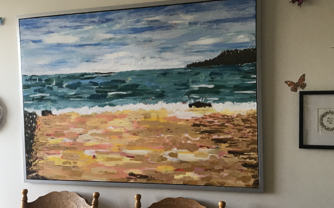
Author: Alison Hazel   -   Published: January 2024 Overpainting Last month I decided to paint over, or overpaint, a large Ikea artwork I had in my living room. Over painting is a technique used by many of the great artists when supplies were short and canvasses hard...
style="display:block; text-align:center;" data-ad-layout="in-article" data-ad-format="fluid" data-ad-client="ca-pub-4471307604888511" data-ad-slot="7787961343">
Sketching English Bay Beach, Vancouver

Sketching English Bay Beach, Vancouver

Introduction

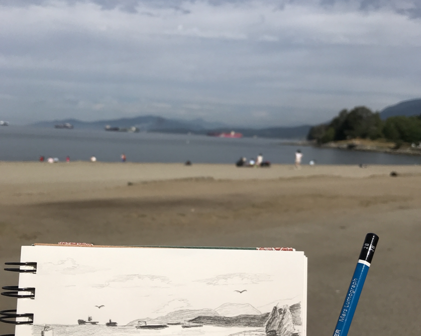
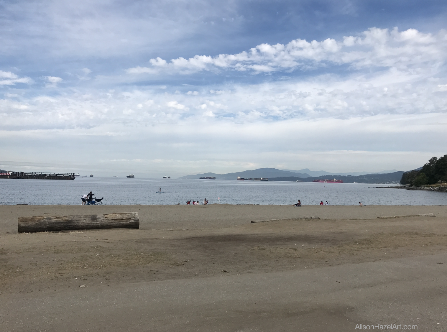
This week I went down to English Bay in Vancouver to do some sketching.

I was down there rather early around 9:00am because it promised to be a scorching day and I knew that the beach would fill up soon with people enjoying the good weather.

With coffee and a sandwich and sat on one of the benches on the promenade.

The seagulls were cawing and kids were playing and screaming in the surf.

There were six to eight large vessels lining up to enter the harbor to the right. The ships to be just hanging on the distance horizon.

I particularly wanted to get the background mountains as they had very interesting shades of greys and purples through the haze.

English Bay Vancouver

Field Art Supplies

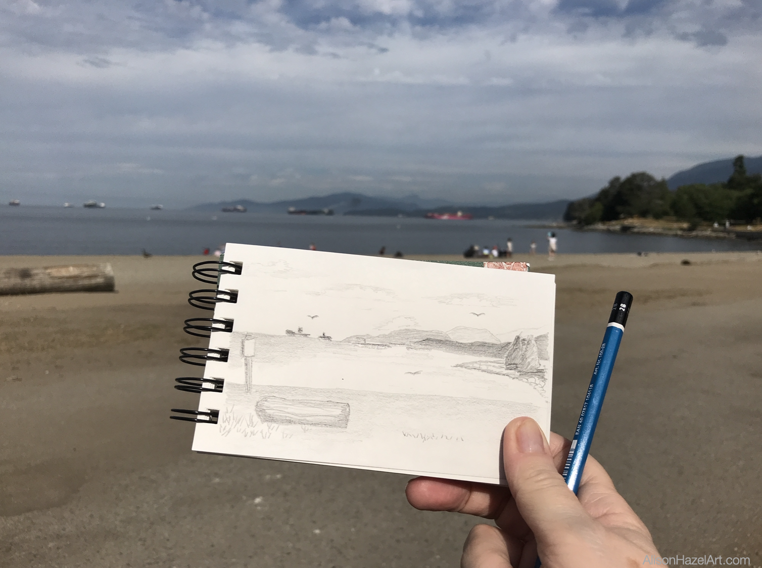
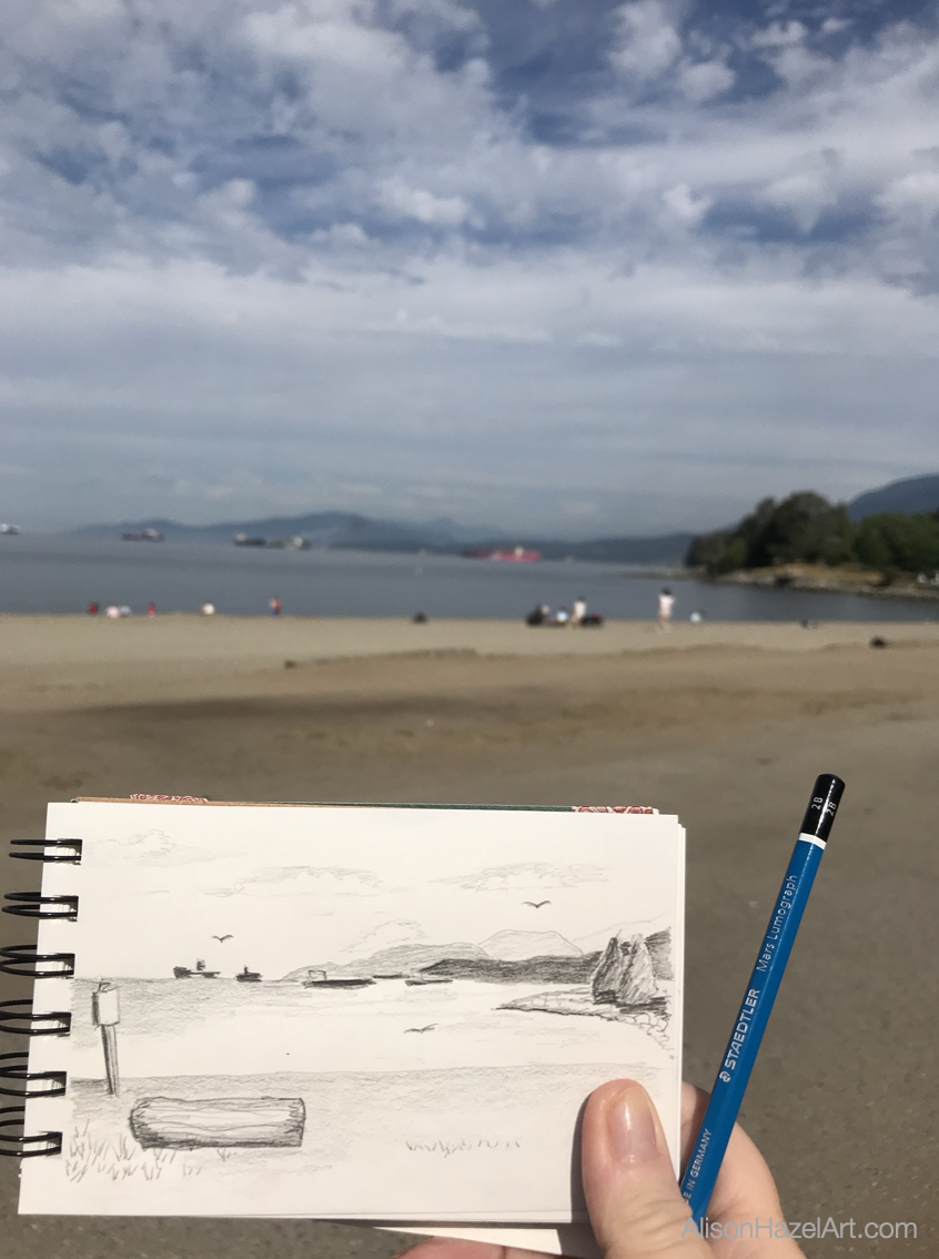
I took my A6 field sketchbook with me a 2B and a 2H pencil.

These fitted conveniently in my little belt bag and I had my phone with me as well, so I could take some photos.

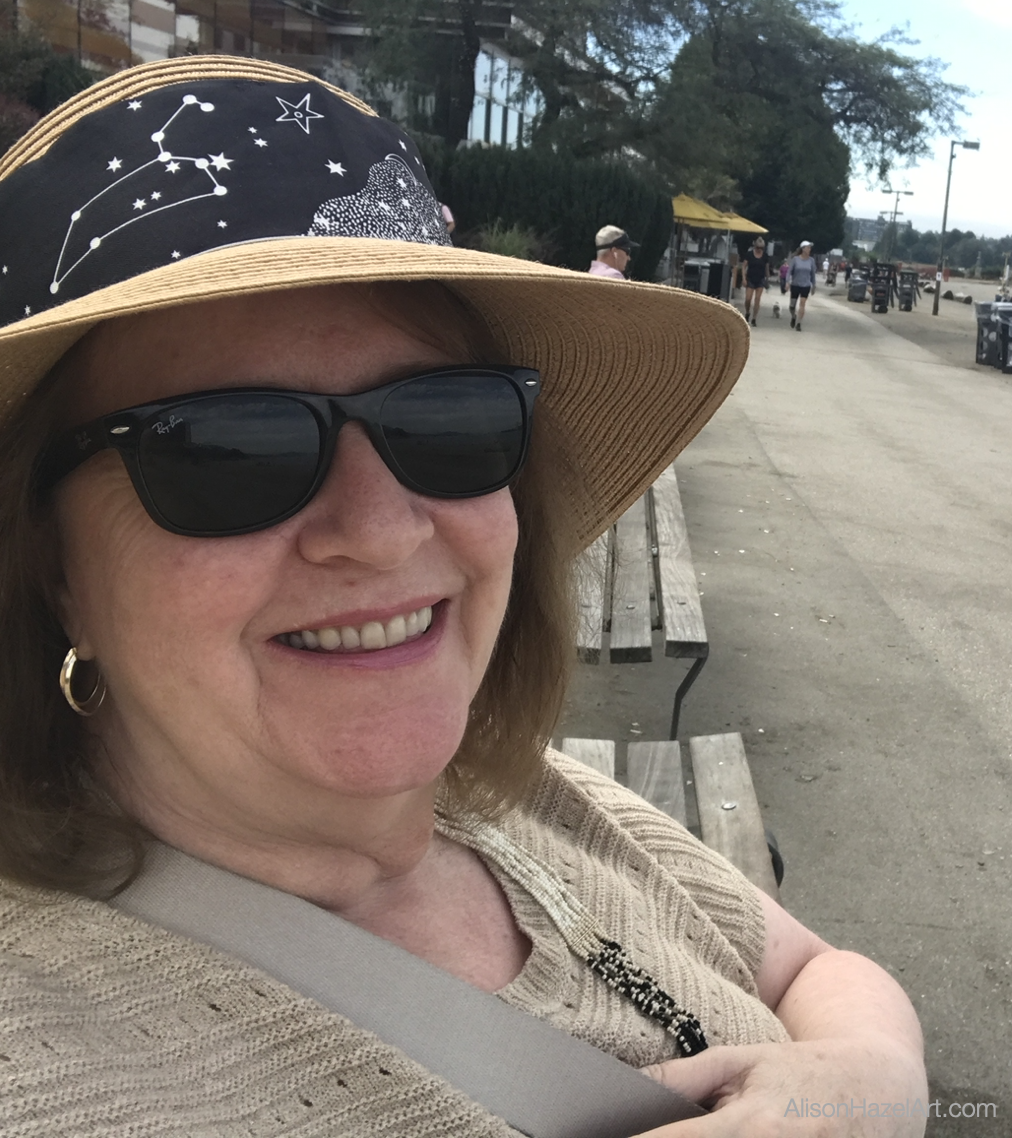
I had my hat and sunglasses because it promised to be a really hot day this is now the middle of summer in Vancouver and the beach is a popular destination.

Loads of people were jogging along the promenade riding their bikes and pushing their kids in their buggies.

There were still the remains of the Pride parade ribbons which was the previous night.

This was Sunday morning.

Composition

I started to sketch out with my horizon line and then the edge of the surf. The sea here is very common at English Bay in Vancouver and the waves just lap at your ankles.

In fact, I’ve never seen a storm on this coast at all, but maybe that’s just because I haven’t been down there when it’s been raining.

Three Sections

Anyhow I did my sketch.

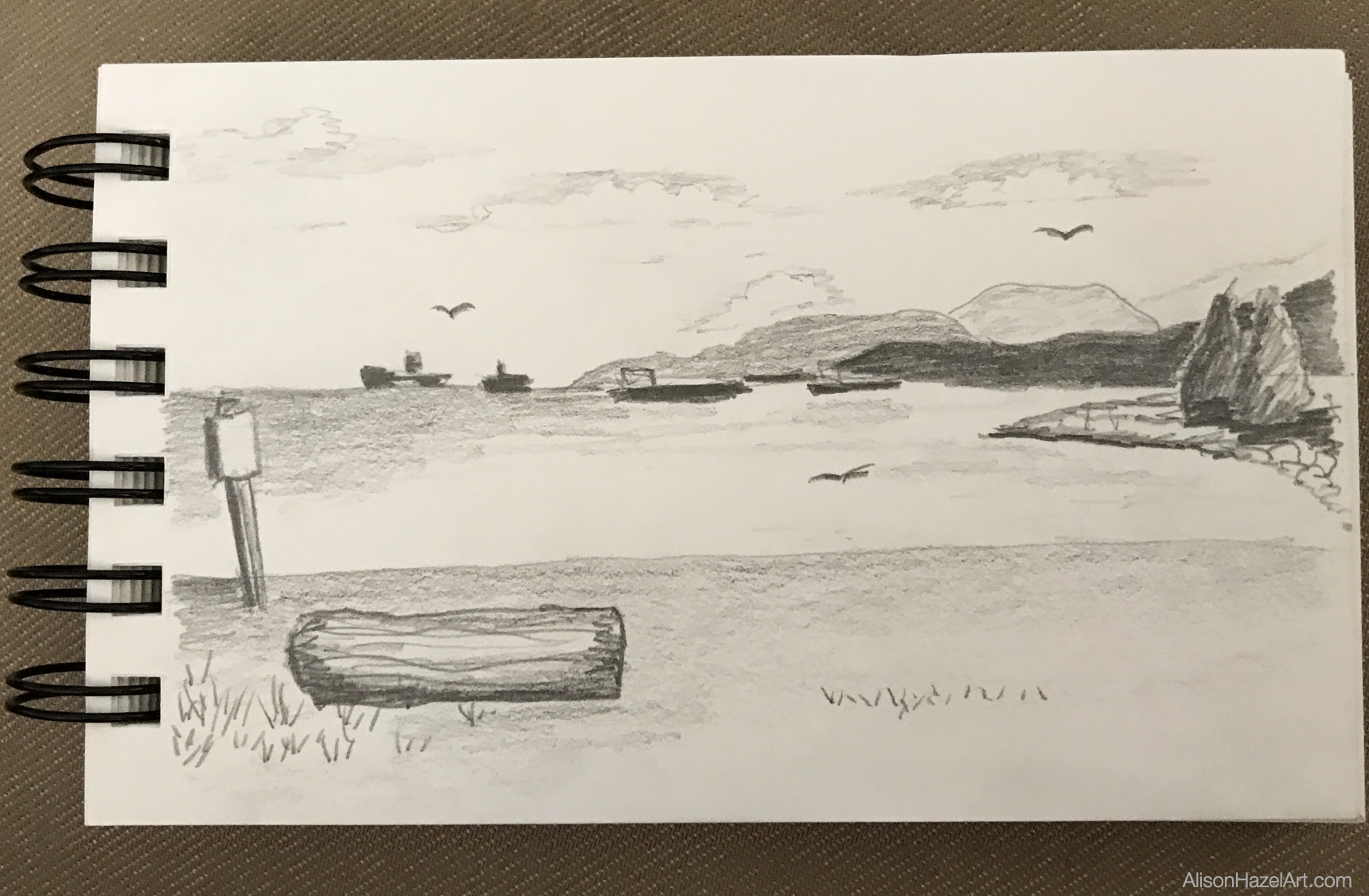
I divided the page into three horizontal bands with the sky, the sea and the sand.

I wanted to make sure to pick up the three distant mountains in the background.

On the far right there was the small curve of a cove which was slightly raised with boulders and had a few fir trees at the edge of the drawing.

There was a huge log of a Redwood tree that the city plonks on the beach for people to sit on and there happened to be one right in front of me, so I just drew it.

There was plenty of people on the beach, but I didn’t add them into my sketch.

Sky

I did attempt to show the clouds in the sky.

It was very difficult with just my pencil.

Clouds are subjects that I find challenging to draw.

Sea

The sea was mainly low flappy wave and I added plenty of little horizontal lines going across the page indicating the motion of the sea.

Beach

For the beach sand, I really drew many dots (and I think it is called pointillism) just to show the texture of the sand.

Although it was very smooth sand, it still had a grainy texture that’s why I tried to express it with dots.

Composition

The three areas on my page, the top, middle and bottom the top being the sky with the clouds, the middle being the ocean with the waves little horizontal dashes and then in the foreground the beach with the dots.

There probably are other ways of depicting these textures, but this is where I am in my art journey.

I added a signpost which I couldn’t read that was stuck in the sand.

Timing

I did enjoy the hour I sat at the beach. It was glorious fresh air, lovely sunshine and it wasn’t too hot although it was promising to be 28C degrees today.

I didn’t want to be there much longer.

Studio Sketch

When I got home, I made a cup of tea and took a bit of a rest.

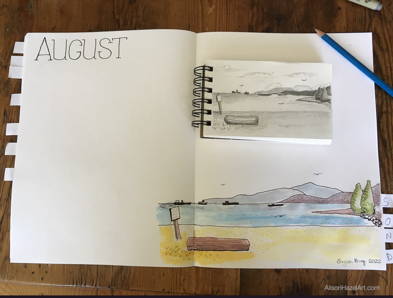
Then I got out my perpetual nature journal because this is where I wanted to add this drawing.

To me nature is all the outdoors on the Earth where we live. It is the environment we live in and our relationship within it.

I don’t believe that nature journaling is required zoom in on one little ladybug or a leaf, it can certainly be the landscape around us as well.

With my 2H pencil I just sketched out in the bottom right hand of my August page in my perpetual nature journal.

I sketched out the main structures in this drawing.

I then went over it with a 0.5mm black pen just to give the shapes some form.

Colored Ink

As I am continuing to work with my Windsor and Newton drawing inks as my current favorite medium, I wanted to once more practice working with them.

I used my inks to colour in the sea, the trees, the mountains and the beach.

I was very aware of watering these inks down.

Inks are unforgiving and once you’ve laid them on the page you really can’t move the color.

In this way inks are not at all like watercolors.

I used a very small brush, I think it was a number 4 and slowly added the impression of the landscape that I was drawing.

Black and Grey Pen

After leaving it to dry I went back in with my black pen.

I also had a grey pen just to add some textures to the log to the sand to the water and to the trees in the distance.

Improvement as an Artist

I would like to be a better artist.

Style

I know that if I keep practicing, I probably will be better, but the art I can do today is the best I can do.

I would love to be able to do a pond of waterlilies like Monet, just for the hint of the image in the painting and I do admire his work.

I’m also a huge fan of Van Gogh’s work with all his many brushstrokes.

Hobby Artists and Colored Inks

At the moment I’m still learning art as a hobby artist.

I’m getting better with my pen work and I’m getting a little better with my colored ink work although that still is going to require a lot of effort.

This is probably the fifth painting I’ve done with colored inks, so I’m still learning this medium so very much.

Perpetual Nature Journal

The third thing I’m really starting to enjoy is working with my perpetual nature journal .

Where it becomes an ongoing journal.

This Year

It is divided into twelve months and each month I can do the drawing of that month within the page and date it for the year.

Next Year

Then next year in August I can come back and do another drawing and add it to the August page.

I do believe there is further potential for other types of perpetual journals and I’m looking into that as well.

I do enjoy doing these artworks.

I find it greatly meditative and relaxing.

I believe creating simple art brings mental clarity and this is what I’m enjoying as well.

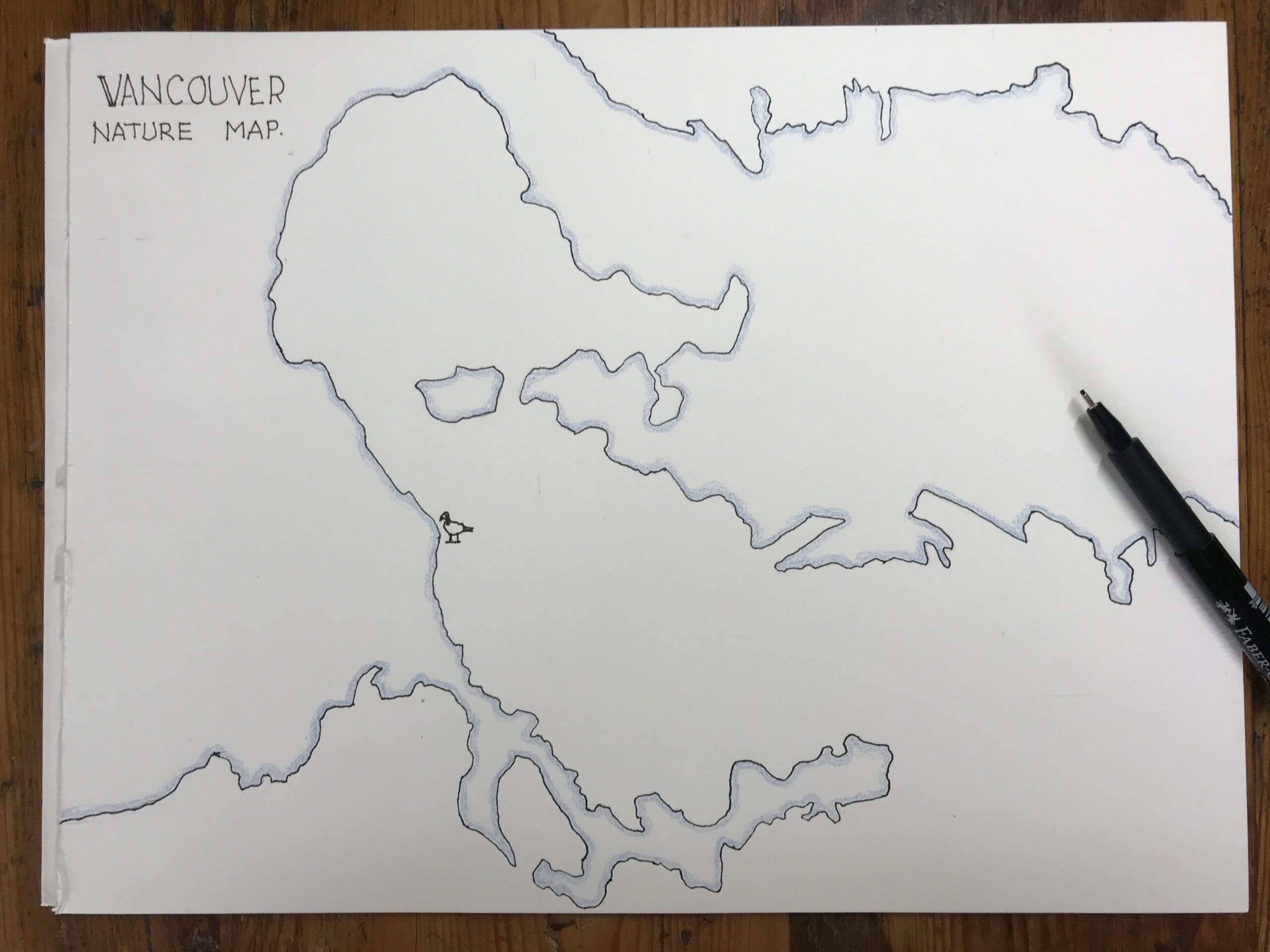
Vancouver Art Map

Creating an Art Map

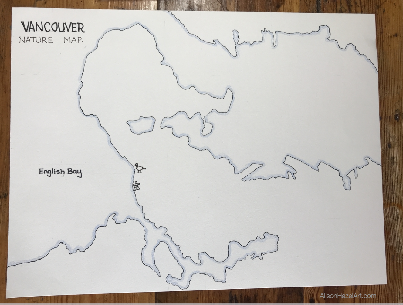
I have an art map for all the field sketching I do in and around my local area.

I created it by copying the map from Google and drew the outline of the coast on to a large piece of paper.

I plan to frame my Vancouver Art Map and hang it in my studio one day.

Sketch

I added this week’s art outing to my Vancouver Art Map.

The position was very close to where I drew the Canada Geese and the Inukshuk pen and ink before.

Clearly, I need to venture farther afield in my sketching life soon.

Aspiring Artist Activity

Take your field sketchbook, some pencils and an eraser and go out to a local beauty spot in your area.

Field Sketch

  • Choose a composition that appeals to you.
  • Sketch it out keeping it simple spend at least 30 minutes on this sketch.

Studio Sketch

  • When you get home crack open your perpetual nature journal and start working either in pen and ink, colored inks or whatever art medium is your favorite now. For example, last year I really thought I was going to become a watercolor painter, but I did struggle with it as it was hard. This year I’ve moved onto colored inks and I’m trying to work with this medium as much as possible.
  • Make sure to enjoy what you are doing.
  • Spend at least one hour on your studio sketch and finish it off the way you like.

Thank you for sharing your day with me,

Alison

Alison Hazel

Author Bio: Alison Hazel

Alison Hazel is a hobby artist and she shares her ongoing journey about becoming an artist later in life. She creates simple art that anyone can make. She hopes to inspire you to reach your creative potential in the area that suits you.

Read more about Alison’s story.

Send Alison a quick message.

AHAtober 2024

AHAtober 2024

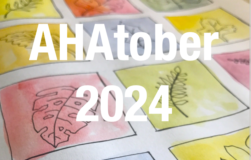
Author: Alison Hazel   -   Published: July 2024 AHAtober 2024 Welcome to AHAtober 2024! AHAtober is a special event for meditative artists, inspired by the popular Inktober challenge. This month-long journey is designed to bring calmness and creativity together,...
Artzlife Newsletter

Artzlife Newsletter

Author: Alison Hazel   -   Published: December 2024 Artzlife Newsletter Creative art journal inspiration for hobby artists Welcome to a Place for Passionate Hobby Artists Are you a hobby artist seeking inspiration, connection and gentle guidance on your creative...
Crystal Ink Swatches

Crystal Ink Swatches

Ink Swatches

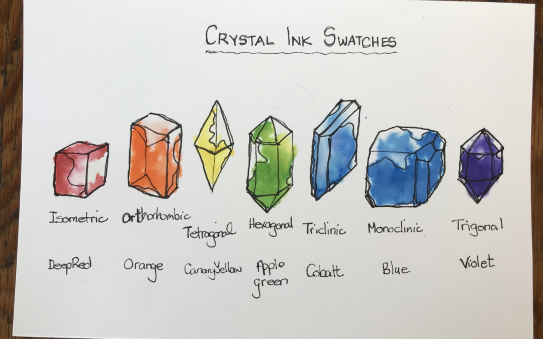
This time I’m creating color ink swatches for the seven colours of the rainbow.

I’ve always felt that paint, ink or colored pencil swatching could be created in a way to make an art piece.

I like working with color and art but dislike not having anything to show for it at the end.

I believe that all my art practice should be beautiful and so I decided to take my swatching up a notch.

Instead of just doing the swatch on a square grid, I’m going to create some artworks as I do this swatch.

These will be in the shape of crystals.

I’ll be using my new favorite Windsor and Newton drawing inks.


style="display:block; text-align:center;" data-ad-layout="in-article" data-ad-format="fluid" data-ad-client="ca-pub-4471307604888511" data-ad-slot="7787961343">

Seven

Seven is a popular number found in everyday life. There are seven days of the week and seven colors of the rainbow, seven chakras and now seven crystal forms.

I’ll be using the seven colors of the rainbow for my ink swatches.

I selected one of the seven forms with a crystal in that form which matches the colour. I will be using artistic license for these images.

Clearly, I’m not using all the colors available in the Windsor and Newton drawing inks range.

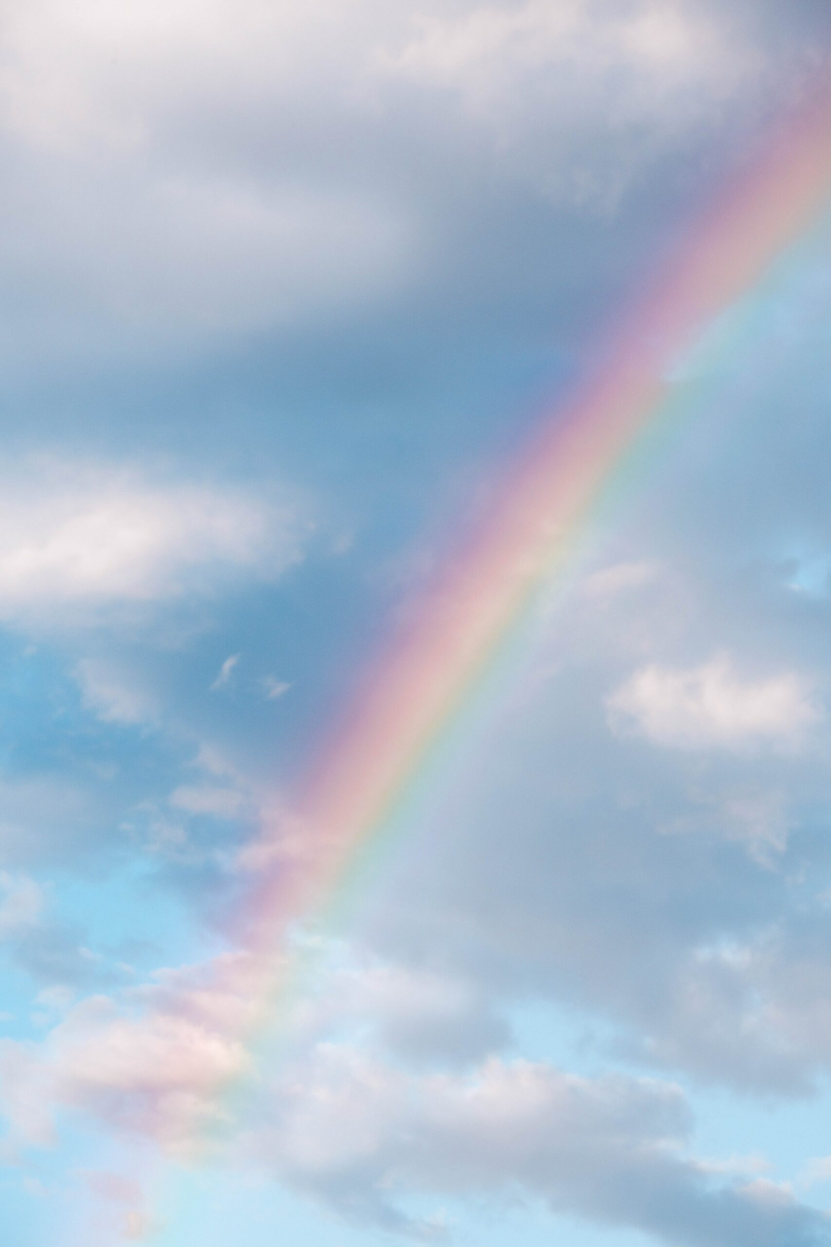
Rainbow

It’s always handy to work in groups of seven as there are seven colours in the rainbow. These colours are broken out from white light which is the true energy.

The seven colours of the rainbow in order are red, orange, yellow, green, blue, indigo and violet.

In a rainbow usually the red is always on the outer circle and violet is always on the inner cycle.

Beyond both ends of the rainbow is where we find infrared, before the red, and ultraviolet, after the violet.

We cannot see these color with our eyes, although scientists can measure them.

Art Supplies

For swatches or ink swatches you can use what you have.

There really is no need to get the exact supplies that I’m using. I believe as an artist you probably have what you need right in your own home.

The specific art supplies which I used are listed here:

Art supplies

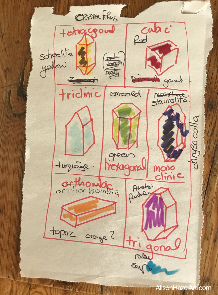
Crystal Forms

In nature, a crystal habit is how it forms.

A crystal’s form is determined by the number of axes and faces on the crystal.

The seven crystal forms are:

  • Isometric
  • Tetragonal
  • Triclinic
  • Hexagonal
  • Monoclinic
  • Orthorhombic
  • Trigonal

Each of the crystal forms has many crystals associated within that form.

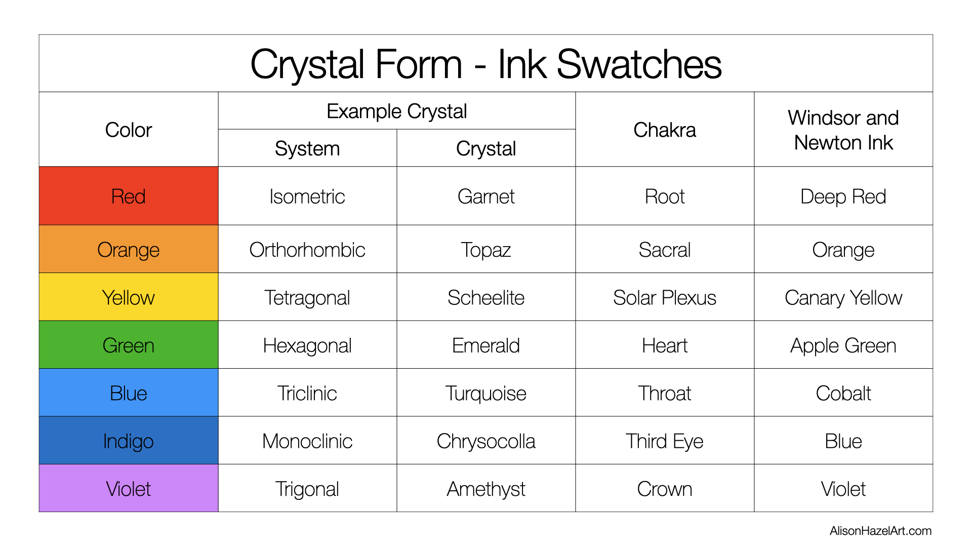
I have selected one colour from each group that matches one of the seven colours of the rainbow for my drawing ink swatches.

Isometric Crystal

Definition

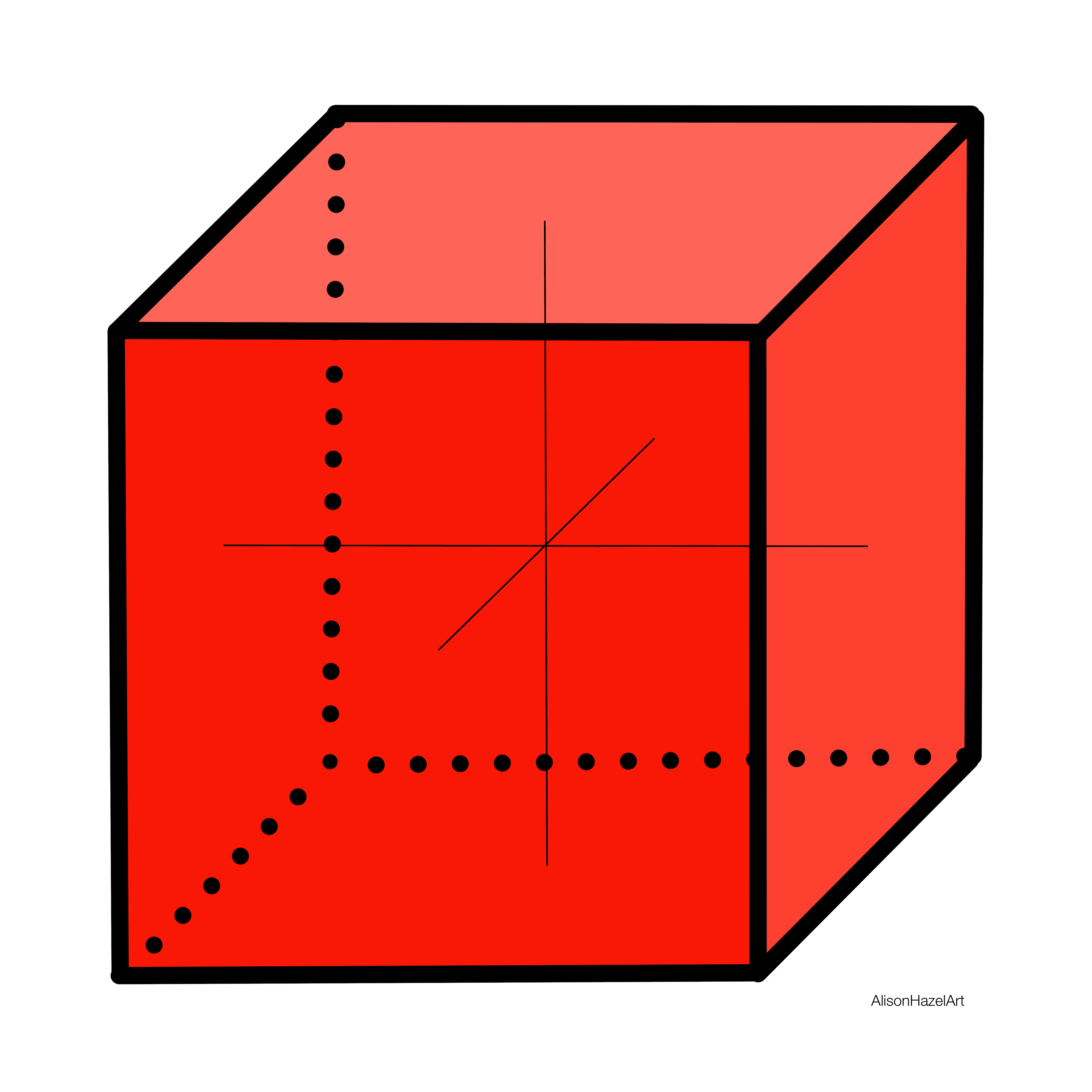
Isometric crystals have all three axes the same and are at right angles to each other.

Isometric Crystal Examples

Examples of isometric crystals are the garnet an icositetrahedron and the spinel an octahedron.

An example of a red crystal in the isometric crystal form is the garnet.

Isometric Crystal Examples

Examples of isometric crystals are the garnet an icositetrahedron and the spinel an octahedron.

An example of a red crystal in the isometric crystal form is the garnet.

Orthorhombic Crystal

Definition

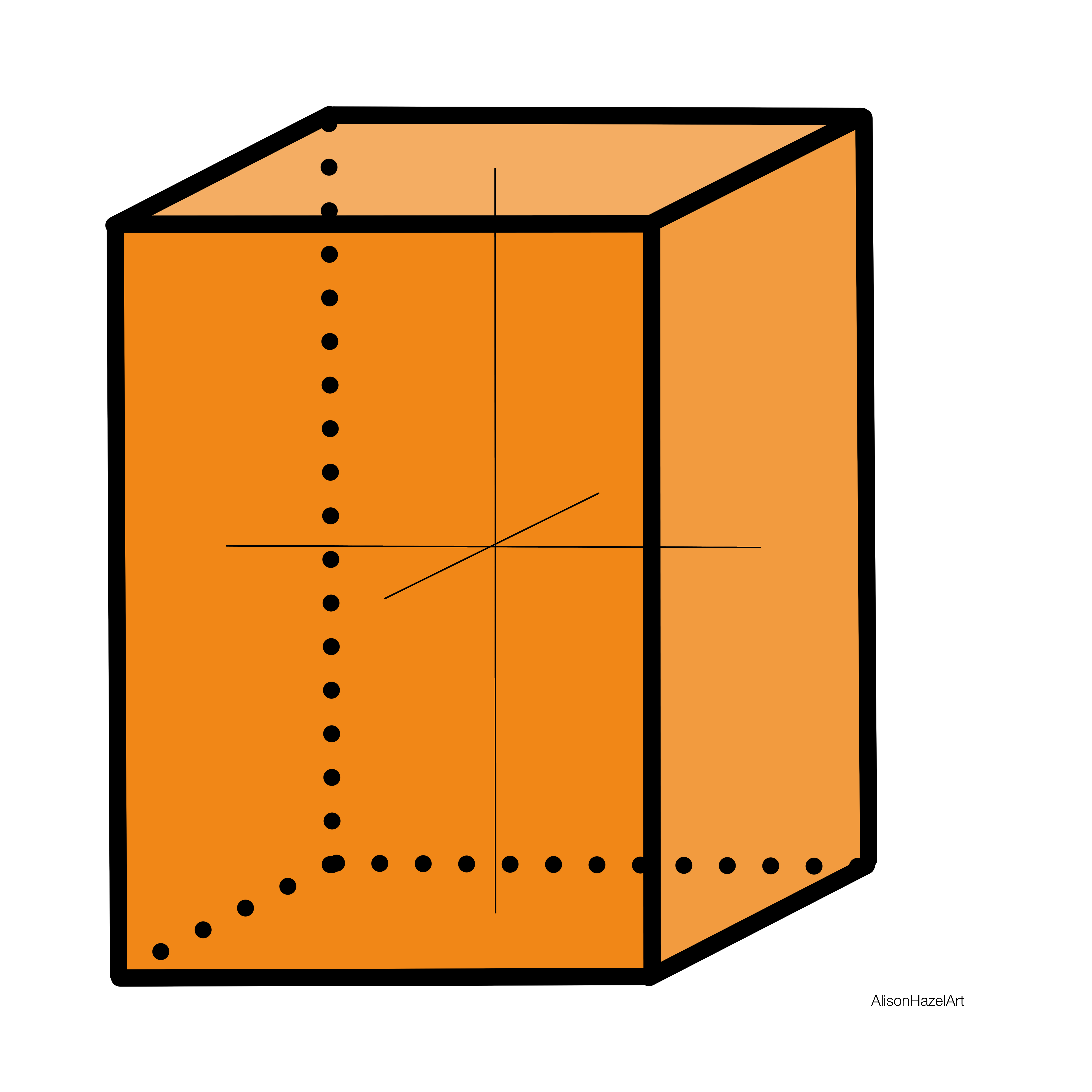
Orthorhombic crystals have three axes of unequal length. Two are at right angles to one another and the third is perpendicular.

Orthorhombic Crystal Examples

Examples of the orthorhombic crystal structure are the peridot and topaz.

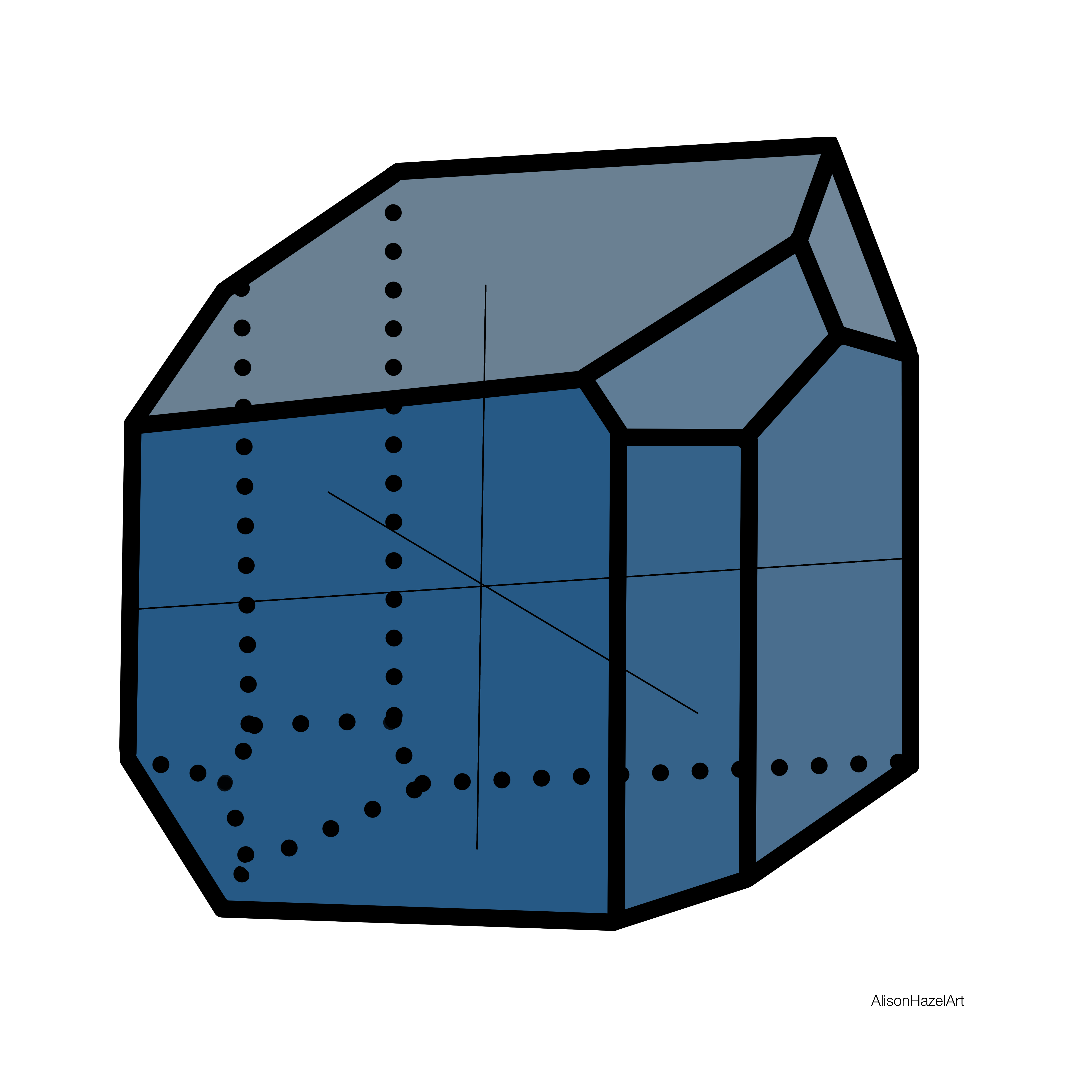
I chose to draw an orange crystal from the orthombic form and this one is a topaz.

Tetragonal Crystal

Definition

Tetragonal crystals have three axes which are at right angles to each other. The two on the same plane are equal in length while the third is perpendicular to this plane and of different length.

Tetragonal Crystal Examples

Examples of tetragonal crystals are the zircon and the scapolite.

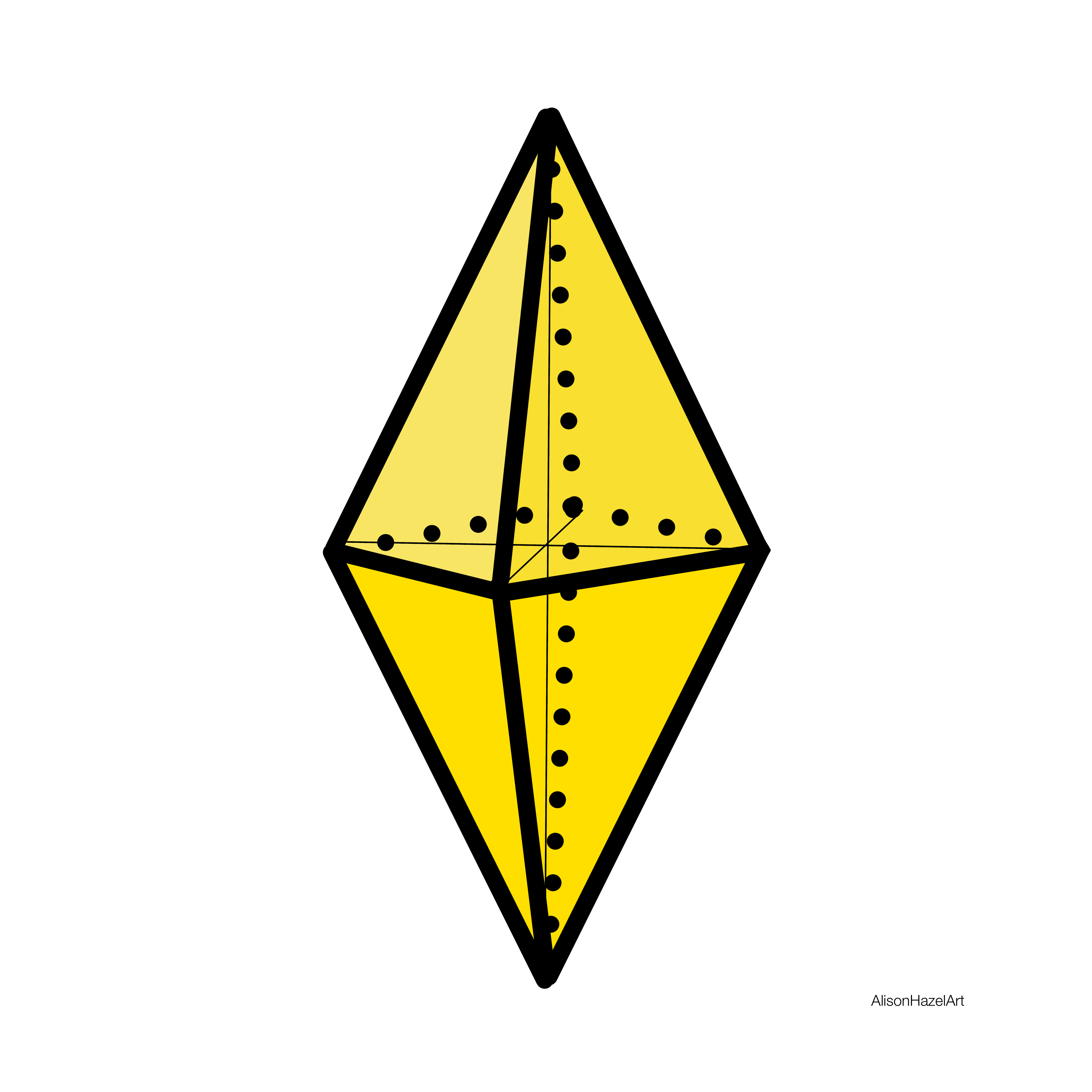
An a yellow crystal in the tetragonal form is scheelite.

Hexagonal Crystal

Definition

The hexagonal crystal has three of the four axes all in one plane and intersect at 60°. The 4th axis is perpendicular and unequal in length to the other. There are six planes of symmetry.

Hexagonal Crystal Examples

Examples of hexagonal crystal are the apatite and the beryl.

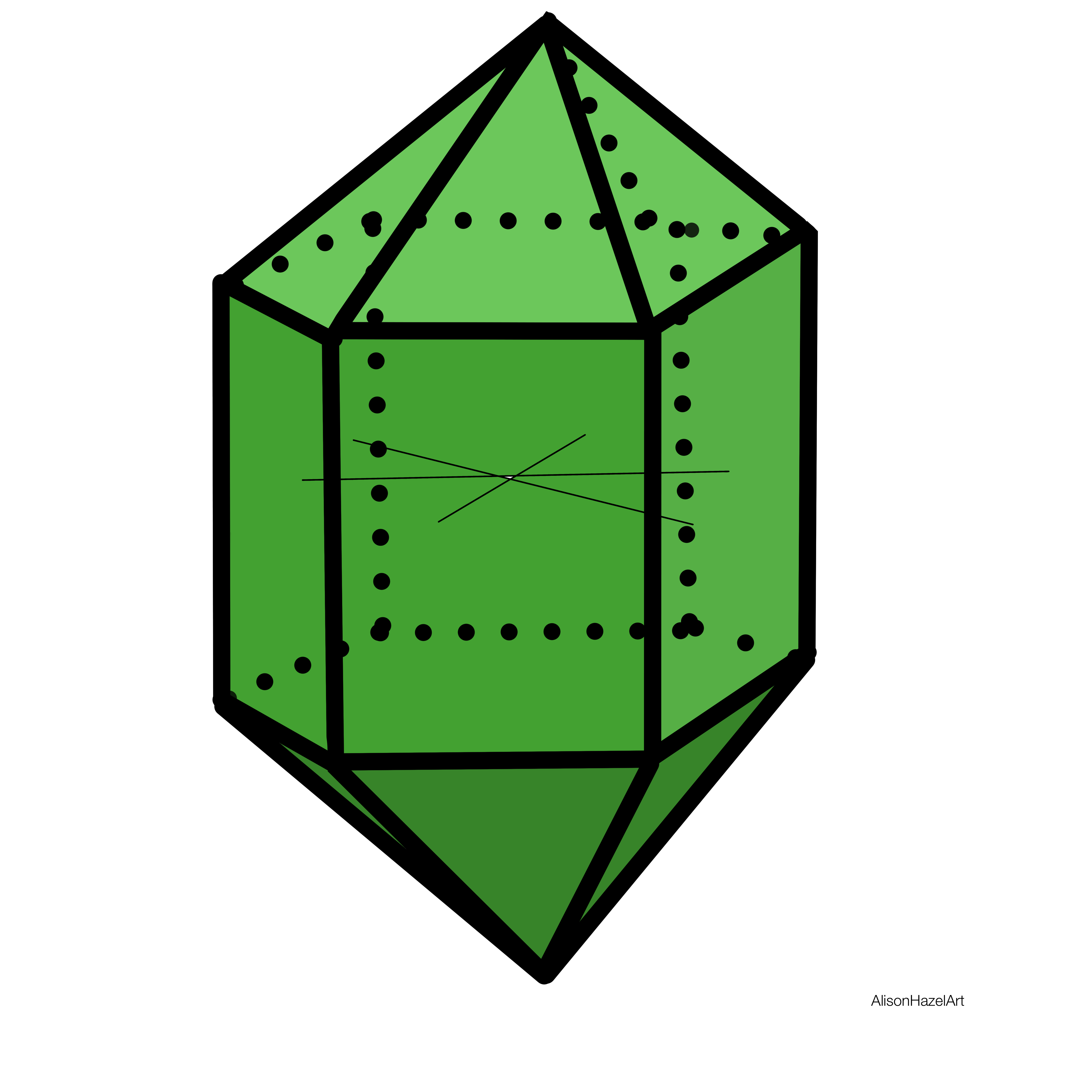
A much-loved hexagonal form crystal is the emerald which are green.

Triclinic Crystal

Definition

The triclinic crystal has three axes of unequal length all inclined to one another at different angles.

Triclinic Crystal Examples

Amazonite (alkali feldspar) and rhodonite are examples of the triclinic crystal form.

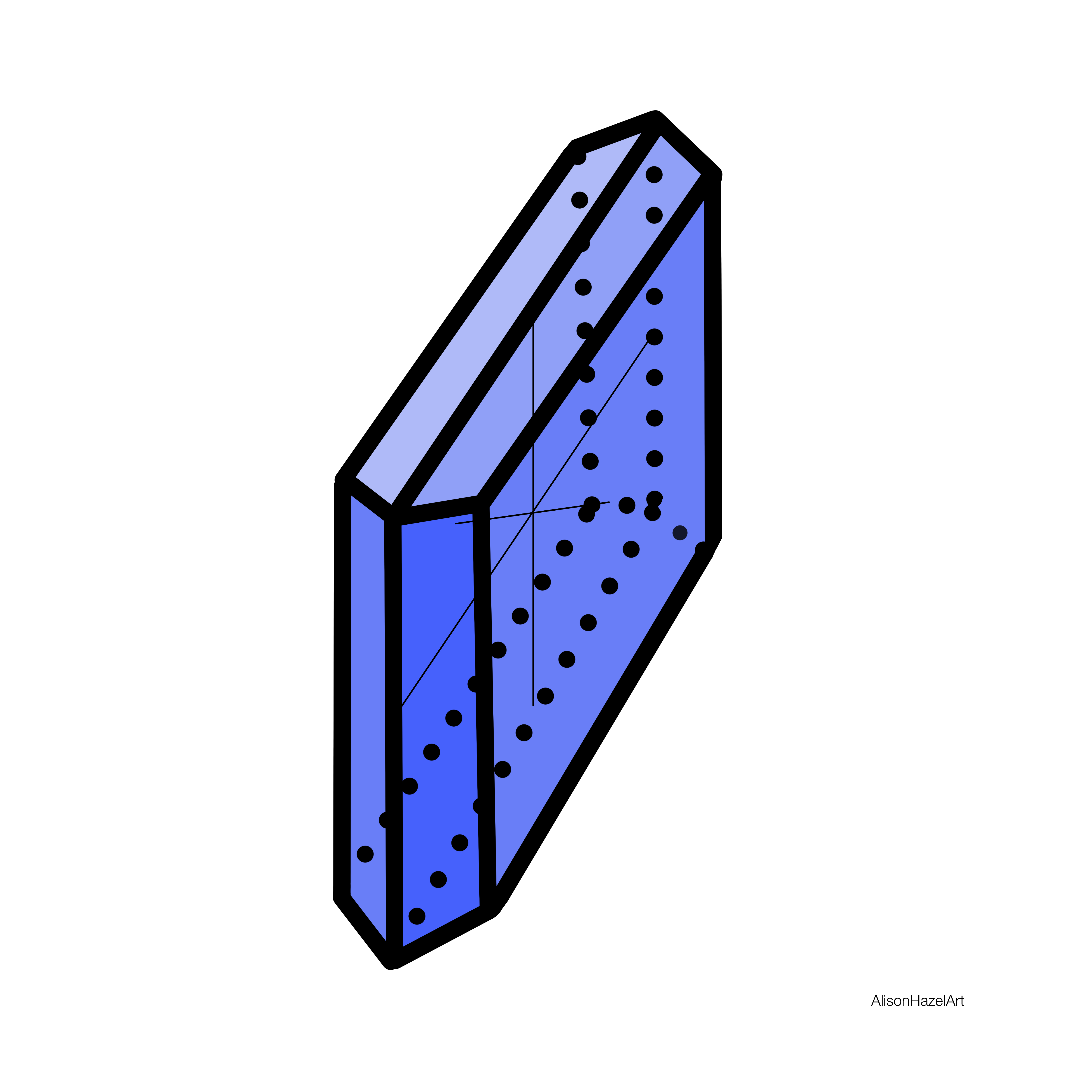
The example I’ve chosen for a blue crystal in the triclinic form is the turquoise blue.

Monoclinic Crystal

Definition

The monoclinic crystal has three axes of unequal length. Two intersect at an oblique angle in one plane and the third is perpendicular.

Monoclinic Crystal Examples

Examples of monoclinic crystals are the epidote and orthoclase feldspar.

In the monoclinic crystal form I have selected the crystal chrysocolla which is often an indigo color.

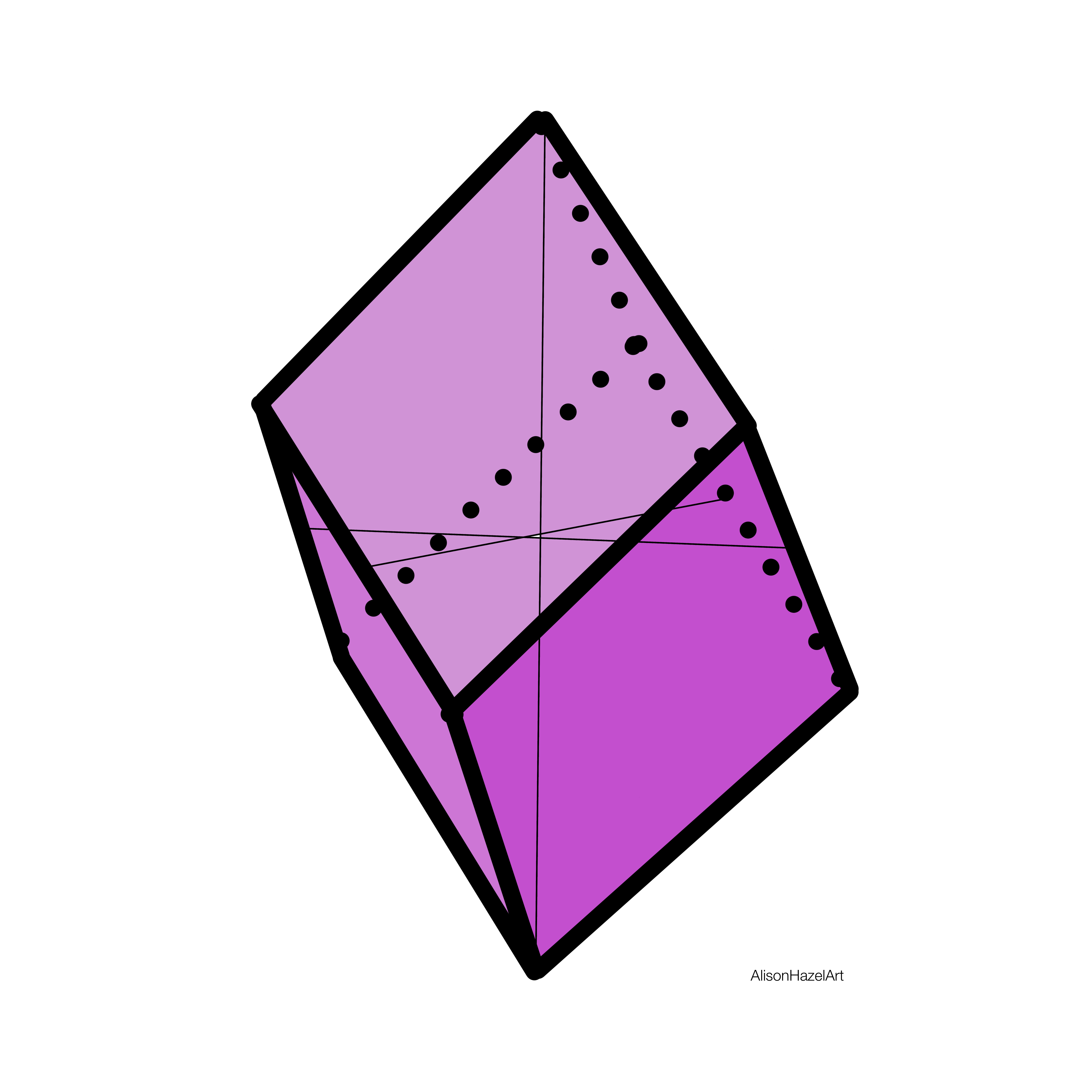
Trigonal Crystal

Definition

The trigonal crystal is similar to the hexagonal system. There are three axes at 60° to each other in the same plane. The fourth axis is perpendicular. There are three planes of symmetry.

Trigonal Crystal Examples

Quartz and sapphire are examples of the trigonal crystal form.

There are many crystals in the trigonal form and the one I have chosen is amethyst which is violet.

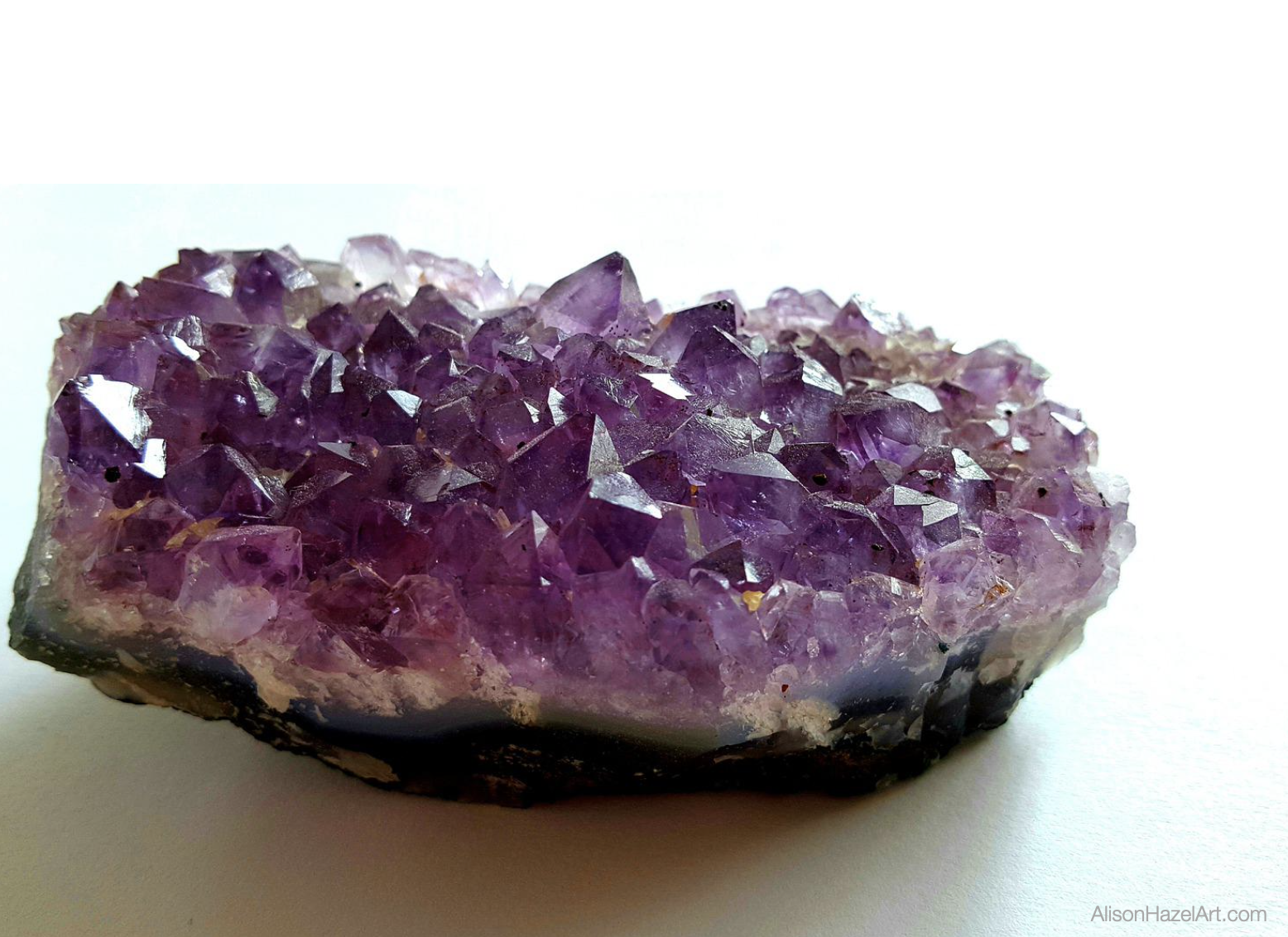
Amethyst Cluster

A popular way to draw an amethyst is in cluster form.

These are highly popular crystals because they form points and sometimes points for both ends.

They are often used in new age practices and crystal healing.

An amethyst cluster will emanate good energy into a room.

Crystal clusters are highly popular as gorgeous décor items which you can place on a coffee table.

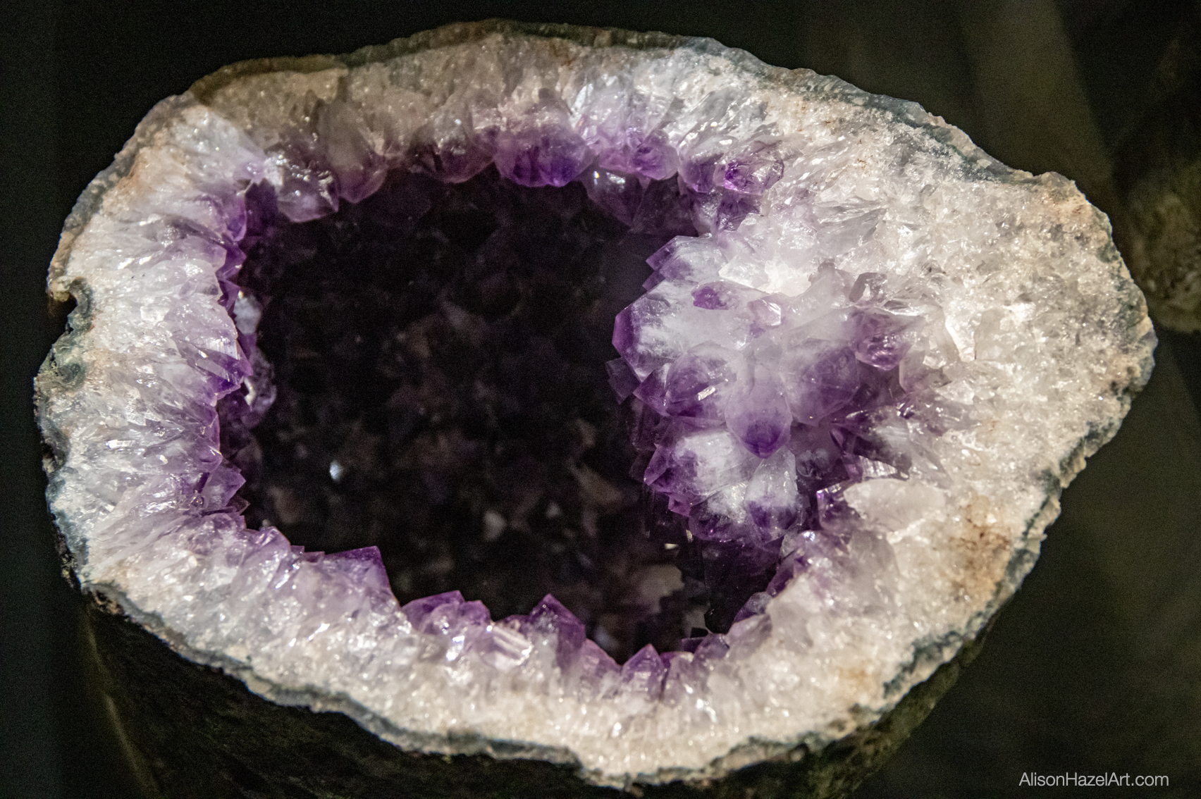
Amethyst Cathedrals

The way amethyst crystals grow are sometimes as original bubbles trapped within an ancient lava flow.

The minerals get trapped within the bubble and overtime crystallize.

These bubbles can either be small as geodes, but when they became very big, they are known as cathedrals.

An amethyst cathedral can be spectacular and a great addition to your home or office style.

style="display:block; text-align:center;" data-ad-layout="in-article" data-ad-format="fluid" data-ad-client="ca-pub-4471307604888511" data-ad-slot="7787961343">

Process

Many of you ask about my process and how I created this artwork.

Research for Ink Swatches

I did some research to start with as I needed seven crystals in particular colors.

I wanted the color sequence to go as on the rainbow which is from red to violet.

I had to explore the crystal forms and find out which crystals were the correct color that I required to use for my rainbow.

Crystal Forms

I investigated each crystal form to find for instance a red crystal for the isometric and a green crystal for the hexagonal.

Even though there are many different crystals within the same form they’re not all the same colors.

I also spent quite a bit of time studying the crystal axes and faces and what that really meant.

To be honest I still don’t fully understand this part, but I do have a couple of sketches to help determine which crystal is which.

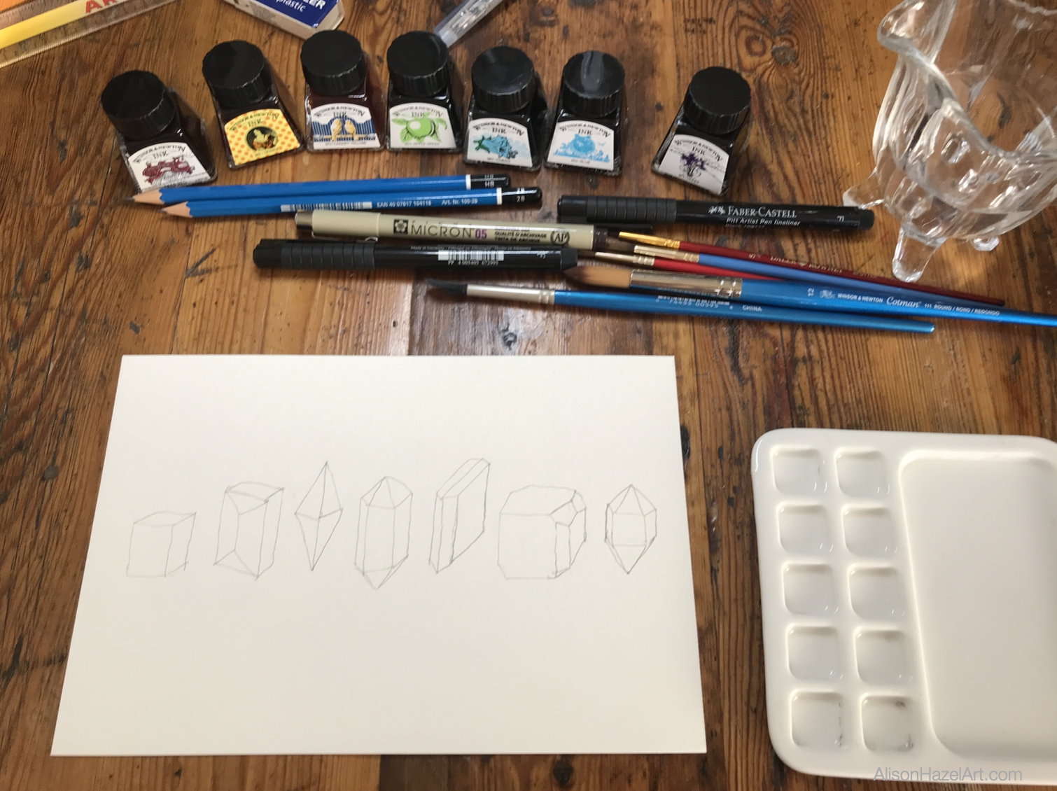
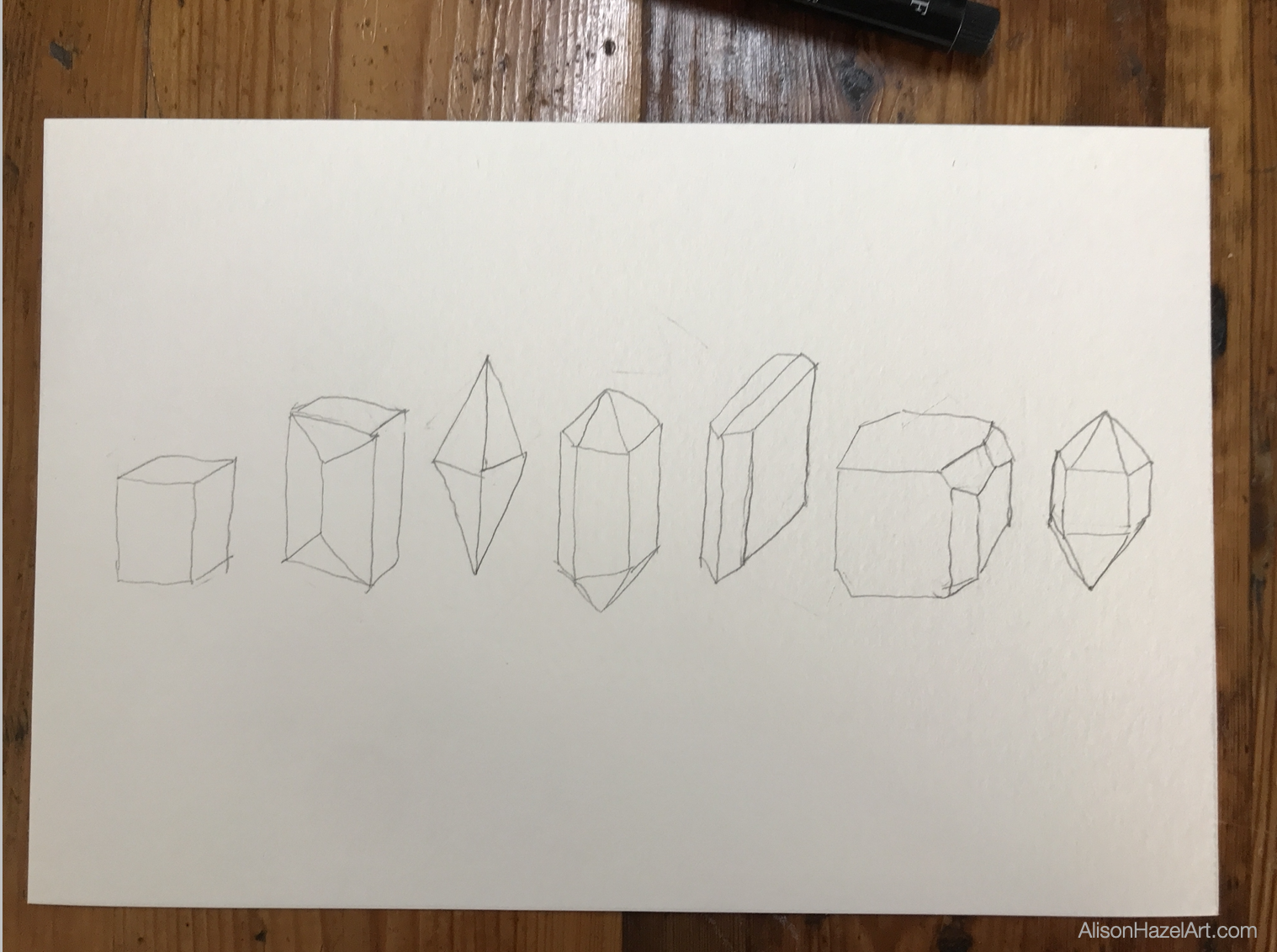
Pencil Sketch

Seven Crystals

Once I had decided which color crystal I was going to use for each form, I laid the crystal shapes out in the order of the colors that I had chosen because I wanted it to go from red to violet.

Now technically this may not be the natural way that you would list crystals because I understand there is a particular pattern, but I moved it around because I wanted to use the different colors crystals.

What the forms were didn’t really matter to me because I was going to be using my inks.

With a 2H pencil I started with to lightly sketch out these crystals.

Although technically when a crystal grows it can be perfect, very often in nature they are not.

Crystals frequently contain flaws, imperfections, cracks and cloudiness within them.

It all depends on which other minerals were around at the time it grew.

When you draw your crystals, they don’t have to be exact and mine certainly are not.

Black Pen

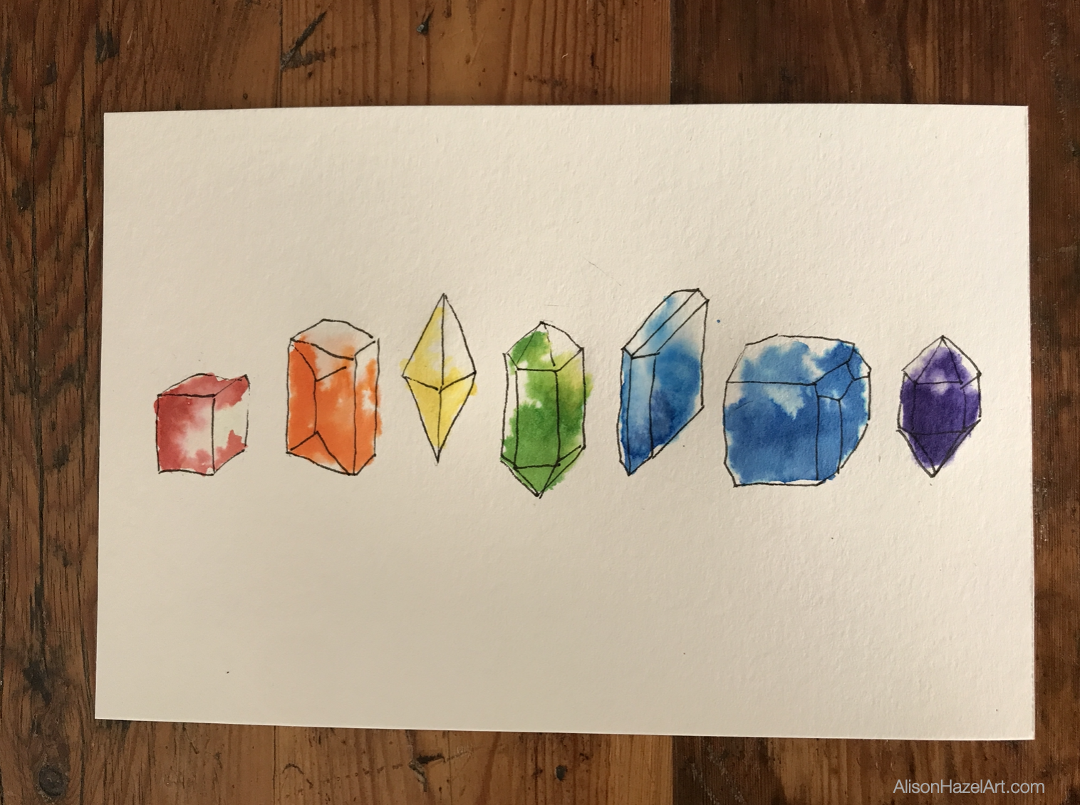
With a 0.5mm black pen and I went over the main outlines of the shapes.

I used a light touch because these lines are a guide on where to place the ink.

crystal image

Colored Ink

Now comes the fun part where we start to use the colored drawing inks.

Red Ink

I started with the red end, so the ink color is called deep red.

I took a clean paint brush and put some of the red ink into the well on my palette so I can see what I’m doing.

With a clean paintbrush which had water on it, I gently laid some water over the shape of the crystal.

Next, I picked up my red ink on my paintbrush, not diluted, and I started dabbing it into the water of the shape of the crystal on the page, so it will naturally disperse and move.

In a way ink is very much like watercolor but it is lighter, and I do enjoy using it.

Orange Ink

For the second crystal, which is orange, I used the ink called orange which is great.

With a clean paint brush, I picked up some orange ink straight out of the ink pot and put it into my palette well.

Then I wet the shape of the crystal with some plain water and dabbed some orange straight onto the crystal.

The idea that I was going for is that it would create a mottled effect, but we can still see the color of the ink.

I’m making ink swatches is so even though there will be some dark areas of ink there will be a lot of light parts as well.

Yellow Ink

There are a couple of yellow inks in the Winsor and Newton drawing in collection.

I chose the Canary yellow for this project.

With a clean paintbrush, I picked up some yellow and put it in the well on my palette.

I wet the crystal with plain water and added some dabs of yellow ink.

Green Ink

For the middle hexagonal crystal, which is going to be green, I chose the ink color called Apple green.

Funnily enough there is an ink called Emerald green in this suite of inks, but I didn’t like the way it was. It was a little too blue for my liking, so that is why I went with the Apple green color.

I wet the crystal and dabbed in some Apple green ink to the crystal.

Blue Ink

The next color in the rainbow is blue. In my stash I have two blue inks namely Cobalt blue and Blue.

For this project I chose the cobalt blue for the blue crystal because I was going to use the other regular blue for the indigo.

With the clean paintbrush I picked up some cobalt ink straight from the pot and put it into the well in my palette.

Next, I wet the image of the crystal and added some cobalt ink into the shape.

Indigo Ink

For my indigo crystal I chose the ink that’s called Blue from the Windsor and Newton inks.

I believe they may have a darker blue as well or a more indigo blue, but I don’t own it, so that’s why I chose the Blue.

It also occurred to me that I could have gone in and used my regular fountain pen dark blue for this project, but that really wasn’t what I was going for.

The idea is that I’m swatching out my Windsor and Newton drawing inks.

Next I wet the crystal and then added some dabs of blue ink for the indigo crystal.

Violet Ink

For the seventh and final crystal which is going to be Violet, I chose the ink which is called Violet which is great.

In my general ink collection, I do have a purple as well which is far darker, so this Violet was a great choice for the Violet crystal.

This will be the amethyst crystal which I must say is one of my absolute favorite crystals.

For this final crystal I wet the paper and with a clean paintbrush I picked up some of the amethyst ink out of the ink pot and I dropped it into the well in my palette.

In this way I could see what I was doing I wet the image and then I gently dabbed some Violet ink into the final crystal.

Gold ink

Titles

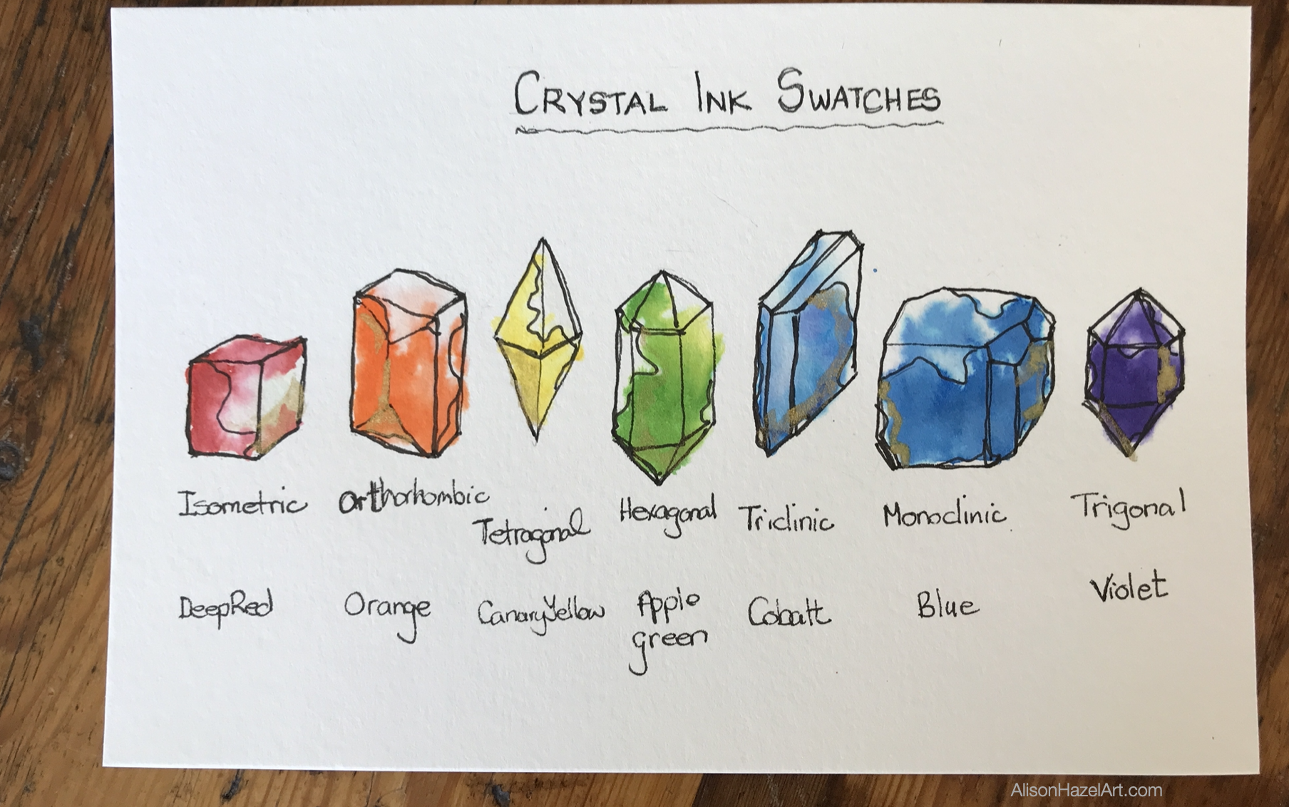
Below each crystal I wrote the shape name, the crystal form and the name of the ink color which I used for that crystal.

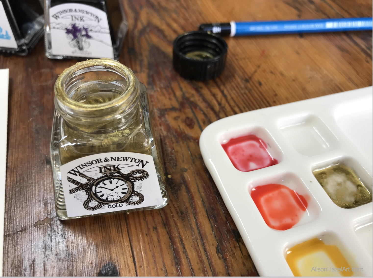
Gold Ink

Because I always seem to add some gold to all the images I do, I decided I would as well this time.

After all, why not?

I got out my gold ink and with a clean paint brush and straight form the ink pot I put some glimmer and shimmer onto each of the crystals.

Conclusion

I’m very happy with the final artwork.

I truly believe that doing a color swatch doesn’t have to be boring.

To add some more interest to a swatch makes sense to me.

There are other ways to do this without even doing crystals.

Perhaps you could do fruit where you would have a red fruit and an orange fruit and a yellow fruit and, in the end, you have created a delightful little artwork as well.

I know that making swatches is a valuable part of an artist’s practice, but swatches don’t have to be humdrum.

Thank you for sharing your day with me.

Alison

Aspiring Artist Activity

For this activity (which you can do with your kids) get your art supplies to hand and your sketchbook and please do the following:

  • Choose your art medium. It could be pencil crayons watercolors or inks it’s up to you.
  • Select the seven colors red, orange, yellow, green, blue, indigo and violet.
  • Using our images as a guide, draw out seven crystal forms. If you find these drawings a bit tricky just work with the small cube first, alternatively you could do fruit.
  • Color in the crystals making sure to have some dark full color at the bottom that fades lighter towards the top.
  • Label each color with the correct color name from your art medium for example cadmium yellow so you know exactly which color you used.
  • Write a title on your swatch so you will know exactly which medium you used whether it was your Faber Castell polychromos crayons, your watercolor paints, or your Winsor and Newton drawing inks.

Share Your Artwork

You can share your artwork on social so everyone can see what you created.

If you add the hashtag #AHAactivity I can find your work as well.


style="display:block; text-align:center;" data-ad-layout="in-article" data-ad-format="fluid" data-ad-client="ca-pub-4471307604888511" data-ad-slot="7787961343">
Alison Hazel

Author Bio

Alison Hazel is a mature woman who shares her ongoing journey about becoming an artist later in life. She creates simple art that anyone can make. She hopes to inspire you to reach your creative potential in the area that suits you.

Go here to read more about Alison’s story.

If you want to send Alison a quick message go here.

More Articles

Here are some more articles for you to have a look at about the different types of art and other cool stuff we do on this blog.

Artzlife Newsletter

Artzlife Newsletter

Author: Alison Hazel   -   Published: December 2024 Artzlife Newsletter Creative art journal inspiration for hobby artists Welcome to a Place for Passionate Hobby Artists Are you a hobby artist seeking inspiration, connection and gentle guidance on your creative...
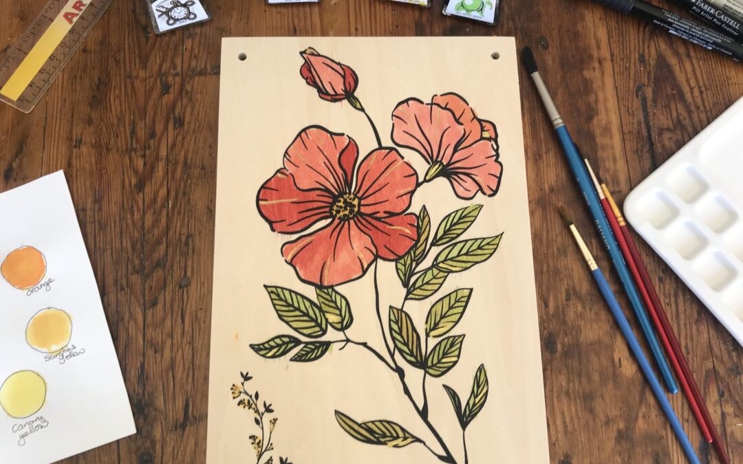
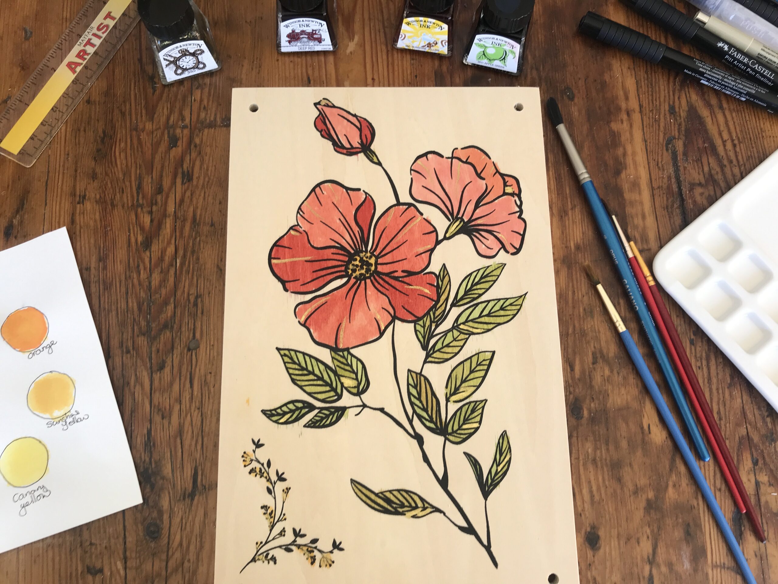
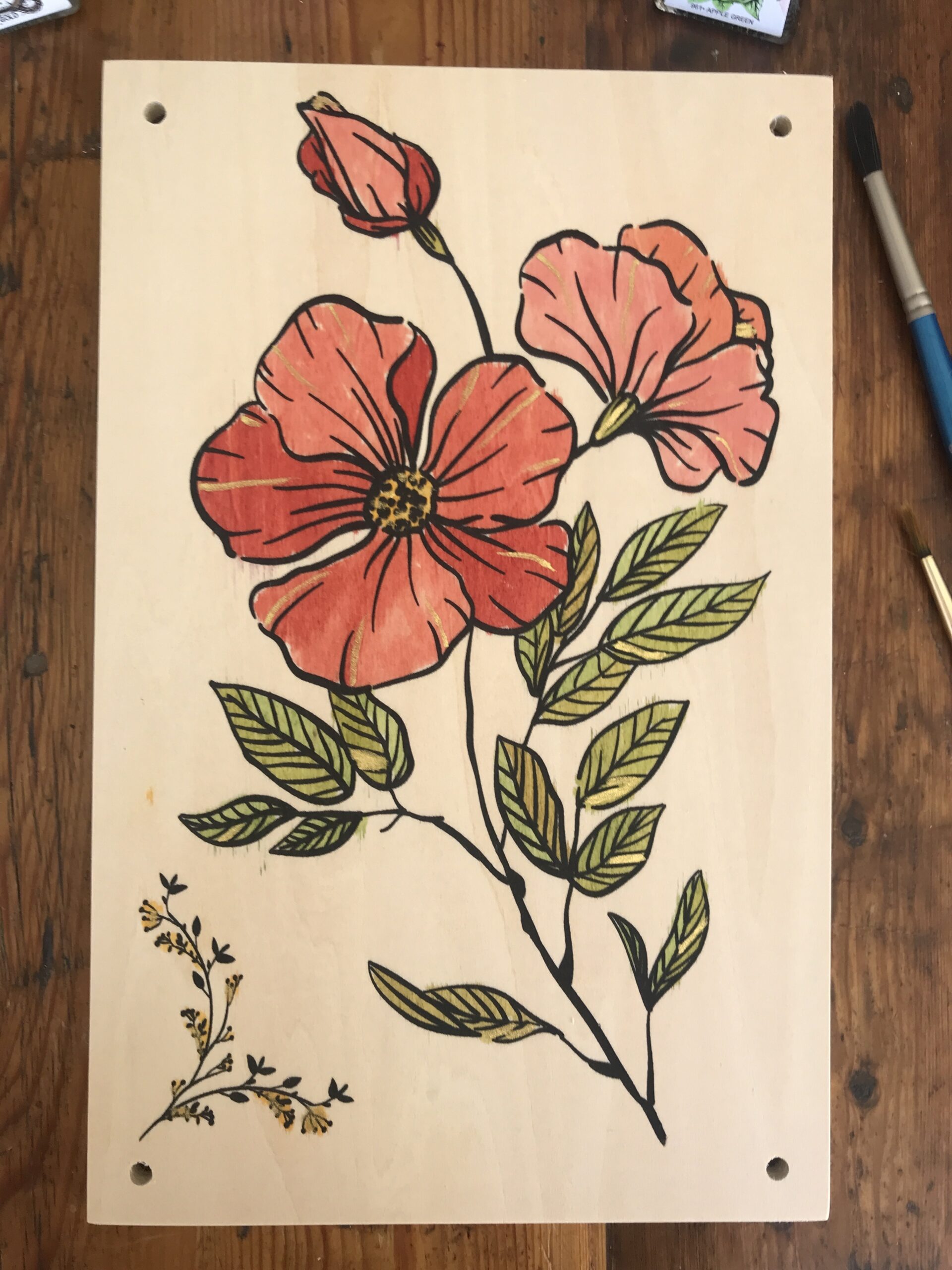
Painting My Flower Press Cover – Ink Art

Painting My Flower Press Cover – Ink Art

Author: Alison Hazel   –   Published: June 2022

Inspiration

In the first week of May I discovered the YouTube channel Daily Nature Journal and I was inspired to start a nature journal. Alex showed some pressed flowers that he was using in his nature journal and I was so interested, I decided to order a flower press for myself from Amazon. I plan to keep my flower press for years and eventually hand it down to my daughters as a family heirloom.
Unboxing Flower Press

I chose a flower press from Berstuk.co.uk. This flower press is made with plywood, not compressed chip board, and brass bolts not mild steel (which will eventually rust) brass does not rust. You can get the same flower press which I purchased on this LINK.

The flower press came in a box, with instructions and included all the bolts, wing nuts and washers you need. There is a front wooden panel with a flower outline painted on and a plain back panel. You also get cardboard and blotting paper cut to size with chamfered corners.

How to Use a Flower Press

This flower press comes with cardboard and blotting paper. You make a sandwich of cardboard, blotting paper, flowers, blotting paper, cardboard and repeat. You can have multiple sandwiches in the press. I hope to start pressing flowers soon.

Ink Colors

The colored inks I’m using are from Windsor and Newton. I recently got these inks and I’m enjoying learning to work with them.

Green

The apple green is quite bright and needs to be toned down with a little yellow.

Yellow

I chose canary yellow and this is used to mellow the green for the leaves. I also used the yellow for the centre of the flowers.

Red

The red is called deep red. I thin the red down to make it more pink.

Gold

I so often use gold in my artworks that it seemed quite natural to do so here as well. Although I had not thought of doing so until the end.

Process

First, I wiped the front panel with a damp kitchen towel to remove and dust or sawdust. Starting with the green I thinned it with water three to one and added a little yellow. This makes an olive green. I painted this on one side of a few leaves.

Next, I mixed more green and yellow and the second mix is slightly different to the first mix. I continue to paint the leaves with a few green and yellow mixes. I painted the center of the flower with yellow.

For the petals I took intense red and watered it down a little differently for each petal to give the flower some depth. Finally, I added a dash of gold ink here and there for highlights.

Heirloom

I let it dry overnight. I may varnish it later. I plan to keep it in the family like a family heirloom and pass it along to my daughters for their pleasure.

Aspiring Artist Activity

When you get your flower press paint the cover as follows:

  • Mix green and yellow ink for the leaves.
  • Mix yellow for the inside of the bloom.
  • Mix a tihn pink for the flower petals.
  • Add a touch of gold to bring your flower press to life.

Share

Share your completed flower press cover with the hashtag #AHAflowerpress so we can all see what you have created.


Alison Hazel

Author Bio: Alison Hazel

Alison Hazel is a hobby artist and she shares her ongoing journey about becoming an artist later in life. She creates simple art that anyone can make. She hopes to inspire you to reach your creative potential in the area that suits you.

Read more about Alison’s story.

Send Alison a quick message.

No Results Found

The page you requested could not be found. Try refining your search, or use the navigation above to locate the post.

Perpetual Nature Journal 🌱 Setup and Cover Page

Perpetual Nature Journal 🌱 Setup and Cover Page

Inspiration The idea of having a Perpetual Nature Journal which is different to a normal nature journal is that rather than starting at the front and working towards the back, depending on where I went and what I saw, I will be focusing on one or two nature features...

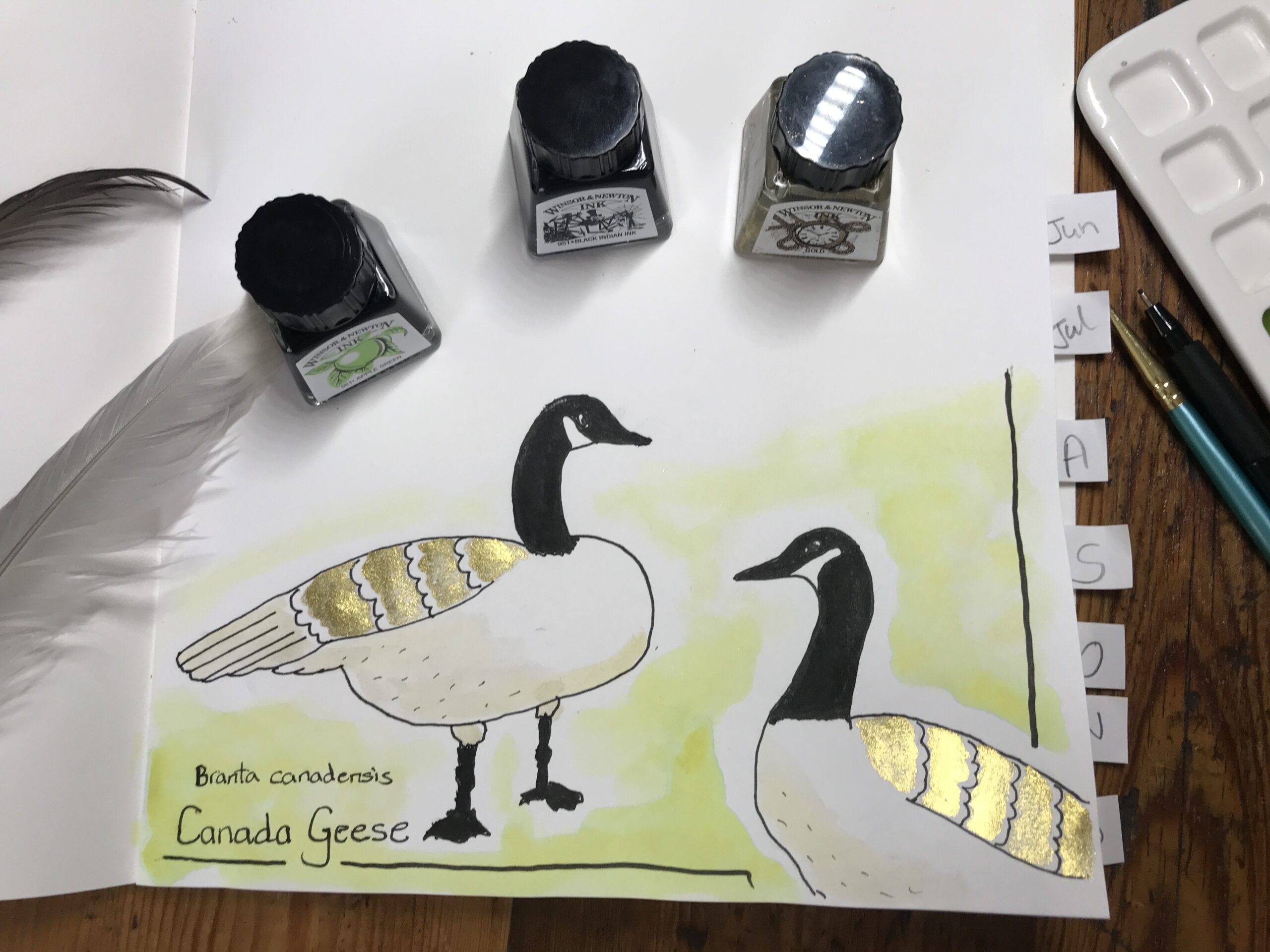
Perpetual Nature Journal – Canada Geese – Ink

Perpetual Nature Journal – Canada Geese – Ink

This week I went to the beach where the protected waters of English Bay laps desultorily at the coast in Vancouver. 

Just behind the foreshore and promenade is a well manicured strip of parkland comprising grass and flowers to enhance the nature beauty of the area. 

It is here that the Canada geese gather or is that flock? 

How many do you need for a flock?

Field Sketchbook

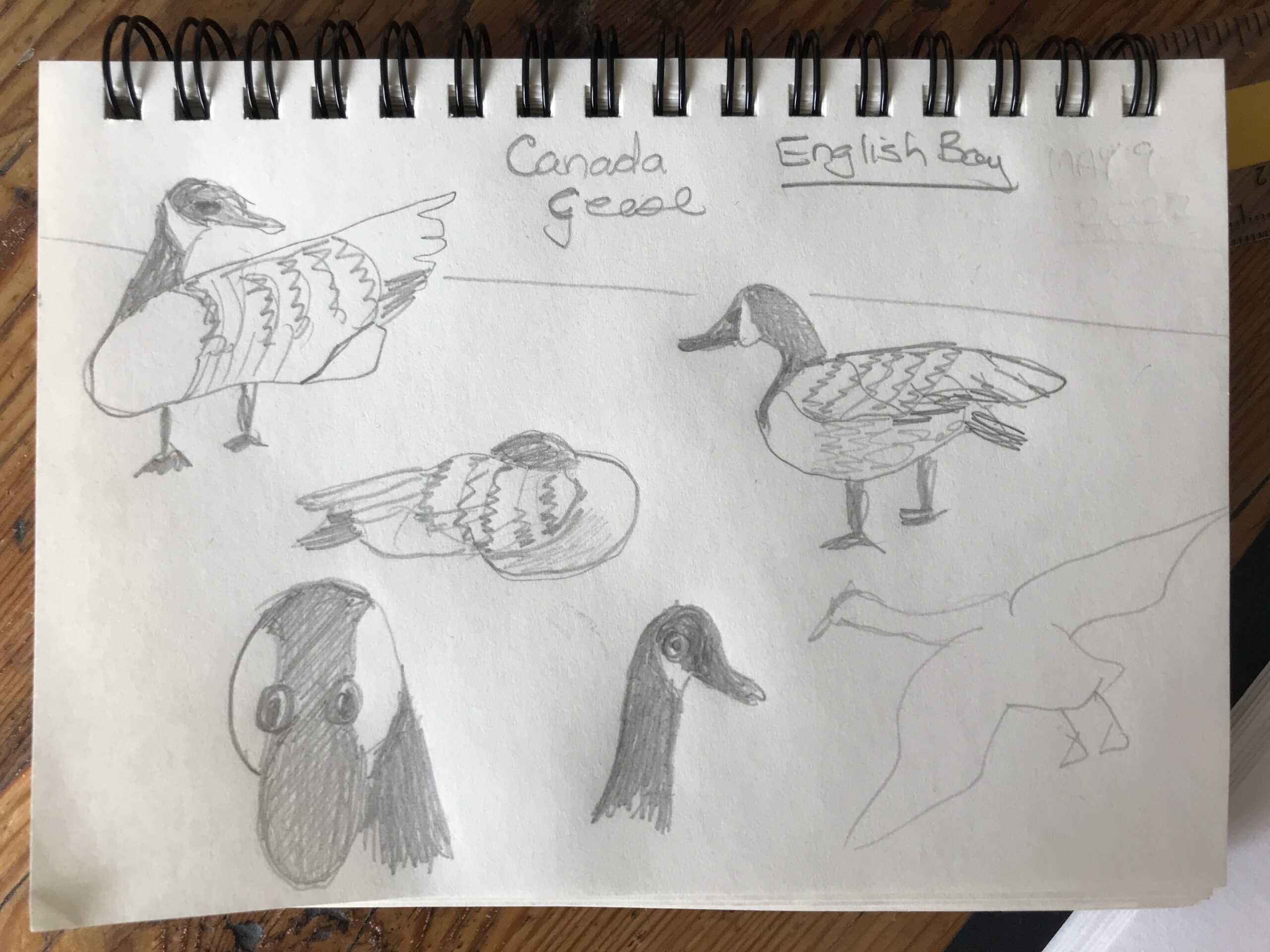
I had my travel field notes sketch journal and a pencil and the. 

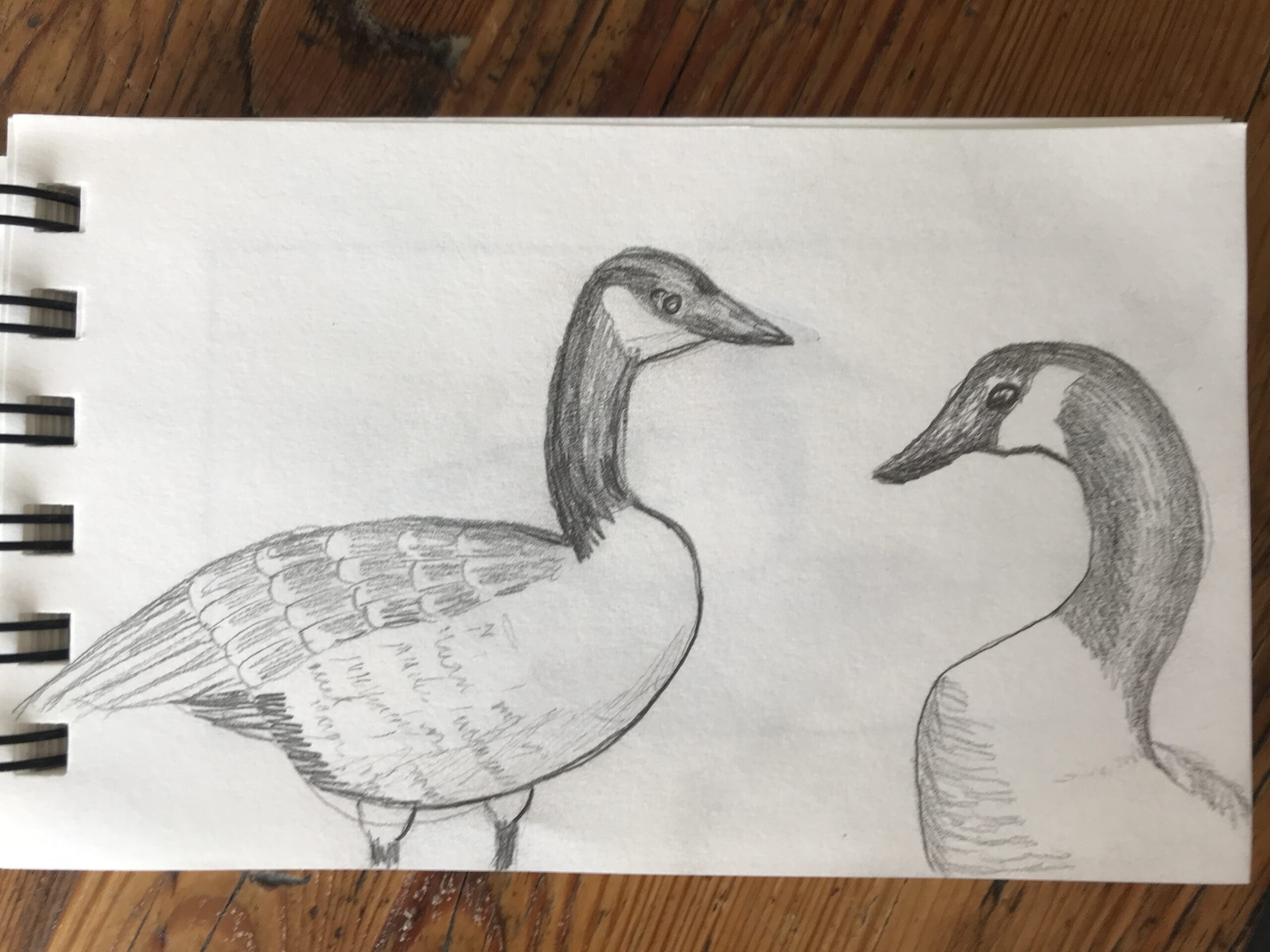
The plan was to draw the sea, but I did quite a few sketches of the geese. 

Here they are swimming in the sea.

I’m not very good at drawing people and animals,so I thought it would be a challenge to sketch some geese for my new perpetual nature journal. 

In ink

Here are some pencil sketches I did on location at English Bay in Vancouver. 

Studio Sketch

Next, when I got home,I looked at more free images from the web of geese. 

I sat down in my creator studio and attempted to draw the geese again.

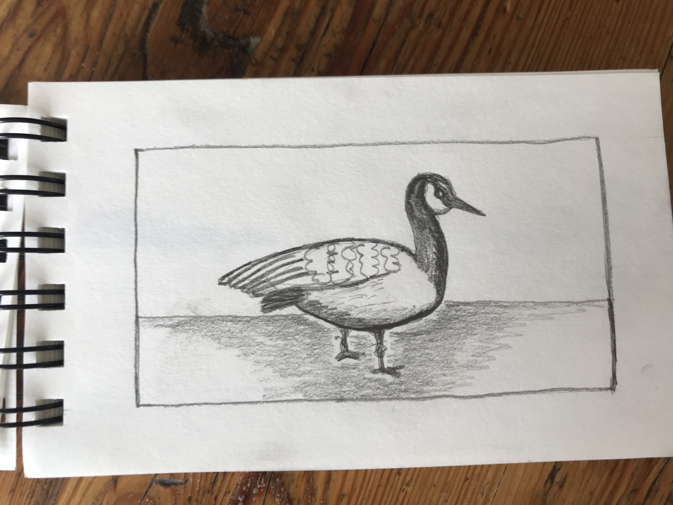
I tried to sketch a few poses. 

After three attempts I did one in my perpetual nature journal. 

Pencil Sketch

First the pencil sketch. I’m using a 2H hard pencil and drawing lightly. 

The back feathers have a beige look with white curved edges.

I tried to replicate this with my pen.

Pen

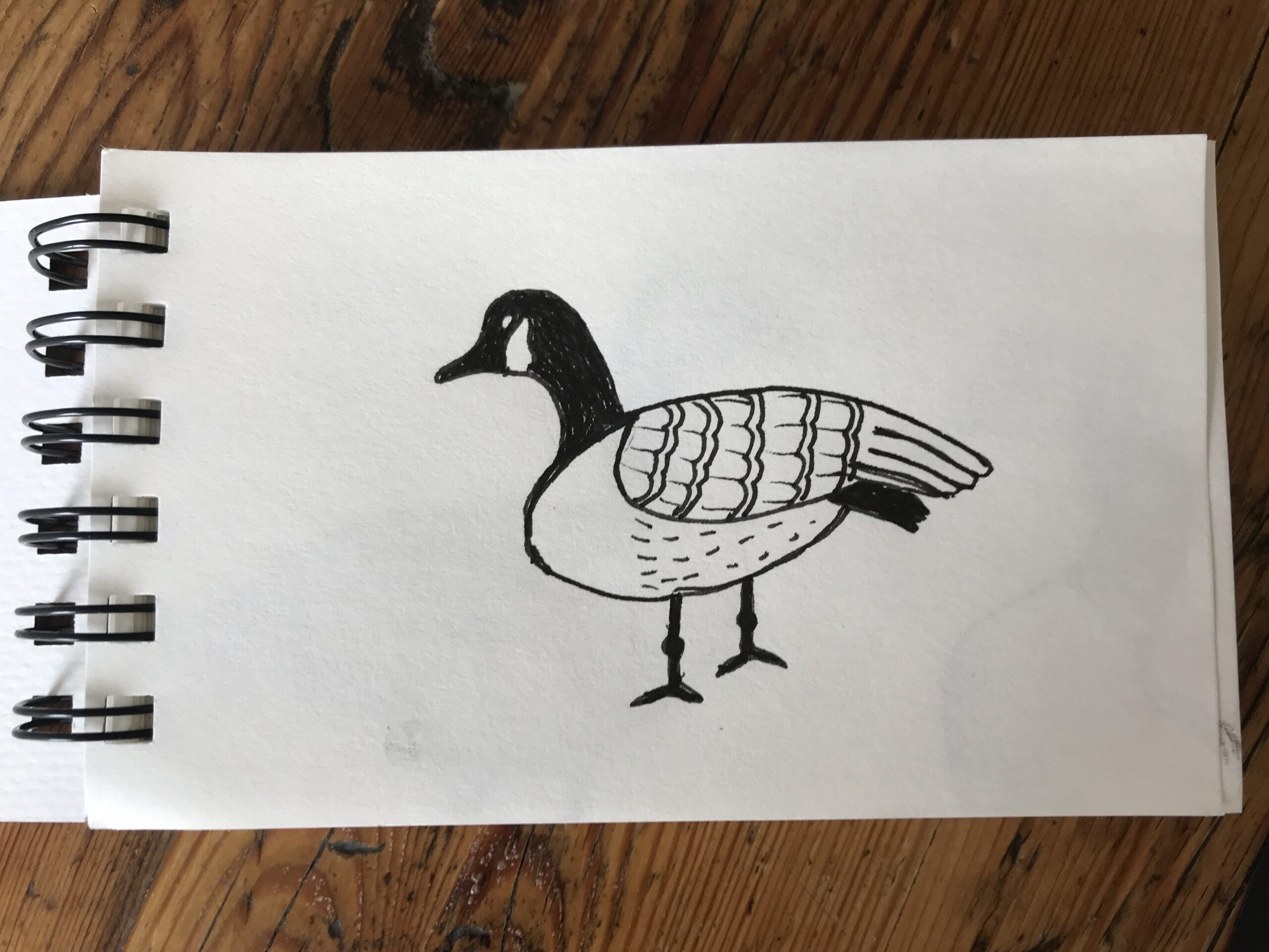
Next I went over the outlines with a black pen. 

It is the Faber Castell Pitt Artist pen in a 0.1mm nib. 

Black Ink

Then it got out my black waterproof Indian ink from Windsor and Newton.

I painted the neck, beak and legs making sure to keep the cheeks white. The legs have knobbly knees and duck feet.

Gold Ink

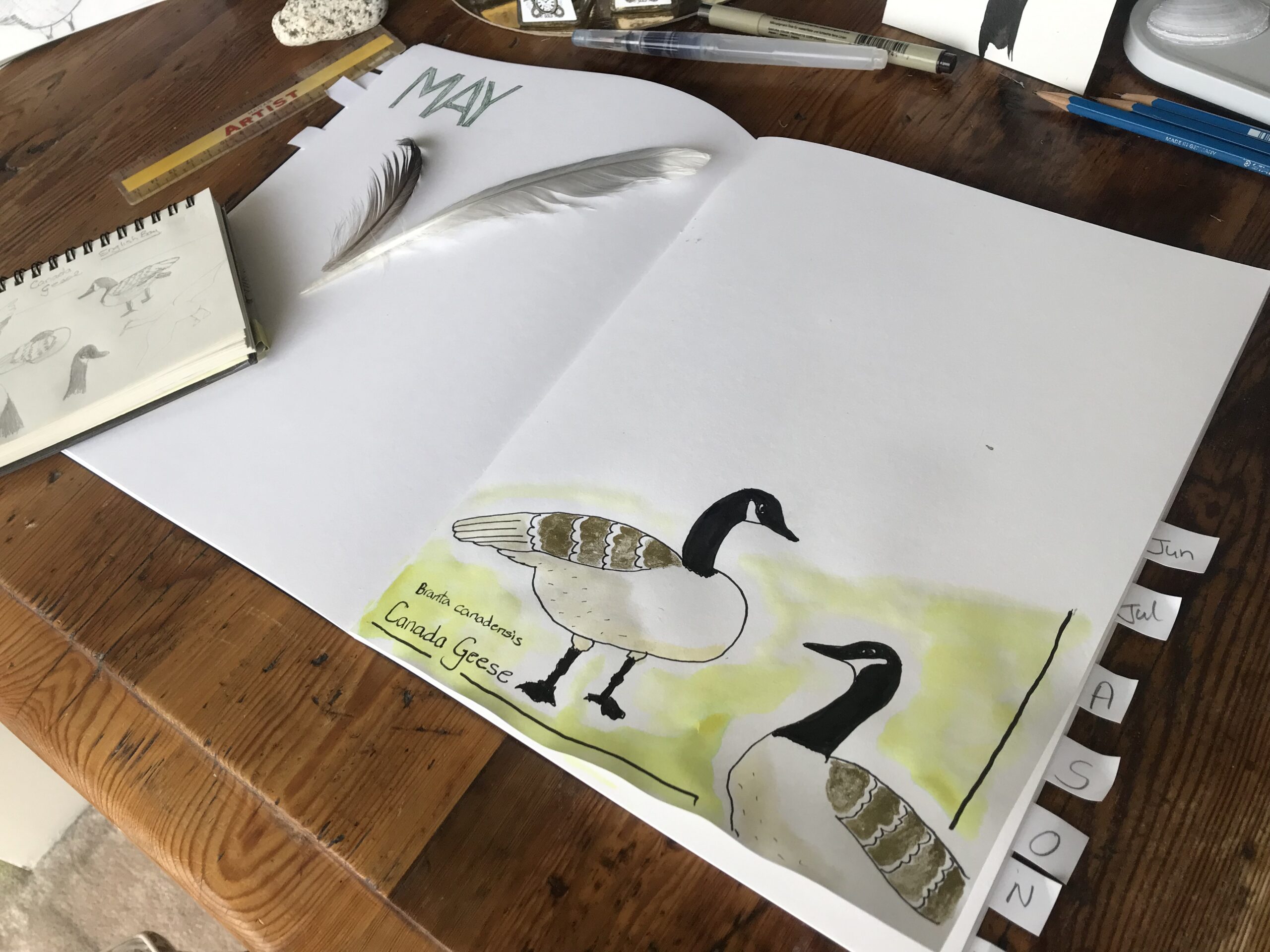
As I wanted to try out my gold ink, and I do love a bit of bling on my artworks. 

With a very thin brush I painted the back feathers in with shimmer.

Yellow Ink

For the soft underbelly I wanted a light taupe beige. 

I’d decided to water down some canary yellow ink with a minuscule dash of black.  

This was very thin and created a light beige.

I painted the underside of the fowl to add some dimension to the body.

Green Ink

For the background grass I blended apple green ink with sunshine yellow and thinned it with water.

style="display:block; text-align:center;" data-ad-layout="in-article" data-ad-format="fluid" data-ad-client="ca-pub-4471307604888511" data-ad-slot="7787961343">

Naming the Birds

I wrote the Latin name for these birds Branta canadensis underneath and also Canada Geese.

Vancouver Nature Map

On a separate piece of paper I drew the map of Vancouver and the surrounding 10km where I live. 

The plan is to add a little icon of each Natur Journal sketch on the map in the place where I drew the image.

This will grow in the future as I really get into nature journaling.

Finished Artwork

I really enjoyed creating this nature drawing in ink in my Perpetual Nature Journal.

I’ve only started nature journaling earlier this month and so far I’m loving it.

style="display:block; text-align:center;" data-ad-layout="in-article" data-ad-format="fluid" data-ad-client="ca-pub-4471307604888511" data-ad-slot="7787961343">
error: Content is protected !!