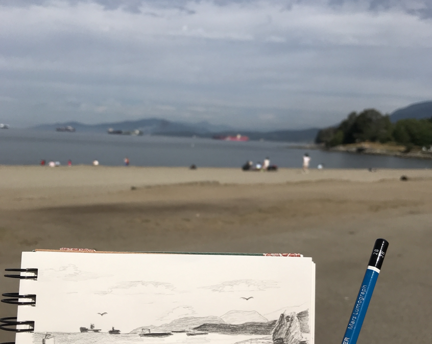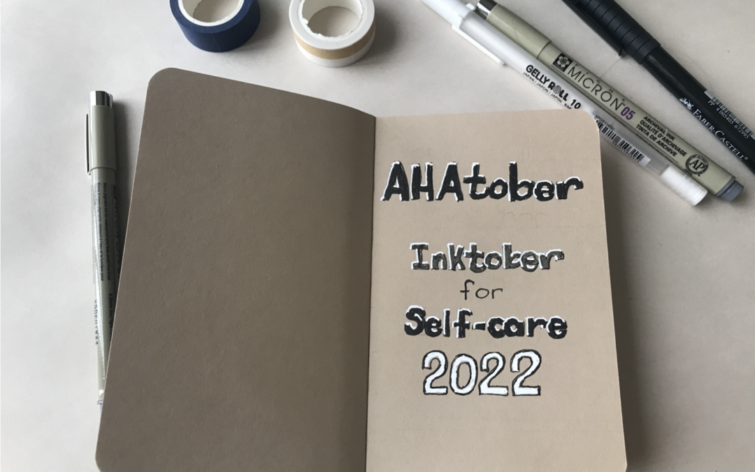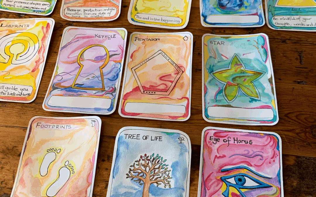
Creating your own artspiration cards is a fun and quick practice for any hobby artist. These little cards give you a spark of inspiration whenever you need it. They are simple to make, deeply personal, and can become a playful tool to guide your creative journey.
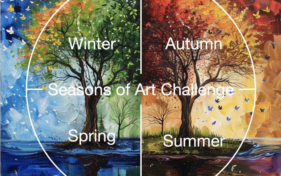
Seasons of Art Challenge
Seasons of Art Challenge
4 Seasons
Every year brings four seasons spring, summer, autumn and winter. Technically each season starts as the Sun crosses an equinox or solstice point in the year.
In the northern hemisphere spring occurs around March 21st, summer occurs around June 21st, autumn starts around September 21st and winter begins around December 21st.
In the southern hemisphere spring begins around September the 21st, summer begins about December the 21st, autumn begins near March 21st and went to begins near June 21st.
Note: Each year the dates may be slightly different, so for the purposes of this post I’m sticking with the 21st of each month. It just makes things easier.

Winter Solar Quarter
Winter is from December 21st for thirteen weeks until the Sun again crosses the equator at the equinox on March 21st. This means that winter contains just over thirteen weeks or around three months. But the three months period of a solar quarter is different to what we would normally call the fourth quarter or Q4.
Four Quarters
Time quarters refer to the four quarters found by dividing the year directly into four. Each quarter contains three months. The four quarters are:
- Q1 contains January, February and March.
- Q2 contains April, May and June.
- Q3 contains June, July and August.
- Q4 contains October November December.
These are the usual time quarters that are used for business. The seasons are different and start at specific dates in the year. They begin are around the 21st of March, June, September and December.

Natural Rhythms
I like the idea of aligning myself with the natural rhythms of the Sun much like phenology. I thought it would be a good idea to create the Seasons of Art challenge which will happen four times a year during each season. It’s up to you whether you do the full Four Seasons in any given year.
Season of Art: Winter
The first Season of Art kicked off in winter. Use the hashtag of #seasonsofartchallenge asthis avoids the winter is north and summer is south issue completely. December 21st, will align to the beginning of winter in the northern hemisphere and for those of you living South of the equator, it will be the beginning of summer.
Northern Hemisphere Centric
Because I am writing this from Vancouver, Canada in the northern hemisphere, I will refer to northern hemisphere seasons although I do respect the southern hemisphere folk as I did live in South Africa south of the equator, for most of my life. If this all sounds complicated, then I apologise. The point is to work with the natural seasons created by the Sun.
Wheel of The Year
The Wheel of the Year is a diagram that divides the year up in a natural way.
Solar Quarter Days
The division start with the two solstices and the two equinox divides the wheel of the year into four solar quarters. The four quarters are the Four Seasons. Each season begins as the Sun transits the equinox or solstice points.

Pagan Quarter Days
The pagan quarter days have special names.
- March the 21st is known as Ostara.
- June the 21st is known as Litha.
- September the 21st is known as Mabon.
- December 21st is known as Yule.
Cross Quarter Days
The cross-quarter days are the midpoints of each of the four quarters. Each of the solar quarters can again be divided by the midpoint day which is typically the first of the month’s February, May, August and November. In the Pagan world the cross-quarter days have special names some of which may be more familiar to you than others.
Pagan Cross Quarter Day Names
- The first of February is Imbolc.
- The first of May is Beltane.
- The first of August is Lammas.
- The first of November is Samhain, and this time is better known and celebrated on October 31st as Halloween.
Seasons of Art – 13 Weeks
Each quarter contains 13 weeks. The idea of Seasons of Art is to draw thirteen artworks in each season. Below are the thirteen prompts for each season upcominging. Even though each quarter may start at a different day in the week, I’m counting the weeks from Sundays.
Weeks
Week one would be from the Sunday to the Saturday and then week two would start on the next Sunday. The reason I choose Sundays is because I believe it’s the first day of the week.
How to Win the Seasons of Art Challenge
What
Every Sunday draw a picture using the Seasons of Art prompt for that week.
Seasonal Prompts
You may start by just completing one season’s worth of artworks. Perhaps you will do the Winter or Summer season.
How
You can use your favorite medium like markers, pen and ink, colored, pencil watercolor, acrylics or oils etc. It’s up to you.
Timeline
You have one week to complete each drawing, so there is no rush. Once you have completed the first season you can continue on and create 52 artworks for the year.
Winner
You win when you have completed the whole challenge and you have 52 artworks to be proud of. Good luck.

Save this pin to read later.
Winter Prompts Page
Below is the Winter prompts page in my Seasons of Art Journal. I’ve written the prompts in the first quarter (or season) of the book. This will act as a reminder of what I was doing when I look at the journal in years to come.

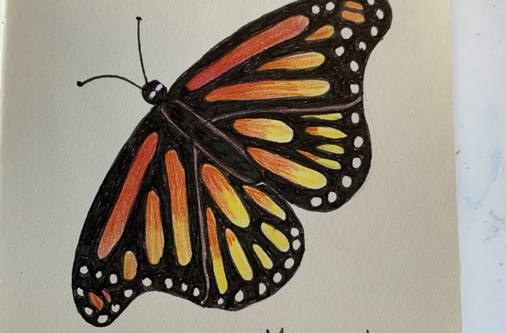
Seasons of Art Challenge: Week 1: Silver
In this image I imagined the Moon to be silver and to have a silvery glow to the top side of the tree’s branches. I may still have to get out my actual silver inks to bring this one more to life.

Seasons of Art Challenge Winter: Hibernate
Here I drew a grizzly bear hibernating in a cave through the cold winter months. I noted the proper name of Ursus Arctos as well. Who knew?

Seasons of Art Challenge Artworks
Below are some more of the artworks from the Seasons of Art Winter Challenge. Some are not quite finished yet but I though I’d add them anyway so you can see how far I’ve got.


Save this pin to read later.

Save this pin to read later.

Save this pin to read later.
Tip: Southern Hemisphere
If you live south of the equator then switch the seasons so they make more sense. For southern hemisphere people please swop summer with winter and spring with autumn.
Seasons of Art: Full Year Challenge
Because the very first Sunday in the December winter season falls on a different day each year, it makes it that there is usually only one week in the first year. All the rest of the weeks for the winter season will be in the next year. This makes Seasons of Art a great art project to do for the whole of the year if you would like.
A Year of Art Prompts
In theory, you could do a full art journal for 52 weeks which is broken down into four seasons of the year. Alternatively, you may decide to do one season, perhaps the winter season, then skip spring, and go straight onto summer if you enjoyed doing the winter season.
Art Challenges
The big thing about art challenges is that they get you into the habit of doing art regularly. Whilst I like to do art daily, I can’t always manage it, but I know for sure that I can create art on a seven-day cycle, and this is where weekly art challenges come into their own.
Share Your Work #SeasonsOfArtChallenge
Use the hashtag #seasonsofartchallenge. Can you see it could be said as, “seasons o fart challenge?” Well, we can live with that. 🙂
Weekly Art Challenges
A weekly art challenges such as Seasons of Art where once a week you make a drawing in your sketchbook is ideal to keep an art practise going. Ideally you can have a dedicated sketchbook for your Seasons of Art for the Year.
If you are going to do the whole year then it makes sense to get a lovely sketchbook beforehand that has at least 52 pages in which you can do your drawings. This type of weekly project can result in you creating a huge memento or even heirloom art book showcasing the type of art you created during this year.
Other Artworks
Now of course you will be doing other artworks on the side. For example, I will be working on my other journals such as my perpetual nature journal. Also, I’ll be doing other work in my grimoire, but the point is that if I have a dedicated Seasons of Art journal it will end up being a delightful reminder of the type of art and the technical skills and media interests that I had during this year.
Looking back, I can reflect upon how revised my approach, developed, or pivoted, my art direction that year. Join us.


Author Bio: Alison Hazel
Alison Hazel is a hobby artist and she shares her ongoing journey about becoming an artist later in life. She creates simple art that anyone can make. She hopes to inspire you to reach your creative potential in the area that suits you.

Don’t Let the Old Lady In
Exploring how creativity can be our quiet companion, keeping us engaged, joyful, and connected to life and even on the hardest days.
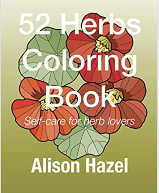
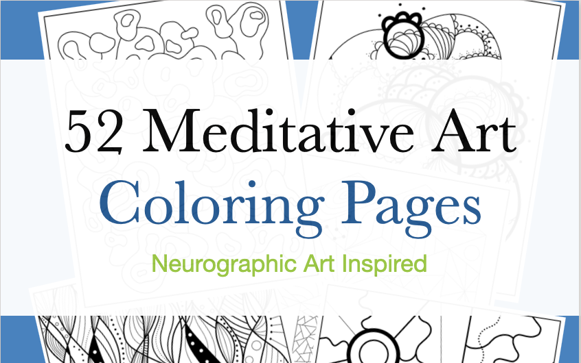
52 Herbs Coloring Book – Self-care for Herb Lovers
Get your 52 Herbs Coloring Book – Self-care for Herb Lovers with original artwork by Alison Hazel Art available from Amazon.