Exploring how creativity can be our quiet companion, keeping us engaged, joyful, and connected to life and even on the hardest days.
AHAtober 2022: Inktober for Self-care
Introduction
Inktober is an art movement devised by Jake Parker way back in 2009. To do Inktober you draw one ink artwork for every day of October. At the end you have thirty-one artworks.
Inktober Prompts
Each year the official Inktober prompts are published which you can follow. Many artists and creators devise their own prompts depending on the type of art or interests they have.
For instance, there is the Starztober challenge for astrologers.
The Inktober artworks are drawn in ink thus it is called Inktober and not Paintober. Many artists take up the challenge, post their work and process drawings on their social channels.
The Inktober Challenge
Inktober is a challenge you take with yourself. The task to create one ink drawing every day for the month of October. To win Inktober is to complete thirty-one drawings in the tenth month.
Many people start Inktober, but not everybody completes it, and I can attest to this. Inktober is not a competition against other people, but rather it is a contest with yourself.
The question is, “Are you able to create one new ink drawing every day for thirty-one days?” That is the challenge of Inktober.
When you complete all thirty-one drawings before the month has ended you win Inktober.
Inktober Winner
See how one artists won Inktober. I was fortunate to interview an artist who did AHAtober for the first time and completed all the artworks. Check out her story here.
Previous Inktober Years
I’ve started Inktober before, but I’ve never completed. I believe that this year I will get there. I’m more of an artist than ever before so I am up for the challenge.
AHAtober Prompts
If you want to be traditional you can find this year’s official Inktober prompts here.
As an aspiring artist, I have created my own Inktober prompts this year and they are all related to self-care. I plan to use my Inktober drawings as the basis of a coloring book which I plan to publish next year.
This year my personal Alison Hazel Art Inktober theme is around supporting mental health, mindfulness and neurographic topics like rest, reflection and the work/life balance. I feel these are the topics I mainly focus on in my art practice and I want to share them with you.
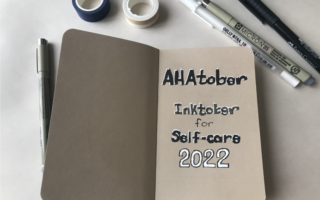
Inktober Journal
I have a new journal dedicated to Inktober this year it is a Stillman and Birn Nova Series sketchbook with toned paper. The size is 3 ½ by 5 ½ inches or 9cm by 14cm. Note that this is a pocket sized notebook.
I believe this will help me complete Inktober because I only have to draw a small artwork. It has over 60 pages which is more than the 31 pages I need for one page per day.
I usually only draw on the right-hand page and leave the left side empty as it is the back of the previous artwork.
Cover Page
Below is my inside cover page. It is clearly written AHAtober, Inktober for Self-care. So now when I look back at this journal in years to come I will immediately be reminded what it was all about.

Prompts Two-Page Spread
On the next full two-page spread I’ve written the full list of AHAtober prompts. I have the 1st to the 16th or October on the left-hand page column and the 17th to the 31st on the right-hand page column.
This way when I’m out and about with my AHAtober journal I can see the day’s prompts and get right on drawing the artwork. I plan to start these sketches early in the day. I may be at a coffee shop or on my lunch break and I have no reason not to at least draft the outlines.

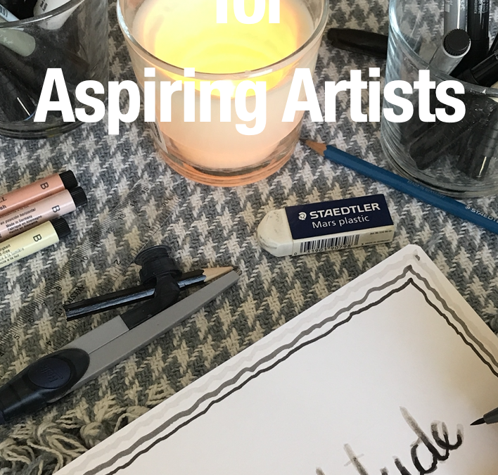
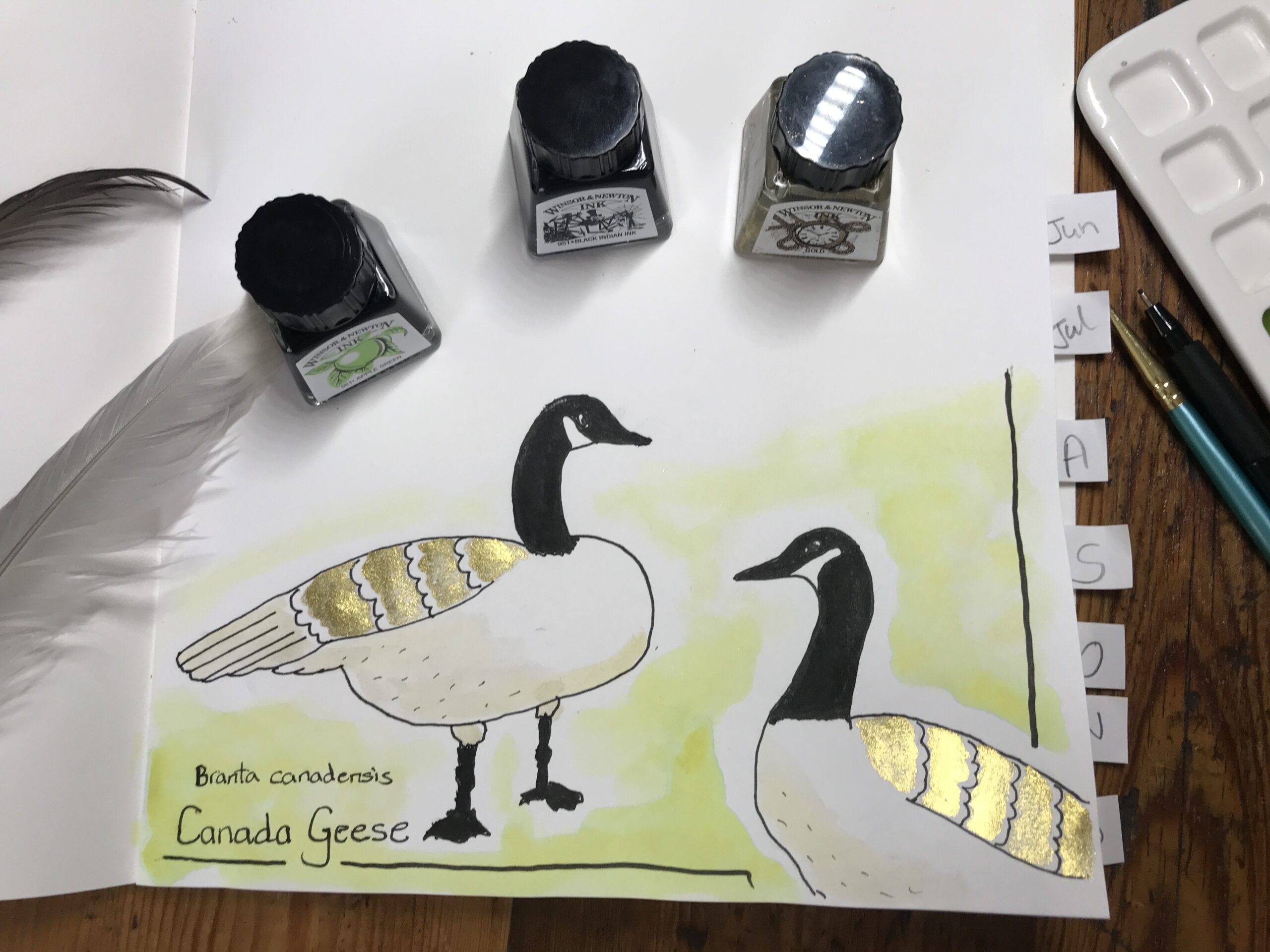
Drawing Inks and Supplies
I recently started working with colored inks and I plan to use this medium in my Inktober challenge this year.
The art supplies I’ll be using are:
- Faber Castell Pitt Artist pens in sizes 0.3mm, 0.5mm and 0.7mm.
- White Gelly Roll pen by Sakura.
- Pigma Micron pens in black, grey and sepia in various sizes.
- Windsor and Newton colored drawing inks.
- Paintbrushs in assorted sizes.
- Journal by Stillman and Birn.

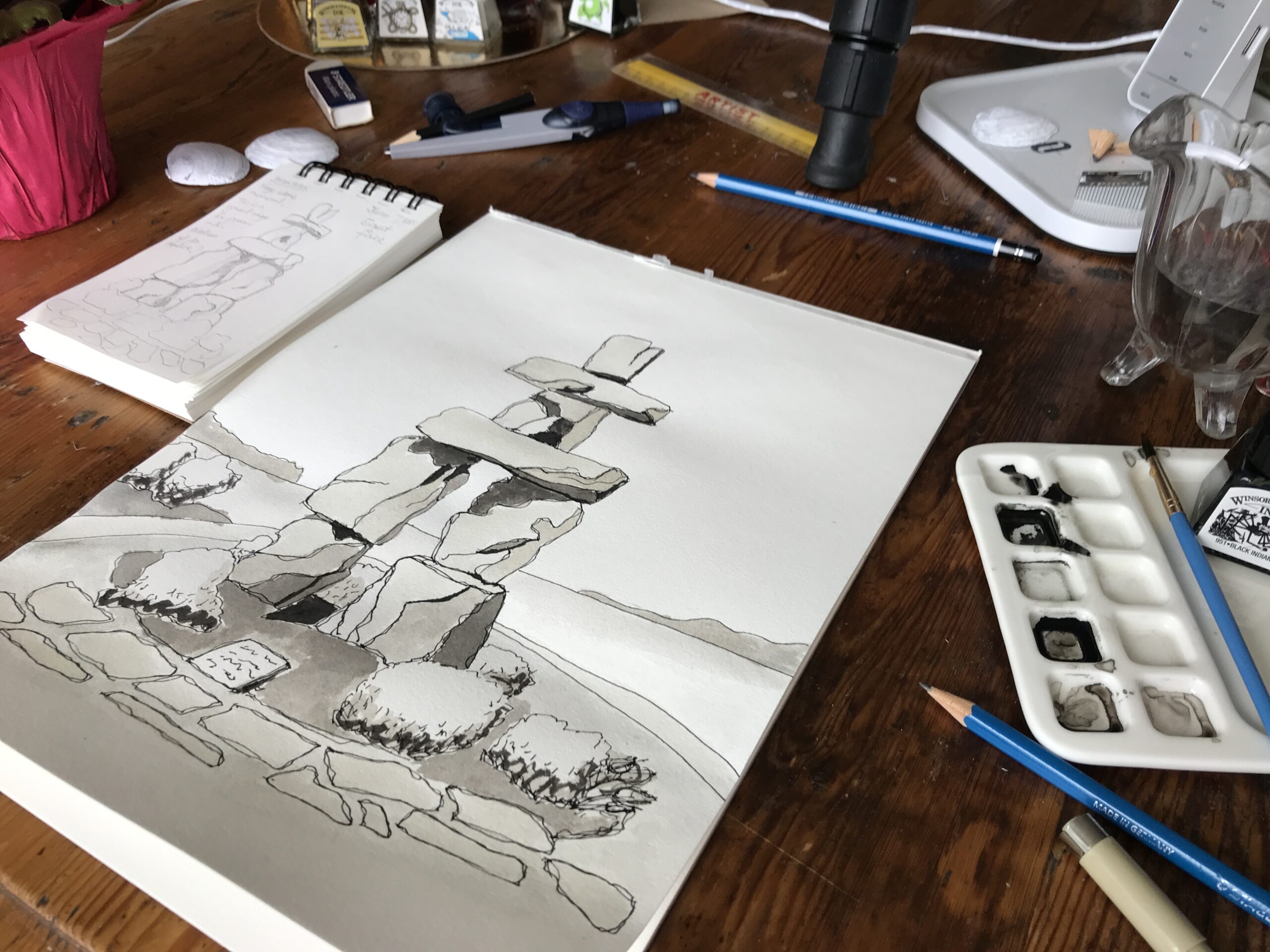
My Art Style and Process
As with most of my pen and ink drawings, I plan to start with a pencil sketch. I’ll also have a border typically 1cm or half an inch wide. Then I’ll do the black pen outline. Next, I’ll add colored inks either with a pen or with a paintbrush.
Inktober Strategy
My strategy for Inktober for this year is as follows:
- I hope to win at Inktober.
- I plan to only compete with myself.
- I will draw every day.
- I propose to learn more about how to work with inks.
Aspiring Artist Activity
Gather your Inktober sketchbook, pens and ink and please do the following:
Inktober Prompts
- Decide whether to use the official Inktober prompts, my Inktober prompts or create your own Inktober prompts.
Inktober Journal Setup
- On the first page write your name.
- Write the year.
- On the second page write the prompts list. This may flow over to two pages.
- On October 1st, start your first drawing perhaps on the right-hand page.
- Keep going inking every day and complete the challenge.
Share
- If you are comfortable, share your artworks with the hashtags #inktober or with my hashtag #AHAtober.
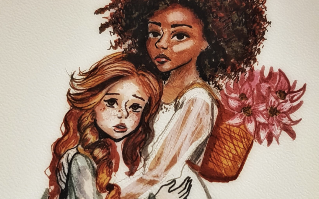
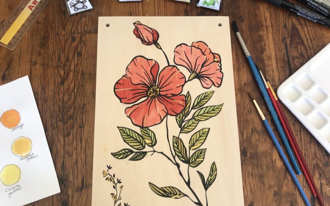
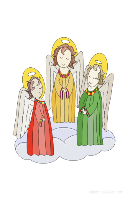
AHAtober Artworks
Below are some of the AHAtober artworks from you and me. Tag me on your drawings and I’ll add them below.


AHAtober Diary
October 11th
I managed to get the first 9 drawings done on time, but since day 10, I’m now officially running behind. I hope to catch up three days worth of artwork later on today. To do a daily art challenge is exactly that – a challenge.

Author Bio: Alison Hazel
Alison Hazel is a hobby artist and she shares her ongoing journey about becoming an artist later in life. She creates simple art that anyone can make. She hopes to inspire you to reach your creative potential in the area that suits you.
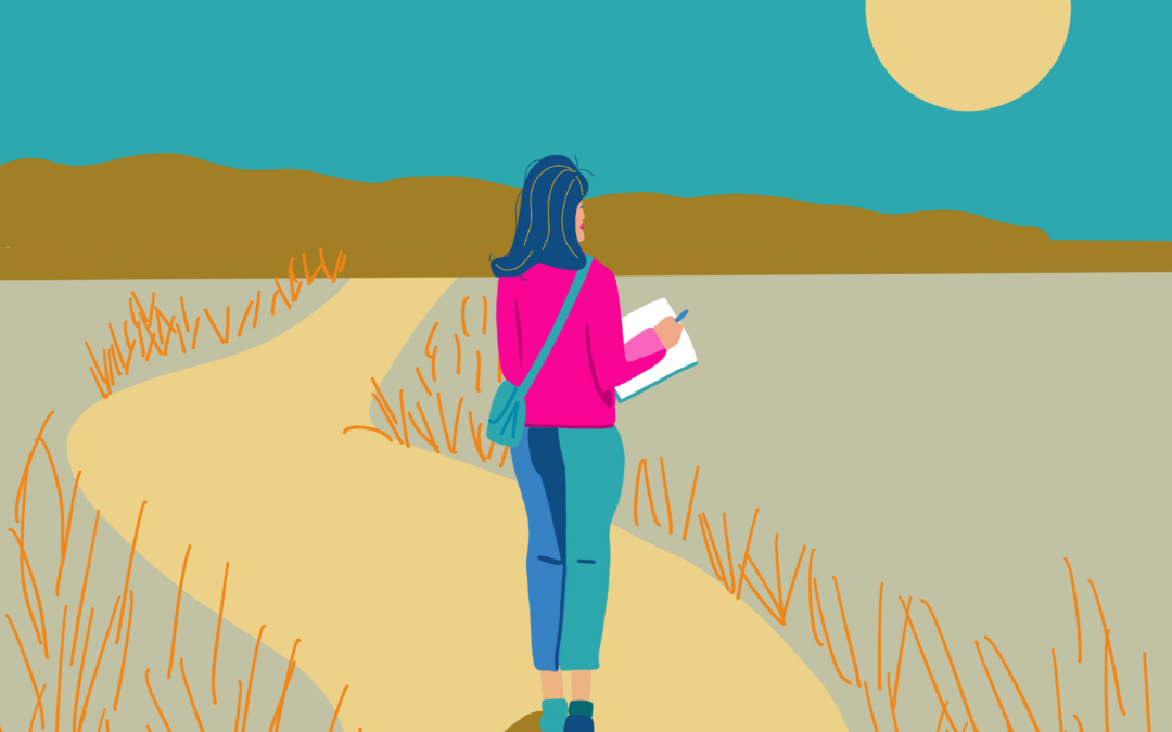
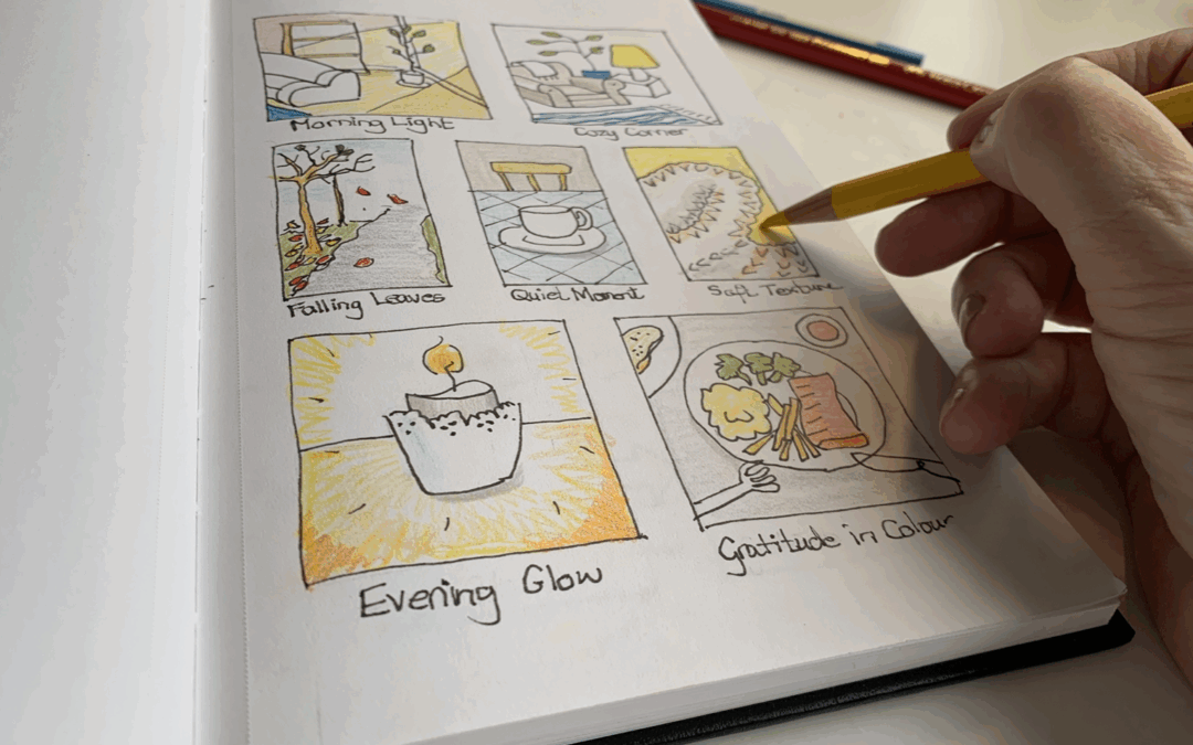
Being Creative When You LIve Alone
Living alone can be peaceful and it can feel very quiet. This gentle piece explores how creativity can become soft companionship rather than another task to finish. Through sketchbooks small rituals and noticing tiny moments your art becomes a kind presence which keeps you company and helps you feel less alone.
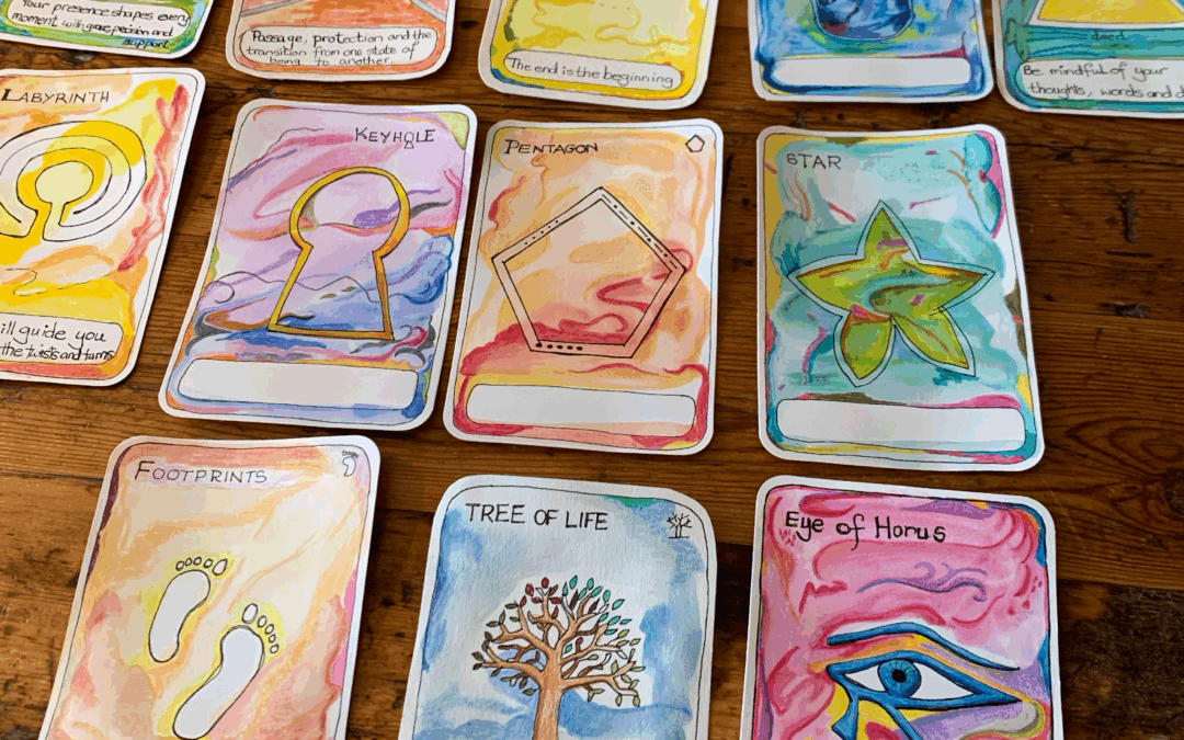
Artspiration Cards
Creating your own artspiration cards is a fun and quick practice for any hobby artist. These little cards give you a spark of inspiration whenever you need it. They are simple to make, deeply personal, and can become a playful tool to guide your creative journey.